Cerulean: A Sophisticated Blue Palette With a Point of View
Some palettes are pretty. This one is intelligent. Cerulean is a nine-color Sherwin-Williams scheme built on refined neutrals, a dusty blush, a mauve taupe, and one deep, unforgettable cerulean that knows exactly what it is. If you want a home that feels layered, cultured, and quietly commanding, this palette was made with you in mind.
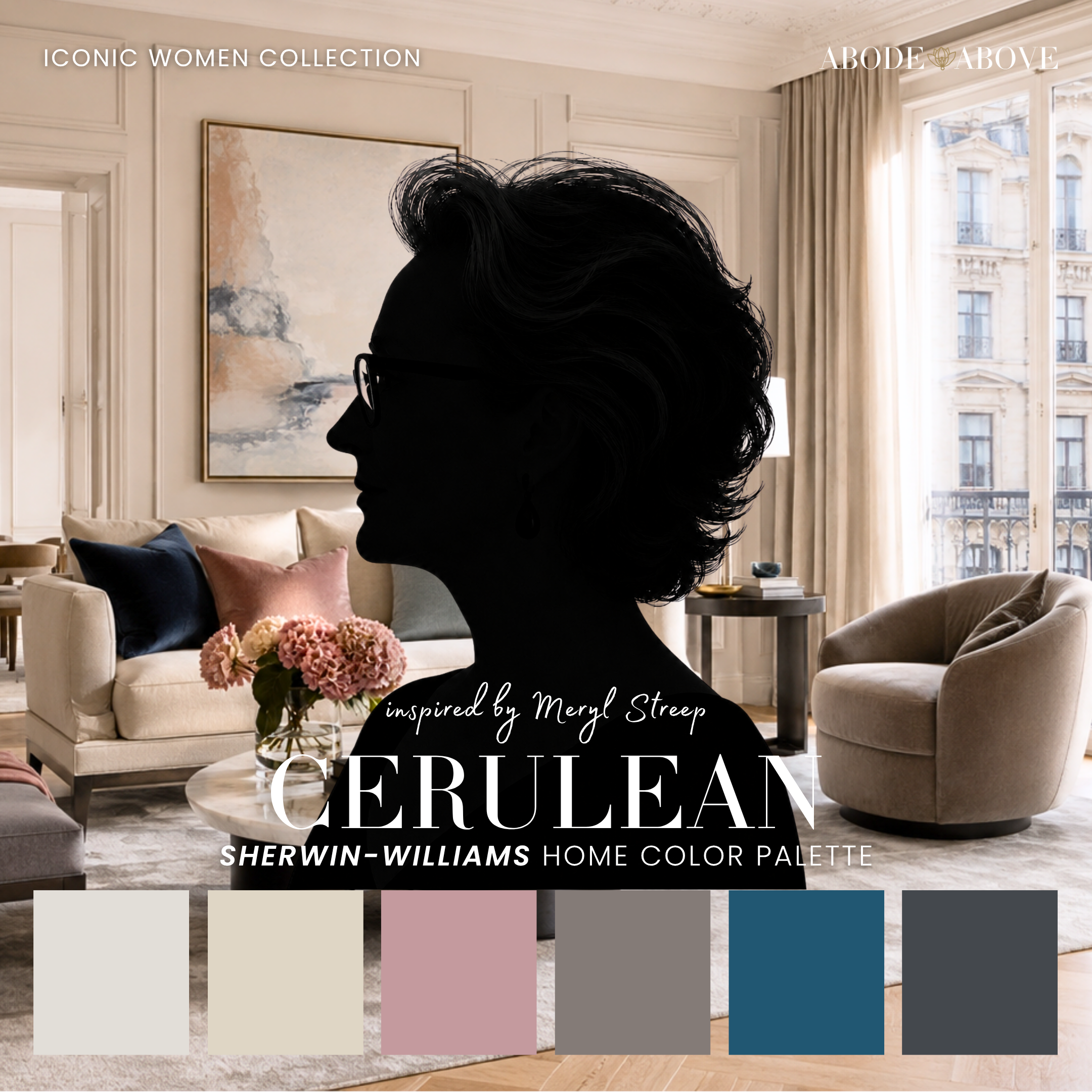
The Woman Behind the Palette
Cerulean is inspired by Meryl Streep, who is range personified.
She can be anyone, in any register, with a precision that has made her the most acclaimed actress of her generation. But this palette tips its hat to one specific, unforgettable scene: the icy magazine editor explaining, in withering detail, that a casual blue sweater was never a careless choice at all. It is, I would argue, the greatest two minutes of color theory ever put on film, and as a designer I have never fully recovered from it. The whole speech is about the idea that color is never accidental, that what looks like a simple choice is the result of countless intentional decisions upstream.
That is the entire philosophy behind how I build palettes, so of course Meryl earned one. Cerulean is designed the way she performs: layered, intelligent, completely in control, and then, right when you have settled in, suddenly and deliberately bold.
The Palette at a Glance
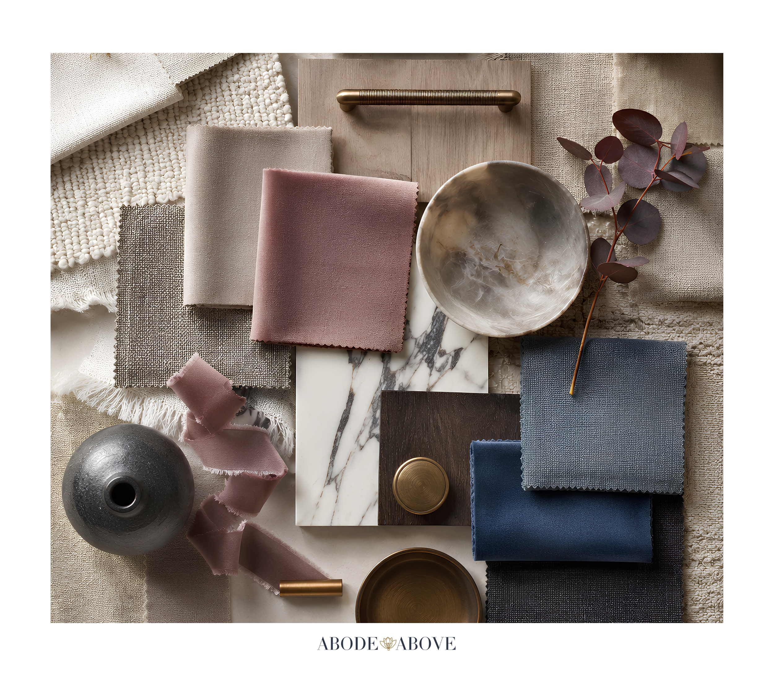
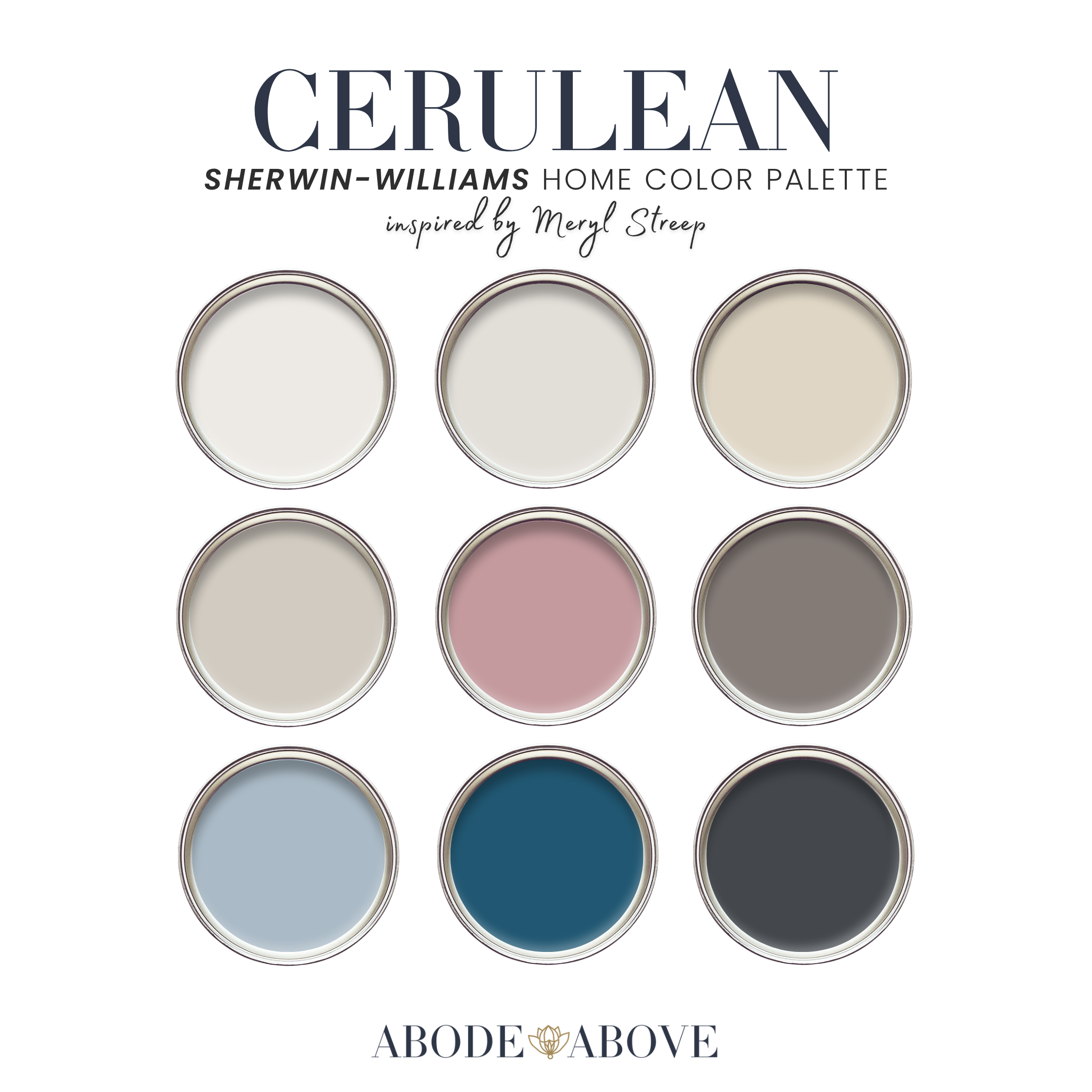
This palette follows my usual architecture: two carefully chosen whites, a set of livable mid-tones, deep grounding shades, and one statement that steals the scene. The whites here are soft and slightly cool, with an editorial polish that flatters everything around them. A champagne neutral warms the mids, alongside a diplomatic greige so balanced it cooperates with anything. Then come the palette's quiet sophisticates: a dusty, grown-up blush and a mauve taupe full of smoke and depth. A soft cerulean-adjacent blue eases you toward the theme. And the statement, the whole reason the palette exists, is a deep, saturated cerulean, grounded by an inky blue-black.
The genius of this palette is the tension between calm and drama. The neutrals, blush, and taupe are endlessly livable, but that deep cerulean gives the whole scheme a spine. It is not just blue. It is the point.
How to Use Cerulean in Your Home
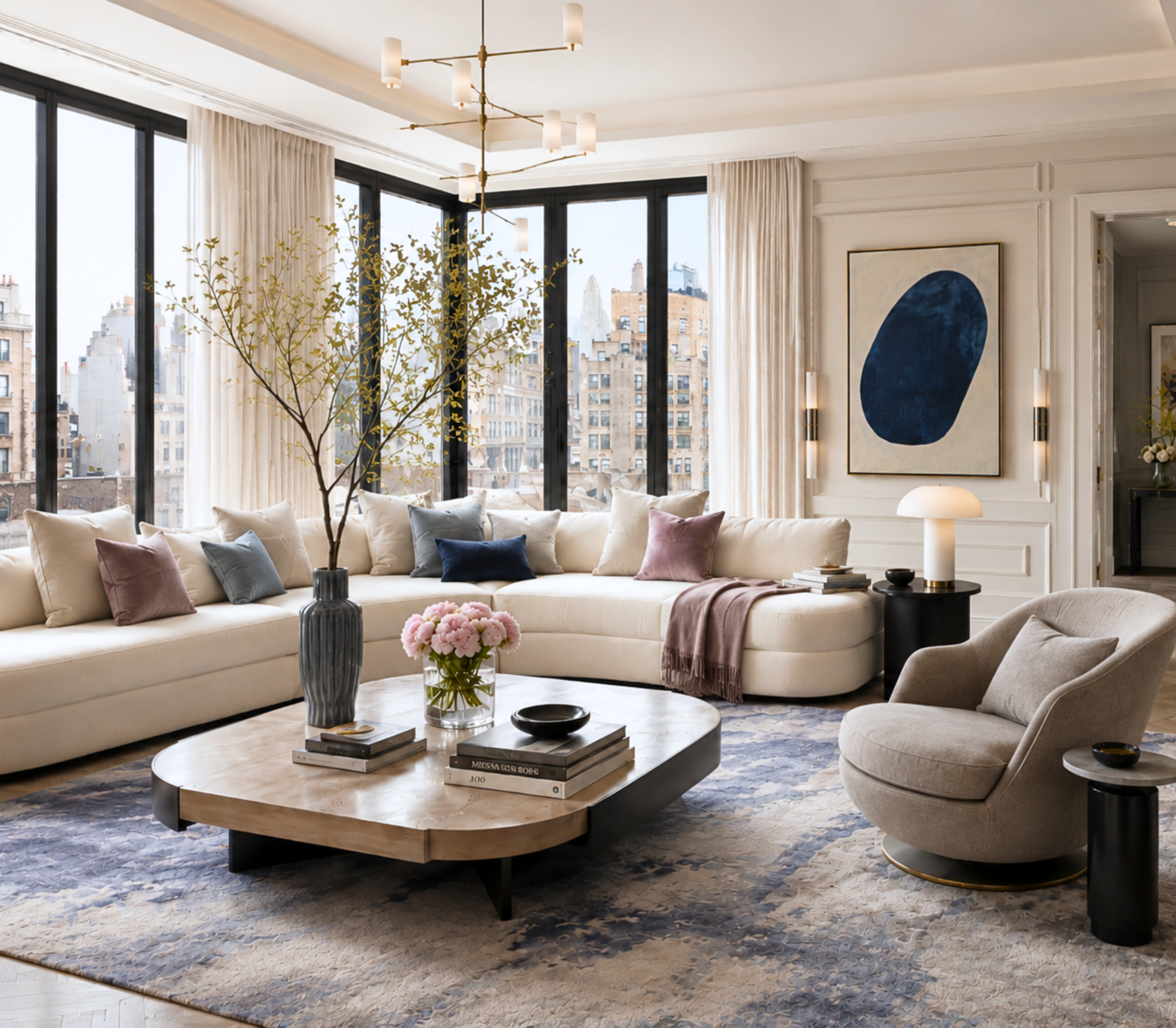
This palette rewards a considered hand, so the 60-30-10 ratio is your guide: about 60 percent of a room in your main color, 30 percent in a secondary, and the last 10 percent in accents. The deep cerulean is most powerful when you resist the urge to overuse it.
The Living Room
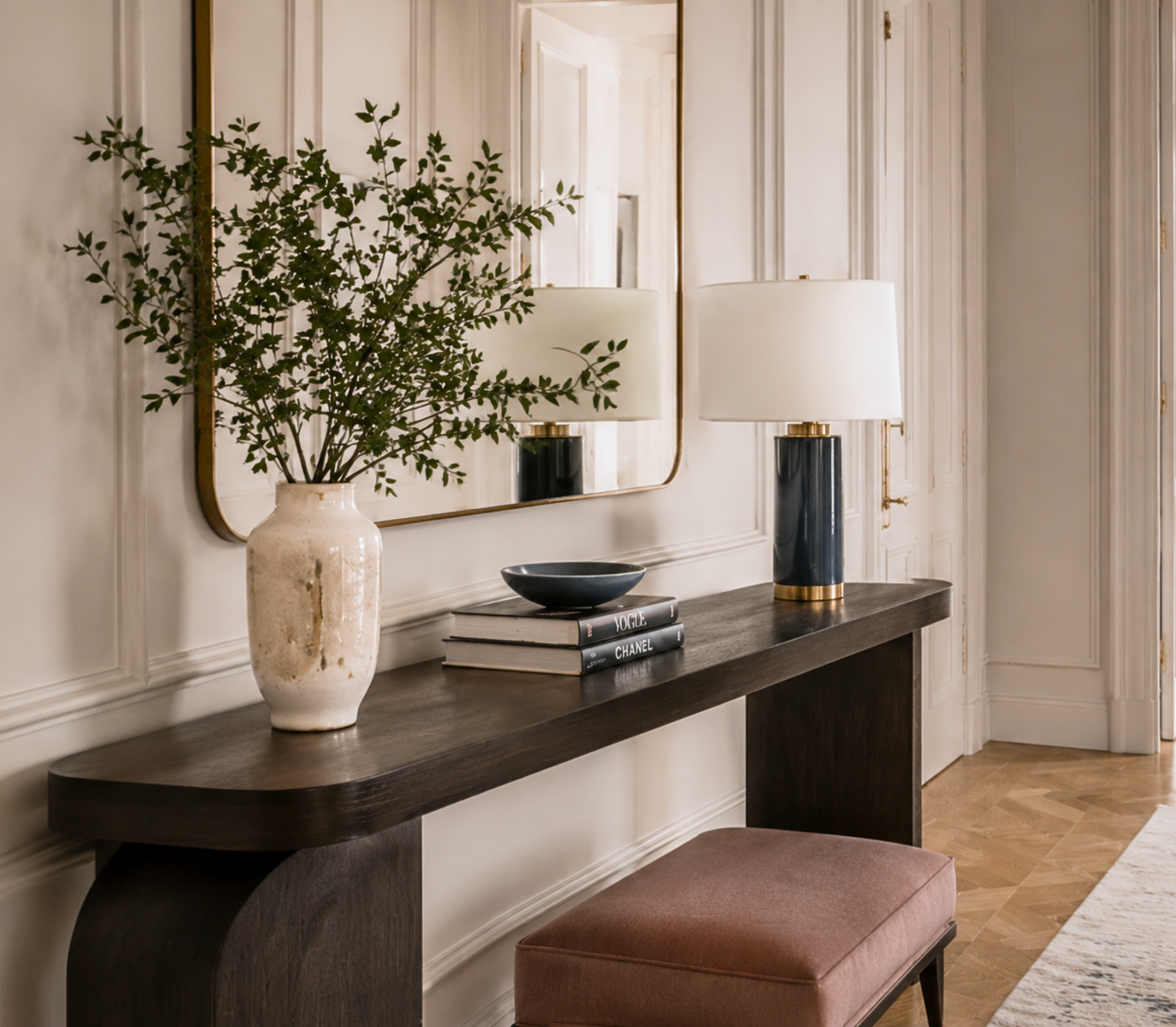
Anchor the room with the soft gray-white or the diplomatic greige on your main walls, which keeps the space refined and full of light. Bring in the champagne neutral or the dusty blush as a secondary through upholstery and drapery for warmth and quiet sophistication. Then let the deep cerulean appear in considered doses: a pair of chairs, a bold piece of art, a lacquered side table. The mauve taupe and inky blue-black handle the accents, on lamp bases, frames, and hardware. The result is a living room that feels cultured and composed, like a space that reads books.
The Dining Room
A dining room is the perfect stage for that cerulean to command the room. Consider it on the walls, or on a run of built-in cabinetry, balanced by the soft white on the trim and ceiling. Against warm brass and rich wood, deep cerulean feels both classic and daring, exactly the note you want in a room made for gathering and conversation. The blush and champagne tones in the seating keep it from feeling austere.
The Bedroom
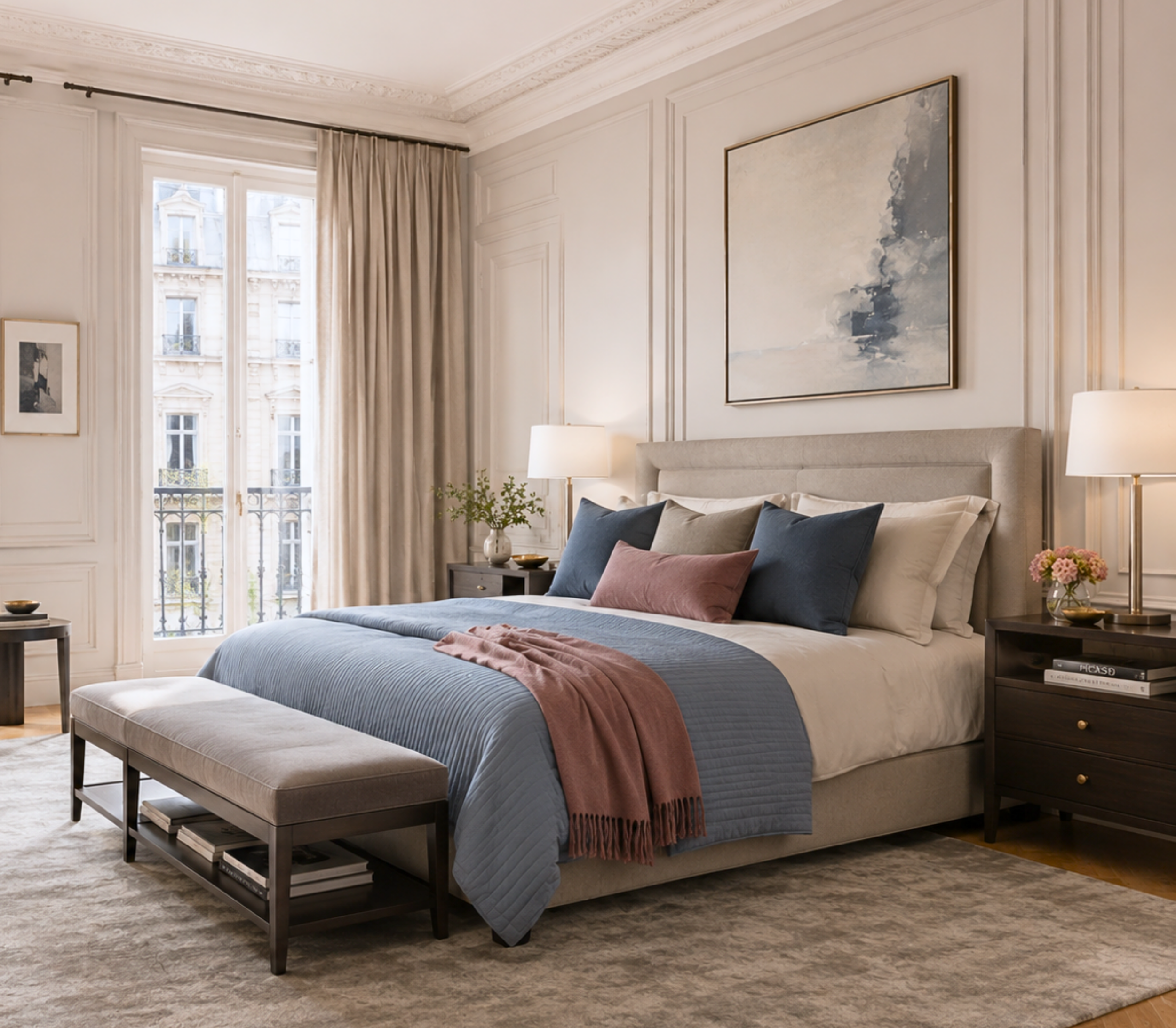
Bring the softer blue forward here for a serene, restful wall color, layered with the champagne neutral and dusty blush in the bedding for a bedroom that feels like a refined retreat. Keep the deep cerulean for one accent, a headboard, a bench, a single piece of art, so the room stays calm but still has a point of view. The mauve taupe makes a gorgeous, unexpected choice for a moody dressing area or closet.
The Study or Powder Room
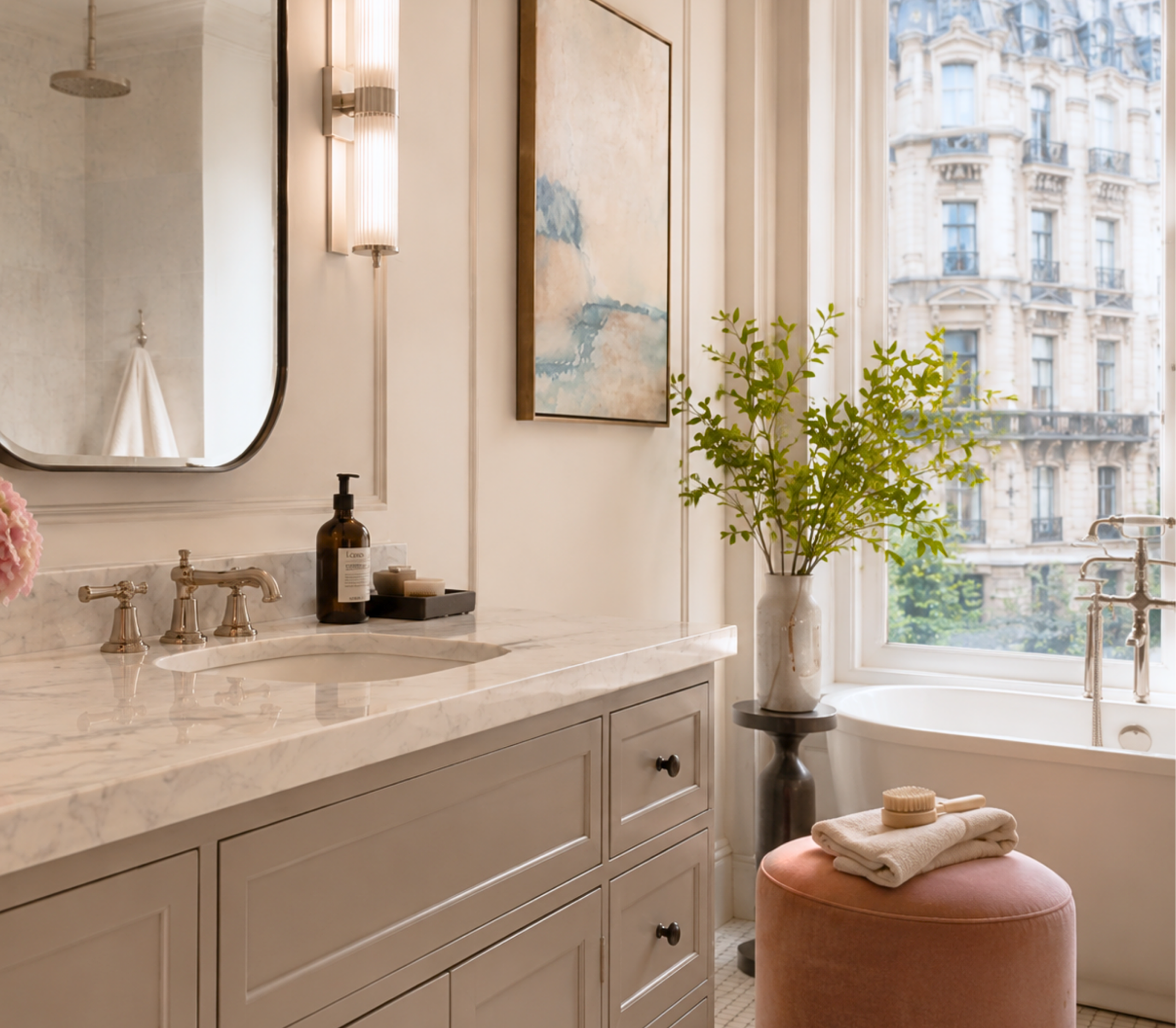
If you want the full drama of the cerulean, give it a small, high-impact room. A study wrapped in that deep blue feels intelligent and enveloping, ideal for focus. Or a powder room in cerulean with the inky blue-black on the fixtures becomes a jewel box with real gravitas. These are the spaces where the boldest part of this palette earns its keep.
The Bedroom
Bring the smoky denim blue forward here as a main wall color. It reads like a broken-in favorite jacket, moody but restful, and it pairs beautifully with the crisp white and the warm nude blush in the bedding. Keep the leather black for small accents so the room stays calm. This is how you get a bedroom that feels grown-up and a little cool without ever feeling cold.
The Powder Room
Small rooms are where you should be boldest, and this palette gives you the perfect tool. A powder room in the leather black or charcoal, with the red on a single accent or the vanity, is unforgettable, a genuine jewel box with an edge. Add brass or matte-black fixtures and you have the kind of space guests comment on the moment they walk out.
Making It Work in Your Light
One honest piece of advice before you commit. Deep, moody colors are the most dramatic in the collection, and they behave very differently depending on your light. A charcoal can feel rich and enveloping in a well-lit room and closer to flat black in a dark one, and the olive can shift noticeably between warm and cool. That is exactly why sampling matters most with palettes like this. Order samples, live with them on more than one wall, and study them morning, noon, and night. With deep colors, this step is the difference between a room that feels intentional and one that feels like a cave.
Bring an Icon Home
Diamonds and Leather is for the home with an edge: moody, confident, sophisticated, and unafraid of one fearless red. If that is the energy you want, this palette is ready in my Etsy shop, Abode Above Colors. Every download includes all nine exact paint colors and codes, the role each color plays, room-by-room placement guidance, and ready-to-use combinations so you know exactly how much of each shade to use and where.
And if you love this bold, layered approach, Diamonds and Leather belongs to a whole collection of palettes, each inspired by a woman whose style works like a signature. There is a dramatic emerald scheme, a warm and glamorous gold, a serene jade green, and a tailored menswear-inspired neutral if you want your edge a little softer. Come find the one that feels most like you, create something you love, and then send me a photo. I would genuinely love to see it.
You can shop the full Iconic Women Collection at Abode Above Colors on Etsy, and if you are local to the Delaware Valley and want the full-service version of this kind of color confidence, you know where to find me.

Images in this post are AI-generated for illustrative purposes only.