Diamonds & Leather: A Moody, Edgy Palette With One Fearless Red
Not every home wants to be soft. Some want an edge. Diamonds & Leather is a nine-color Sherwin-Williams palette built for exactly that: cool grays, a muted military olive, worn denim blue, and one red that does not ask permission, all grounded by two deep, confident darks. If your style leans moody, modern, and a little dangerous, this is the palette I made for you.
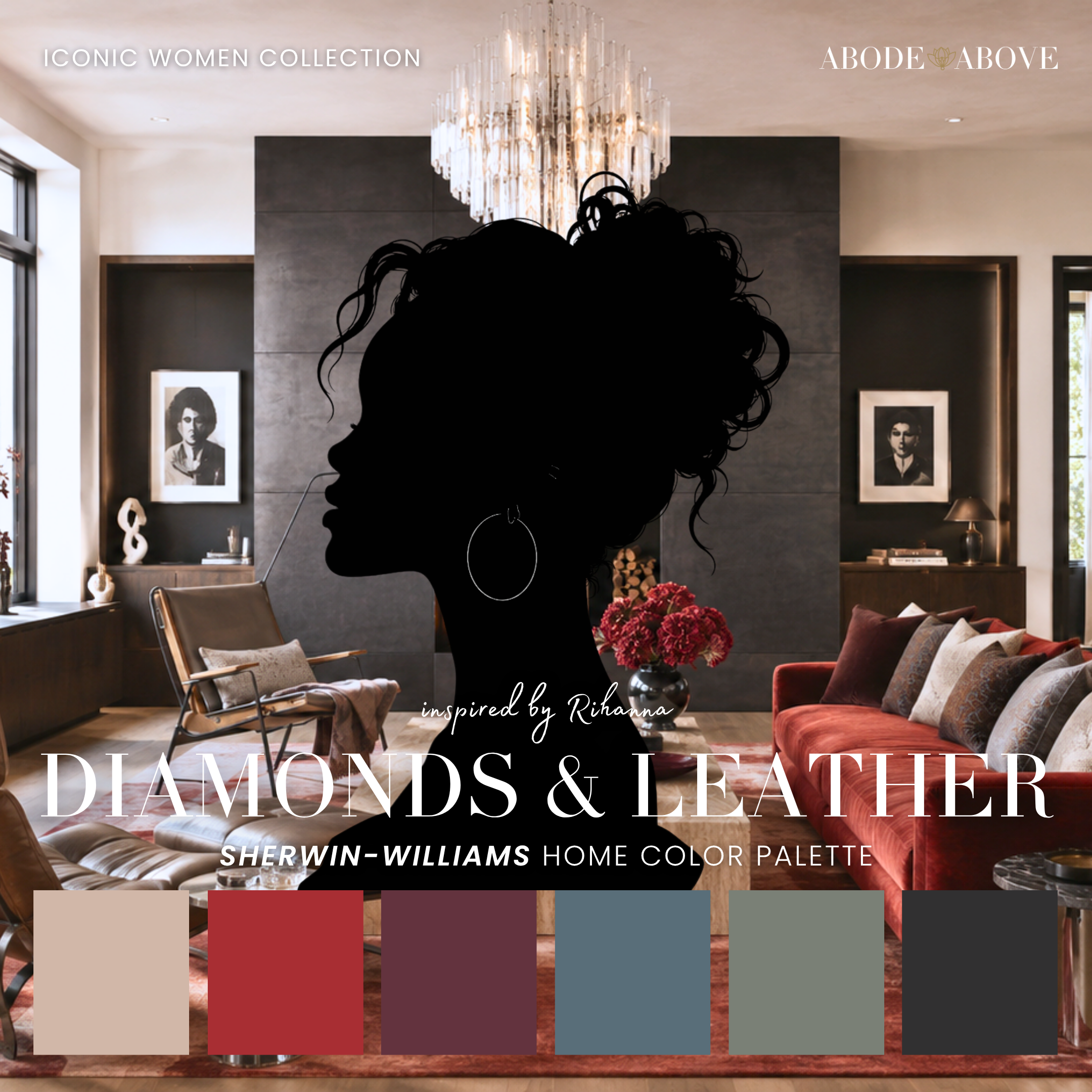
The Woman Behind the Palette
Diamonds & Leather is inspired by Rihanna, who built an empire on refusing to choose.
Streetwear and couture. Edge and softness. She turned a beauty line into a genuine cultural reset by insisting that luxury include everyone, and her personal style has always mixed military-surplus toughness with red-carpet glamour, often in the very same look. She is proof that you do not have to pick a lane to be iconic. You can be all of it at once, as long as you commit fully to every part.
That fearlessness is what I wanted this palette to carry. So many people play it safe with color because they are afraid of getting it wrong. Rihanna has never once looked like she was afraid of anything, and there is a real design lesson in that. The boldest rooms are not reckless, they are just confident. Diamonds & Leather gives you a structured, sophisticated base and then hands you one unapologetic red, so you can be brave without being chaotic.
The Palette at a Glance
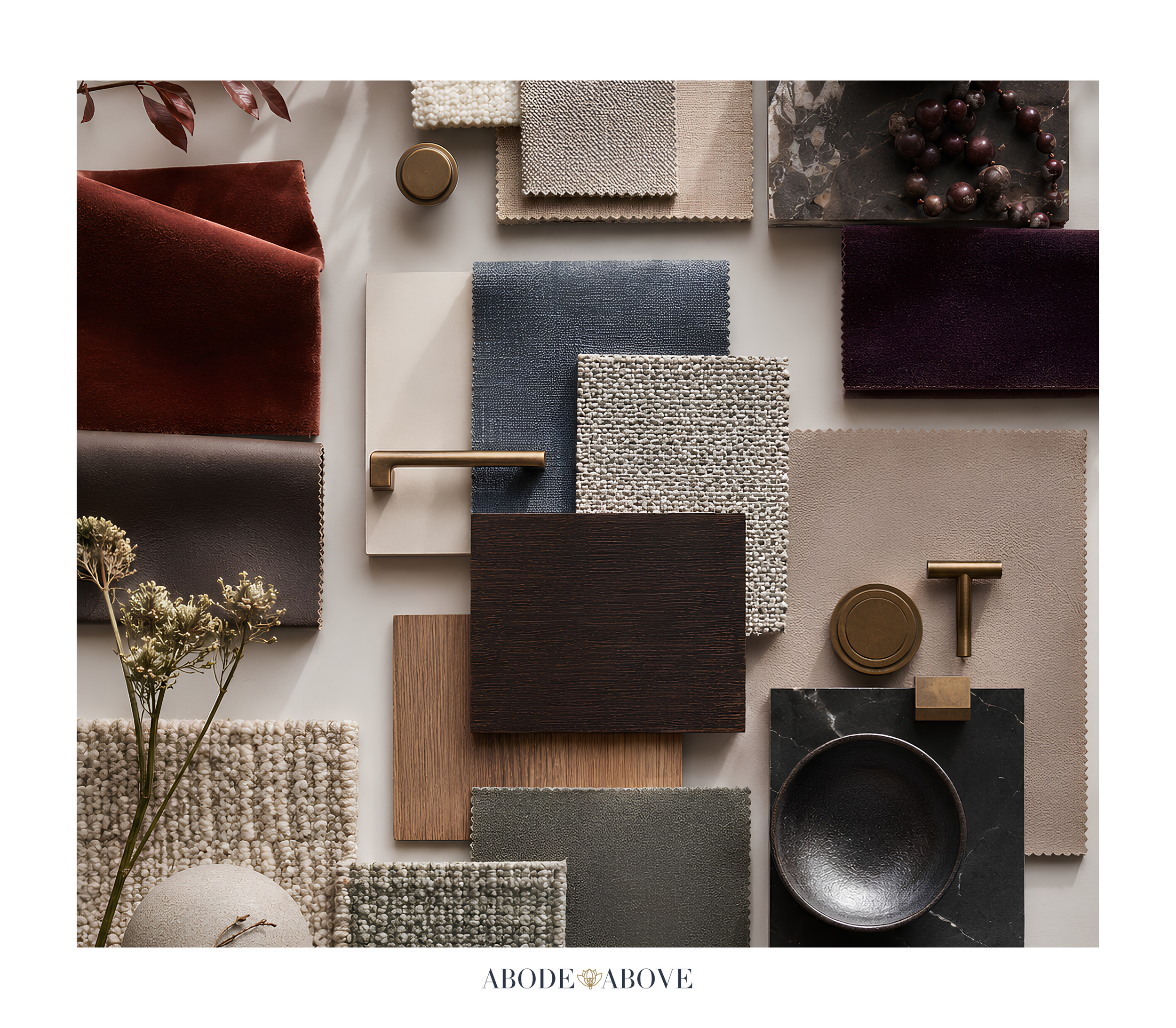
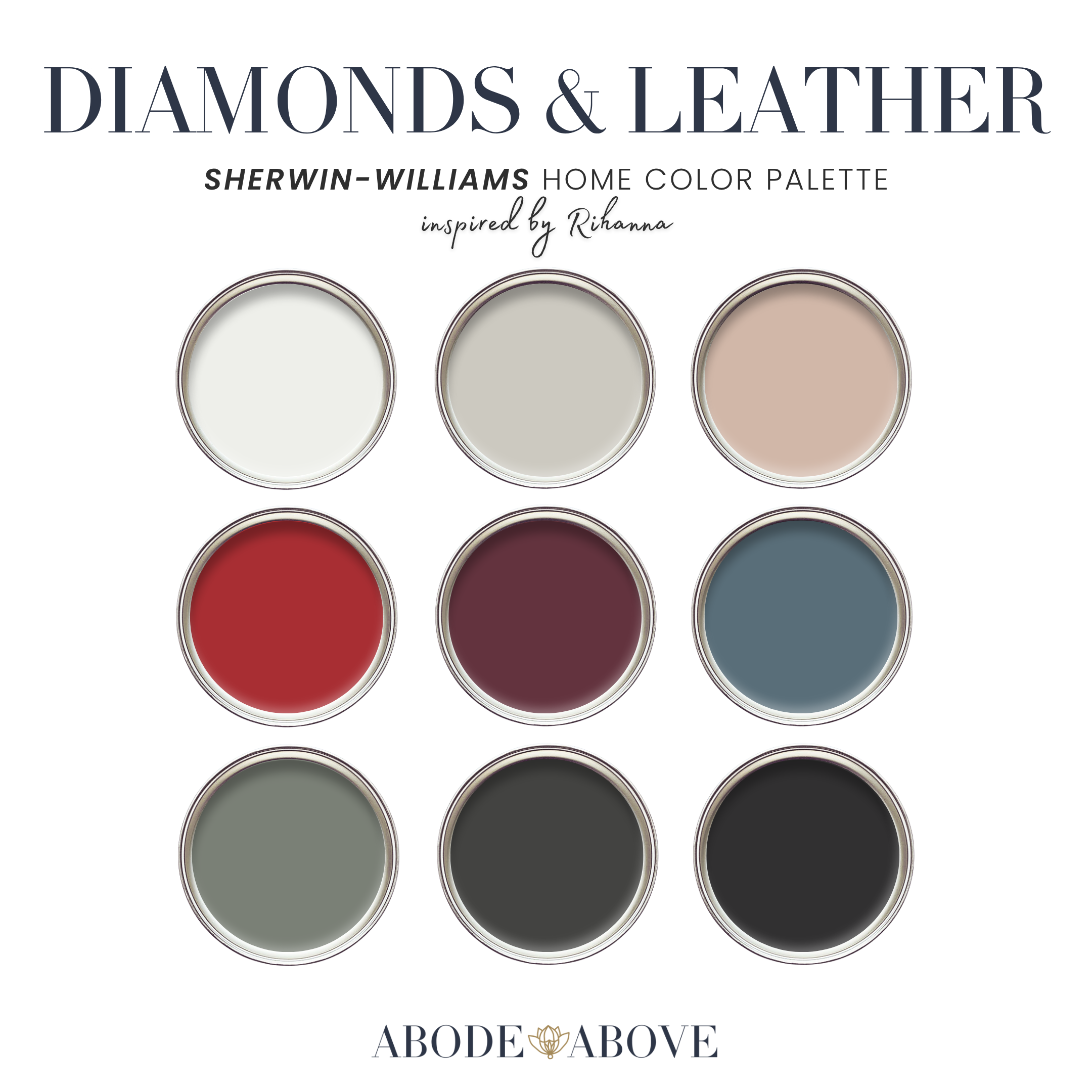
This palette uses the architecture I rely on for every client: two undertone-matched whites, a band of livable mid-tones, deep grounding shades, and a single fearless accent. The whites here run cool and crisp, the kind that read clean and gallery-bright so the darker colors below them never feel heavy. A dependable greige anchors the mids, joined by a warm nude blush that keeps the whole scheme human, plus a muted military olive and a smoky denim blue for character. At the deep end, a soft charcoal and a true leather black provide the grounding. And the statement, held in reserve, is a bold, confident red.
The nude blush is the quiet hero here. In a palette this cool and edgy, that touch of warmth is what keeps a room from feeling cold or severe. It is the softness inside the toughness, which is the whole point.
How to Use Diamonds & Leather in Your Home
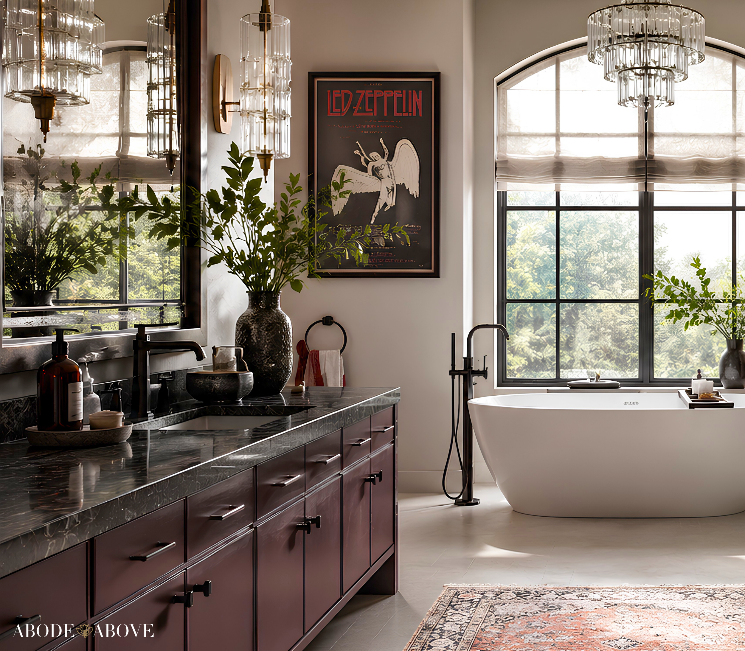
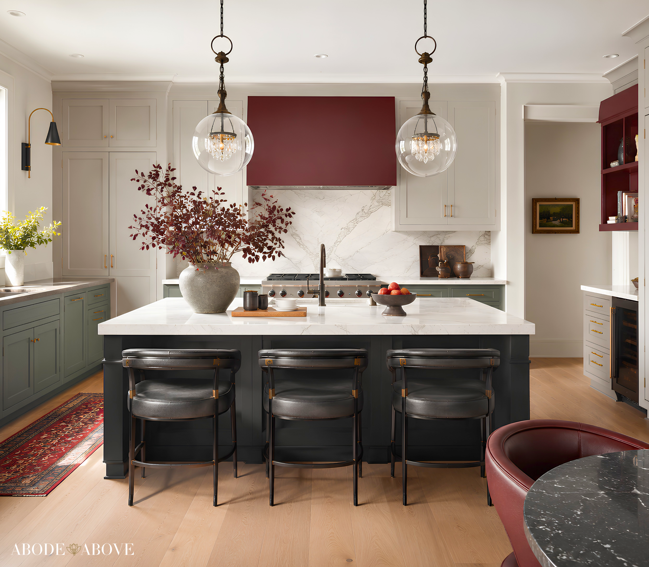
A moody palette needs discipline to keep it from tipping into gloom, so lean on the 60-30-10 ratio: about 60 percent of a room in your main color, 30 percent in a secondary, and the last 10 percent in accents. With this palette, the accents are where the personality lives.
The Living Room
Set your base with the dependable greige on the main walls, which keeps the room grounded and easy while leaving room for drama. Bring in the warm nude blush as a secondary through upholstery, a rug, or drapery, so the space stays inviting. Then let the deeper colors do the talking in your ten percent: a leather-black cabinet, charcoal frames, an olive velvet chair. Reserve the red for one deliberate strike, a single lacquered piece or a bold throw. The result is a living room that feels collected and cool, with just enough edge to feel like yours.
The Home Office
This palette makes a phenomenal office. Take the muted military olive onto the walls for a room that feels focused, moody, and a little luxe, especially paired with leather and dark wood. The crisp white on the trim keeps it sharp, and the charcoal and black show up naturally in the desk, shelving, and hardware. An office in these tones feels serious and creative at once, the kind of room where good work happens.
The Bedroom
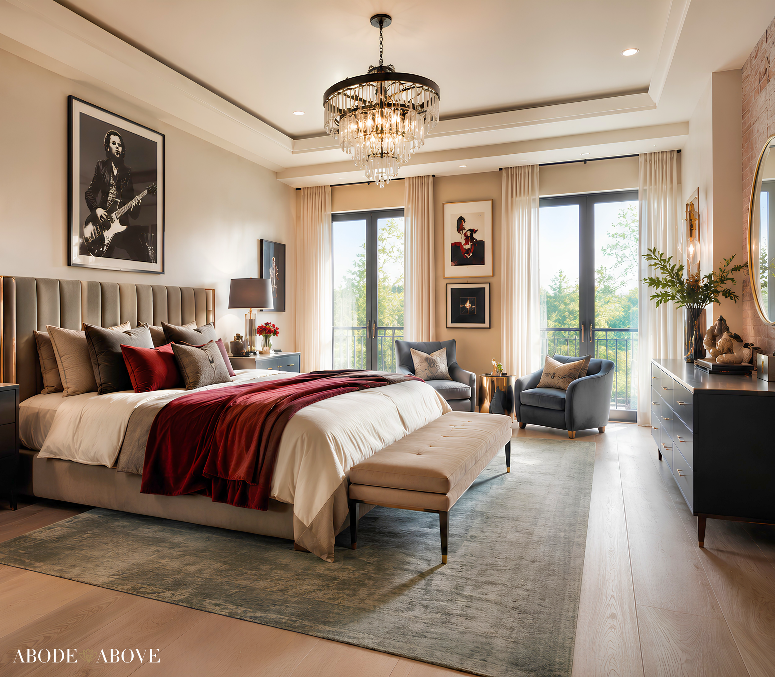
Bring the smoky denim blue forward here as a main wall color. It reads like a broken-in favorite jacket, moody but restful, and it pairs beautifully with the crisp white and the warm nude blush in the bedding. Keep the leather black for small accents so the room stays calm. This is how you get a bedroom that feels grown-up and a little cool without ever feeling cold.
The Powder Room
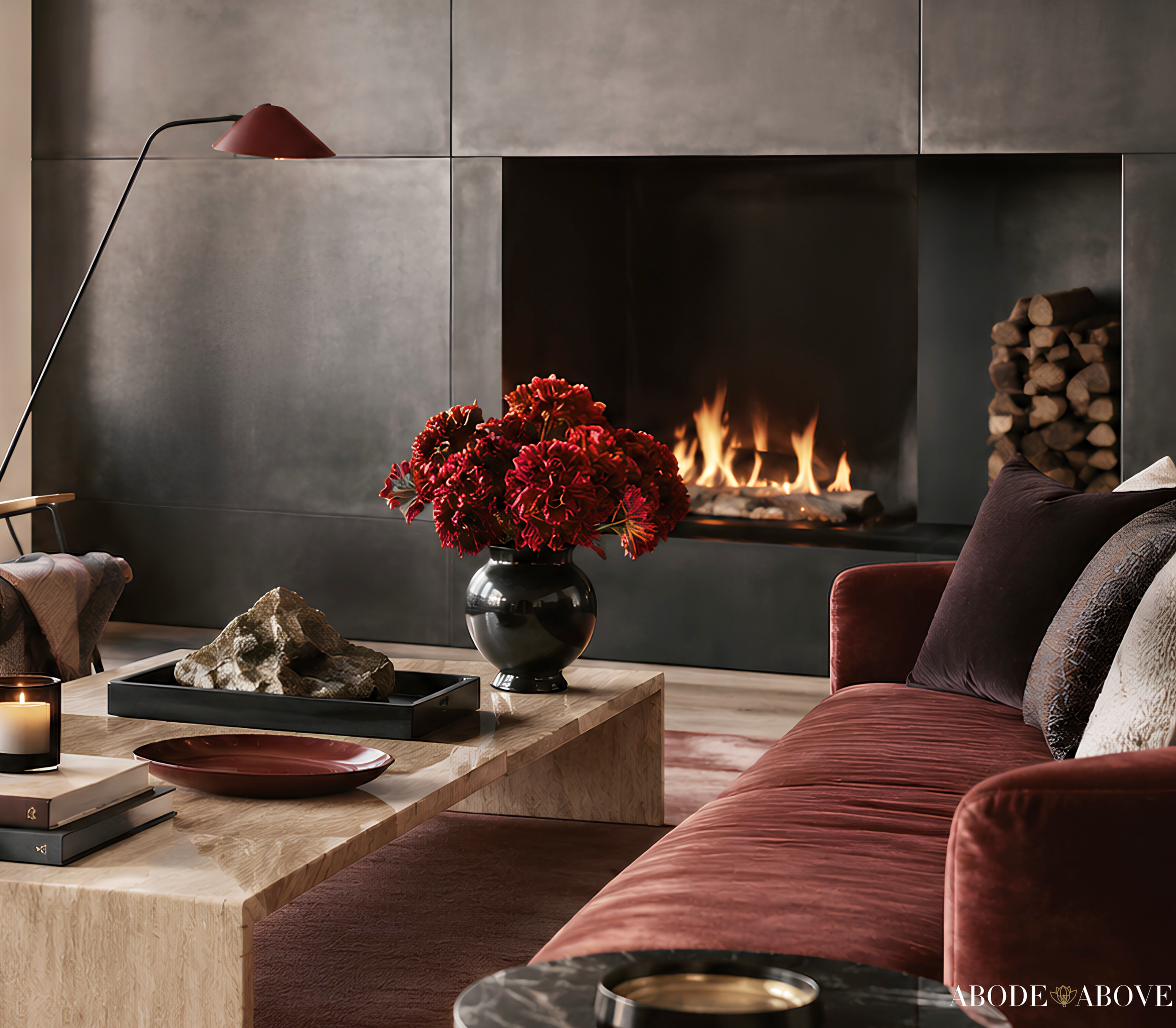
Small rooms are where you should be boldest, and this palette gives you the perfect tool. A powder room in the leather black or charcoal, with the red on a single accent or the vanity, is unforgettable, a genuine jewel box with an edge. Add brass or matte-black fixtures and you have the kind of space guests comment on the moment they walk out.
Making It Work in Your Light
One honest piece of advice before you commit. Deep, moody colors are the most dramatic in the collection, and they behave very differently depending on your light. A charcoal can feel rich and enveloping in a well-lit room and closer to flat black in a dark one, and the olive can shift noticeably between warm and cool. That is exactly why sampling matters most with palettes like this. Order samples, live with them on more than one wall, and study them morning, noon, and night. With deep colors, this step is the difference between a room that feels intentional and one that feels like a cave.
Bring an Icon Home
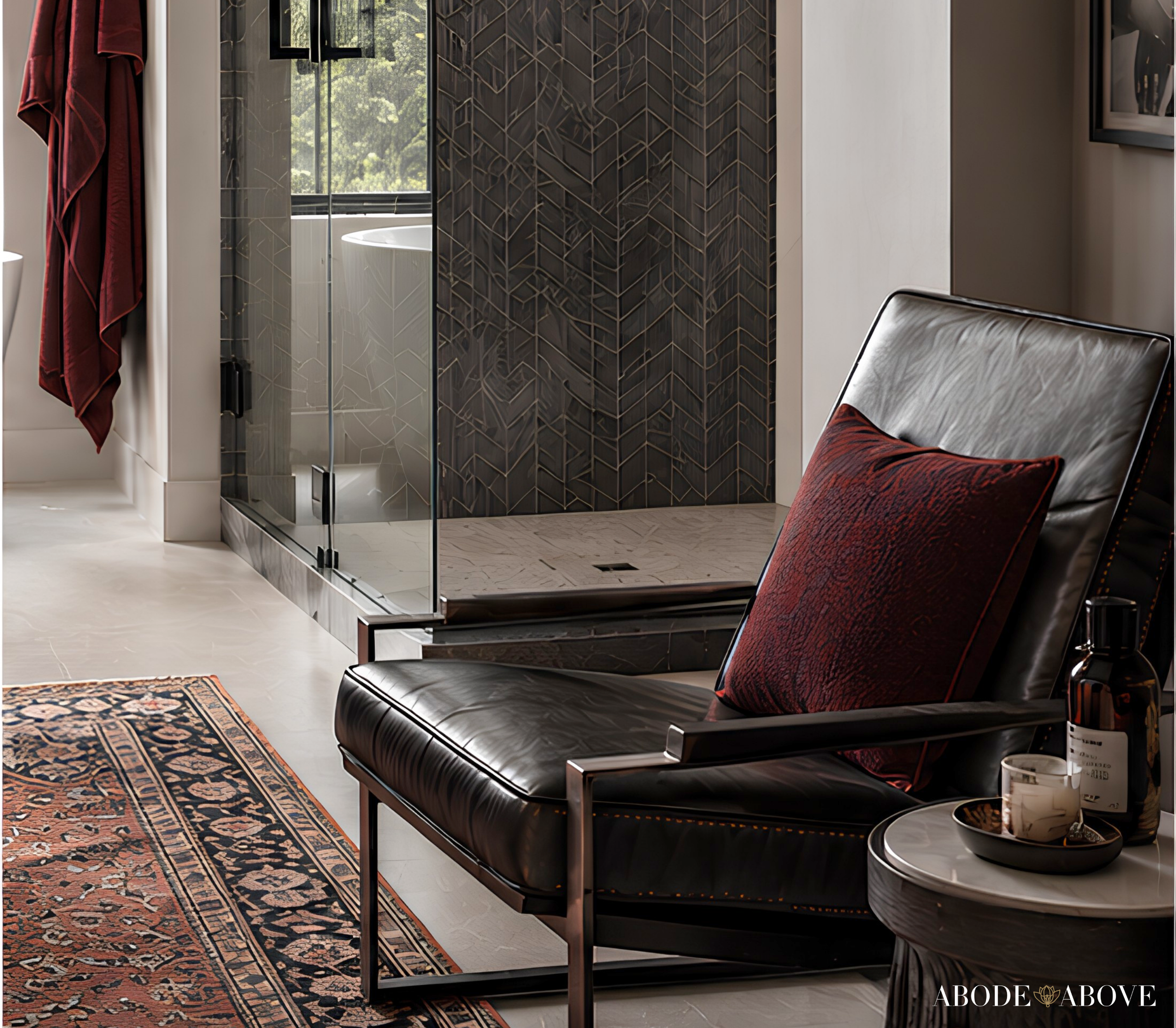
Diamonds & Leather is for the home with an edge: moody, confident, sophisticated, and unafraid of one fearless red. If that is the energy you want, this palette is ready in my Etsy shop, Abode Above Colors. Every download includes all nine exact paint colors and codes, the role each color plays, room-by-room placement guidance, and ready-to-use combinations so you know exactly how much of each shade to use and where.
And if you love this bold, layered approach, Diamonds & Leather belongs to a whole collection of palettes, each inspired by a woman whose style works like a signature. There is a dramatic emerald scheme, a warm and glamorous gold, a serene jade green, and a tailored menswear-inspired neutral if you want your edge a little softer. Come find the one that feels most like you, create something you love, and then send me a photo. I would genuinely love to see it.
You can shop the full Iconic Women Collection at Abode Above Colors on Etsy, and if you are local to the Delaware Valley and want the full-service version of this kind of color confidence, you know where to find me.

Images in this post are AI-generated for illustrative purposes only.