Schoolhouse: A Joyful, Colorful Palette Rooted in Warmth
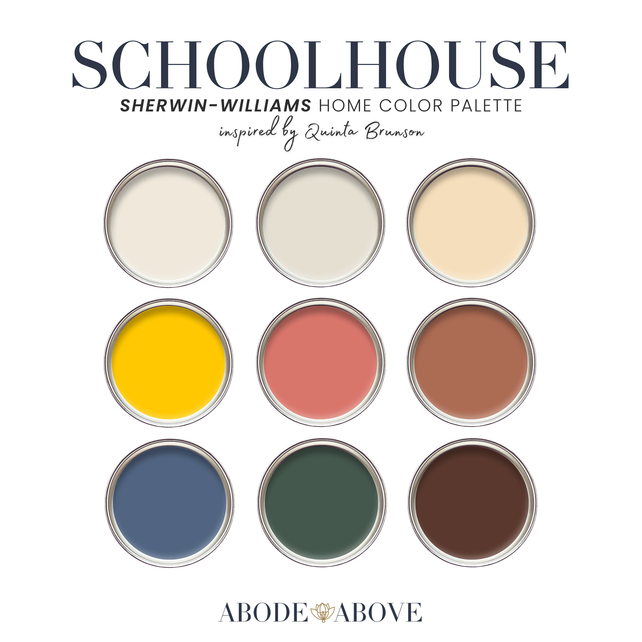
Some homes are meant to make you smile the moment you walk in. Schoolhouse is the palette for those homes: a nine-color Sherwin-Williams scheme built on marigold, chalkboard green, brick terracotta, and broken-in denim, all softened with warm creams. It is dopamine decor with a syllabus, joyful but grounded, and if you have been craving color that feels happy without feeling chaotic, this is the one I made for you.
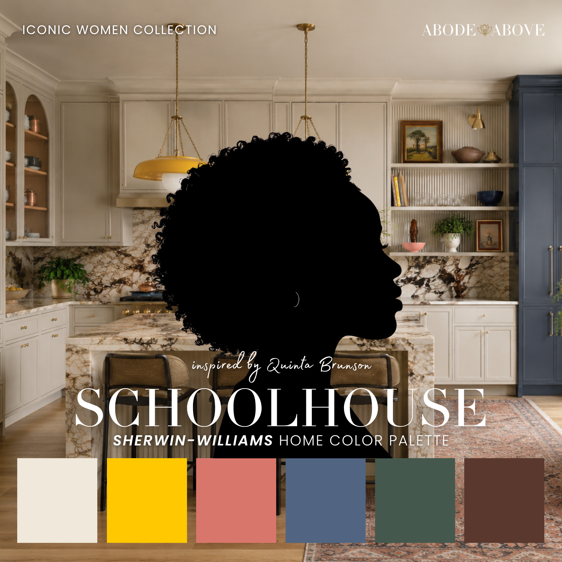
The Woman Behind the Palette
Schoolhouse is inspired by Quinta Brunson, and this one is personal for me.
She took her Philadelphia roots, her deep love of teachers, and her impeccable comedic timing and built a show with more genuine warmth per square inch than almost anything on television. Her whole presence is joy with real substance underneath, the kind of humor that makes you laugh and then quietly moves you. As a designer based right here in the Delaware Valley, the Philly of it all means a great deal to me. The brick rowhomes, the schoolhouse nostalgia, the sense that a place can be both unpretentious and full of heart.
That is exactly the feeling I built into this palette. It would have been easy to make a children's-book rainbow, but Quinta's warmth is more grounded than that. It is optimism that gets things done. So Schoolhouse pairs its joyful brights with real earth tones and cozy neutrals, giving you color that feels alive and cheerful but still like a serious, well-designed home.
The Palette at a Glance
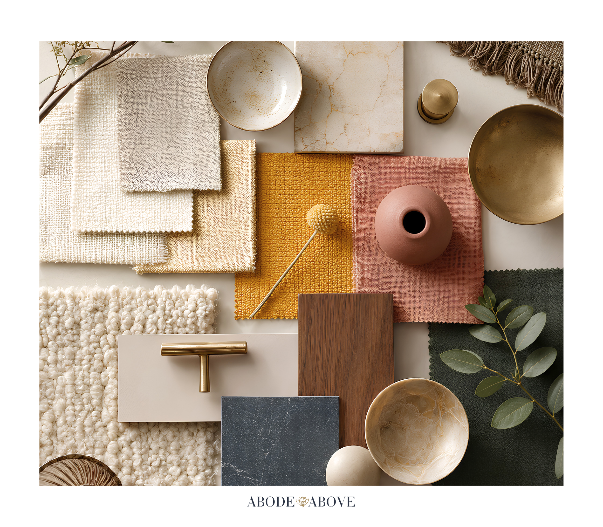
This palette uses my usual architecture, tuned for warmth and joy: two warm vintage whites for a sunny, welcoming foundation, then a spectrum of grounded, happy color. A buttery light yellow eases you in before the full marigold arrives as the star. A playful coral and a deep chalkboard green add personality and depth. A broken-in denim blue steadies the whole thing, a brick terracotta brings that rowhome warmth, and a cozy brown grounds it all.
The trick that makes this palette work is that its brights are anchored in earth. The marigold and coral are joyful, but the terracotta, denim, green, and brown keep the whole scheme rooted and livable. That balance is what separates cheerful from overwhelming.
How to Use Schoolhouse in Your Home
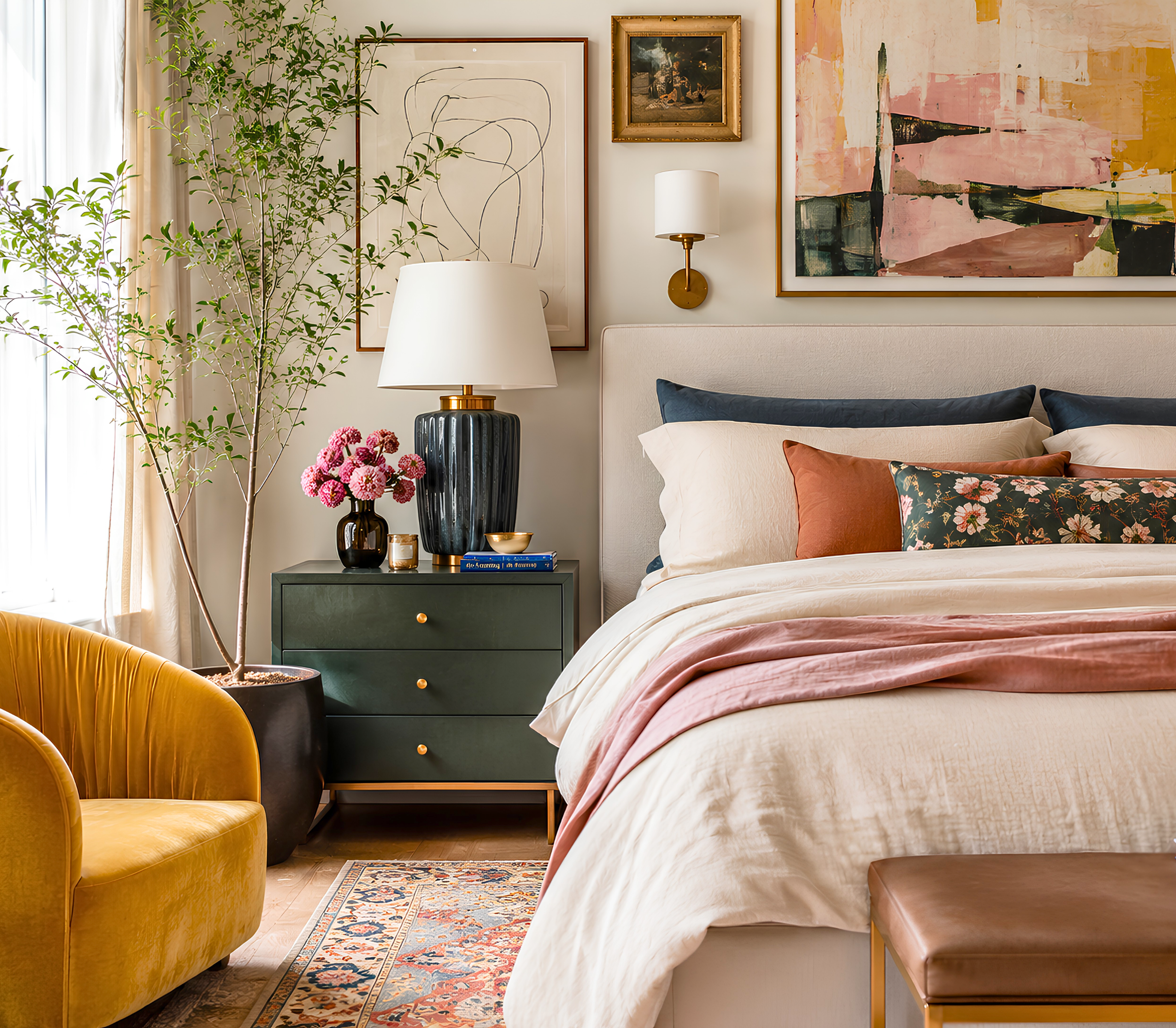
A colorful palette especially needs the discipline of the 60-30-10 ratio: about 60 percent of a room in a calm main color, 30 percent in a secondary, and only the last 10 percent in the boldest pops. That structure is what lets you use joyful color without the room feeling like a playground.
The Kitchen
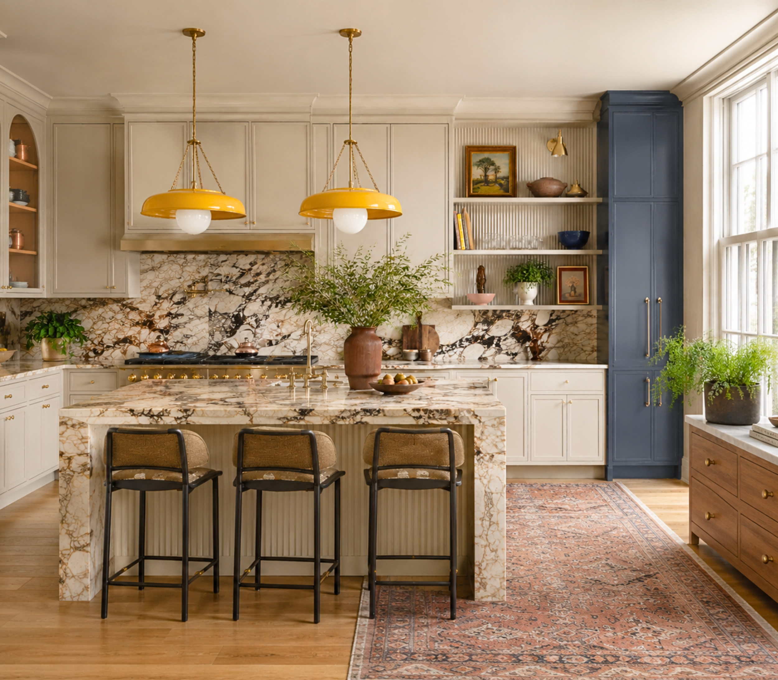
Kitchens are the heart of a home, and they can take a lot of cheer. Start with a warm cream on the main walls to keep things sunny and bright, then bring in the deep chalkboard green as a secondary on an island or lower cabinets for real character. Reserve the marigold for smaller, joyful moments, bar stools, a light fixture, a piece of art, so it punctuates rather than shouts. The brick terracotta and cozy brown show up naturally in wood tones and tile. The result is a kitchen that feels like morning, warm, happy, and genuinely inviting.
The Living Room or Family Room
This is a wonderful room for the terracotta and denim to shine. Use a warm cream as your base, bring in the brick terracotta on an accent wall or through generous upholstery for a rooted, nostalgic warmth, and let the denim blue steady the space in a rug or drapery. Keep the marigold and coral for cheerful accents in pillows, throws, and art. It is a family room that feels lived-in and joyful, the kind of space where people actually want to gather.

The Kids' Room or Playroom
Schoolhouse Sunshine is a natural for children's spaces, but with more grounding than a typical kids' palette. Let the cheerful coral or the buttery yellow lead as a secondary, keep a warm cream as the calm base, and add the green and denim in the furniture and accents. It feels playful and happy without the overstimulation of a primary-color free-for-all, and it will grow with a child far better than a theme.
The Home Office or Study
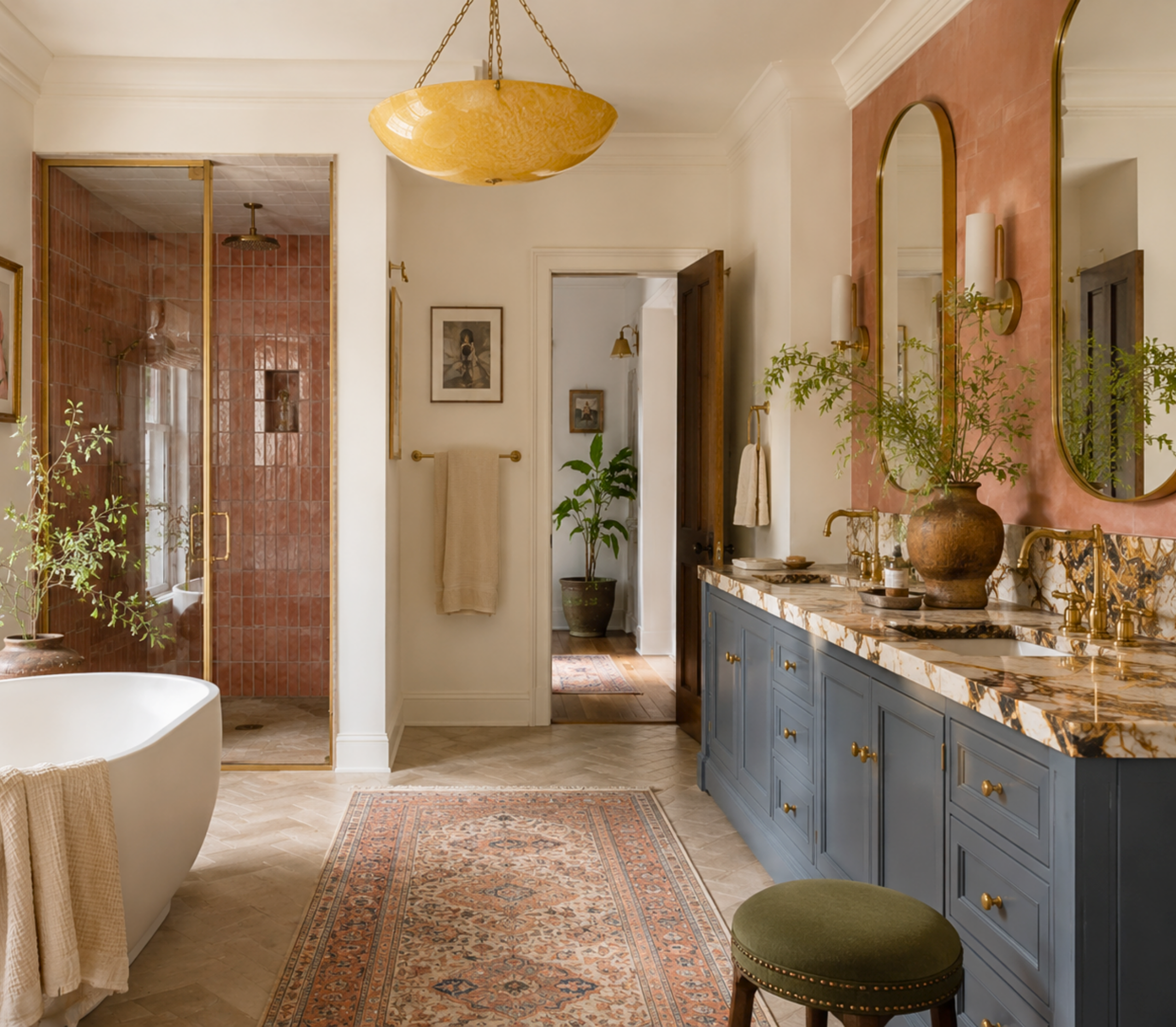
For a room where you need to focus but still want warmth, take the deep chalkboard green onto the walls. It is scholarly, rich, and rooted, exactly the schoolhouse feeling the palette is named for, and it makes a home office feel both serious and comforting. The warm cream on the trim and a few marigold or terracotta accents keep it from feeling heavy.
Making It Work in Your Light
A quick, practical word. Warm and saturated colors like marigold and terracotta can intensify dramatically in strong natural light, so the sunny yellow that looks cheerful on a chip can read almost neon on a big wall in an afternoon-lit kitchen. That is not a reason to be timid, it is a reason to sample. Put the colors on more than one wall and watch them across the day, especially in the room's brightest hours. It is the simplest way to make sure your joyful color stays joyful and does not tip into overwhelming.
Bring an Icon Home
Schoolhouse Sunshine is for the home that wants to feel joyful, warm, and full of personality, without giving up the grounded, designed quality that makes a space truly livable. If that sounds like you, this palette is ready in my Etsy shop, Abode Above Colors. Every download includes all nine exact paint colors and codes, the role each color plays, room-by-room placement guidance, and ready-to-use combinations so you know exactly how much of each shade to use and where.
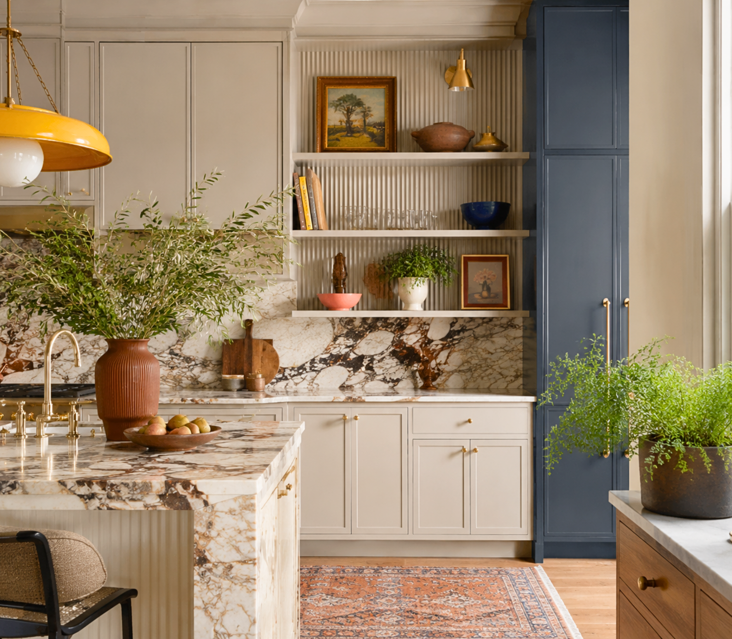
And if you love this joyful, grounded approach, Schoolhouse Sunshine belongs to a whole collection of palettes, each inspired by a woman whose style works like a signature. There is a warm and glamorous gold, an earthy abundant scheme full of sage and terracotta, a bright and family-friendly palette for the little ones, and a soulful one layered with amber and plum. Come find the one that feels most like you, create something that makes you smile, and then send me a photo. I would truly love to see it.
You can shop the full Iconic Women Collection at Abode Above Colors on Etsy, and if you are local to the Delaware Valley and want the full-service version of this kind of color confidence, you know where to find me.

Images in this post are AI-generated for illustrative purposes only.