All the good things Monthly blog Designer Tips, Color Palettes, Design Trends Abode Above Interiors 7/14/26 Designer Tips, Color Palettes, Design Trends Abode Above Interiors 7/14/26 Euphoric: A Quiet-Luxury Palette With Range and One Bold Green Read More Designer Tips, Color Palettes, Design Trends Abode Above Interiors 7/13/26 Designer Tips, Color Palettes, Design Trends Abode Above Interiors 7/13/26 Rhinestones: A Sweet, Bold Palette With Steel Underneath Read More Designer Tips, Color Palettes, Design Trends Abode Above Interiors 7/12/26 Designer Tips, Color Palettes, Design Trends Abode Above Interiors 7/12/26 Becoming: An Elevated, Grounded Palette in Sage, Plum, and Gold Read More Designer Tips, Color Palettes, Design Trends Abode Above Interiors 7/11/26 Designer Tips, Color Palettes, Design Trends Abode Above Interiors 7/11/26 Schoolhouse: A Joyful, Colorful Palette Rooted in Warmth Read More Designer Tips, Color Palettes, Design Trends Abode Above Interiors 7/10/26 Designer Tips, Color Palettes, Design Trends Abode Above Interiors 7/10/26 Cerulean: A Sophisticated Blue Palette With a Point of View Read More Designer Tips, Color Palettes, Design Trends Abode Above Interiors 7/9/26 Designer Tips, Color Palettes, Design Trends Abode Above Interiors 7/9/26 Diamonds & Leather: A Moody, Edgy Palette With One Fearless Red Read More Older Posts Feeling inspired? Get started
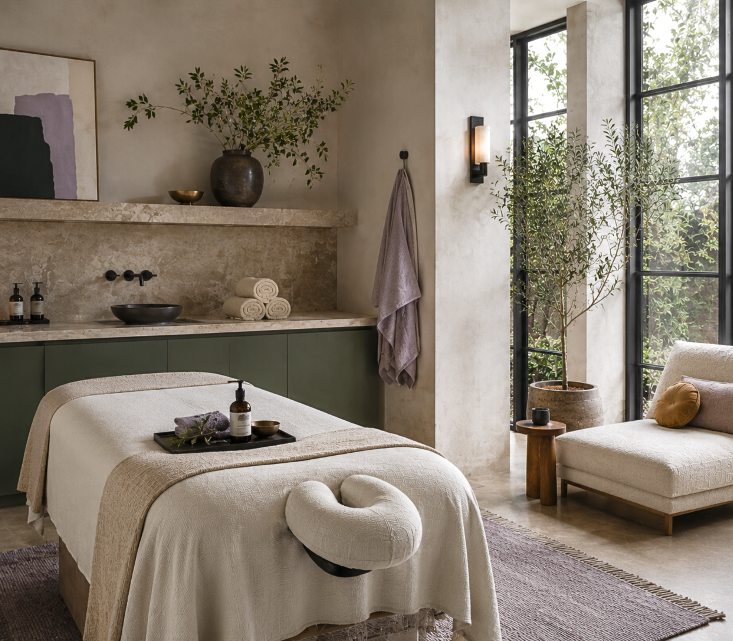
Designer Tips, Color Palettes, Design Trends Abode Above Interiors 7/14/26 Designer Tips, Color Palettes, Design Trends Abode Above Interiors 7/14/26 Euphoric: A Quiet-Luxury Palette With Range and One Bold Green Read More
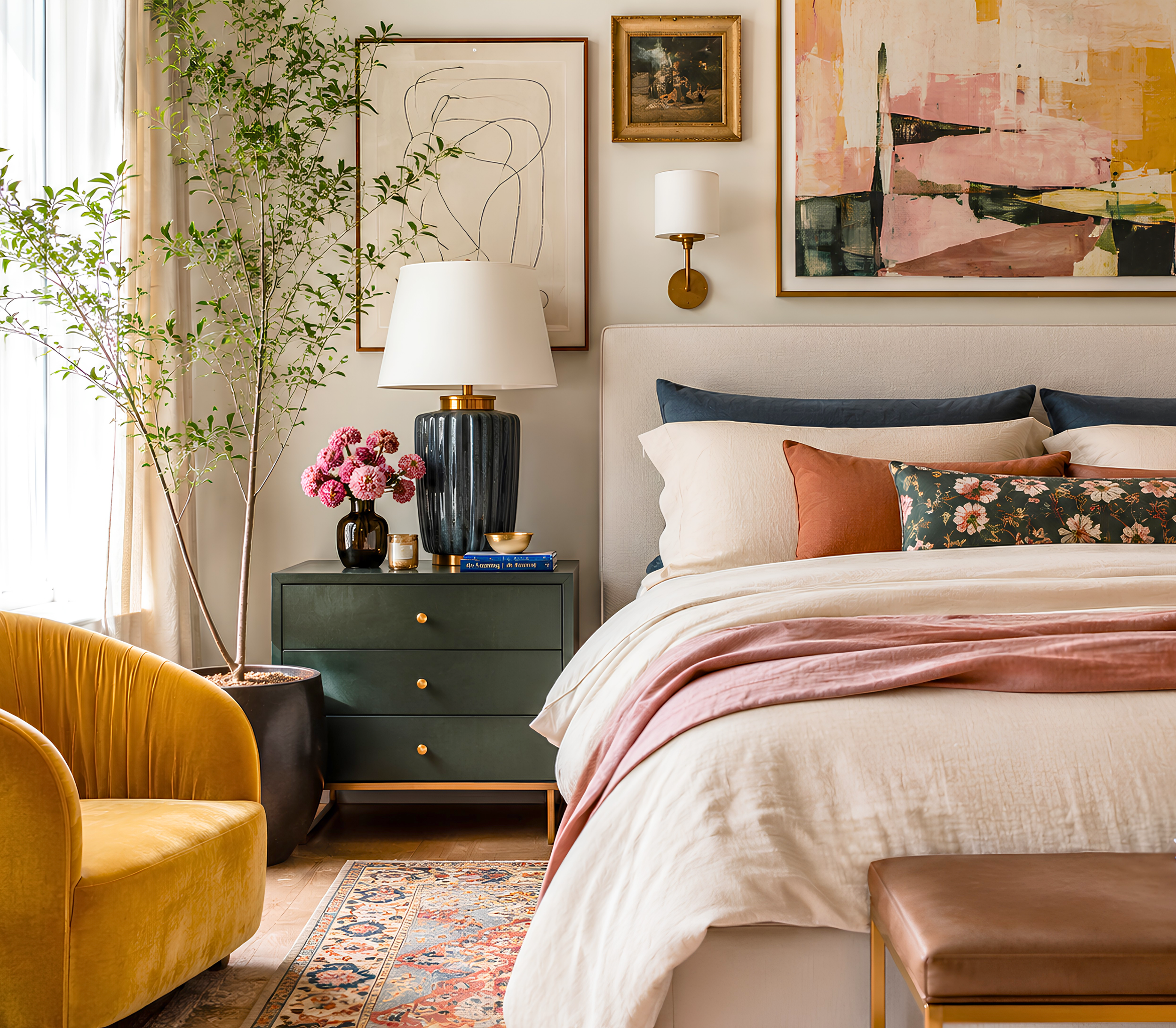
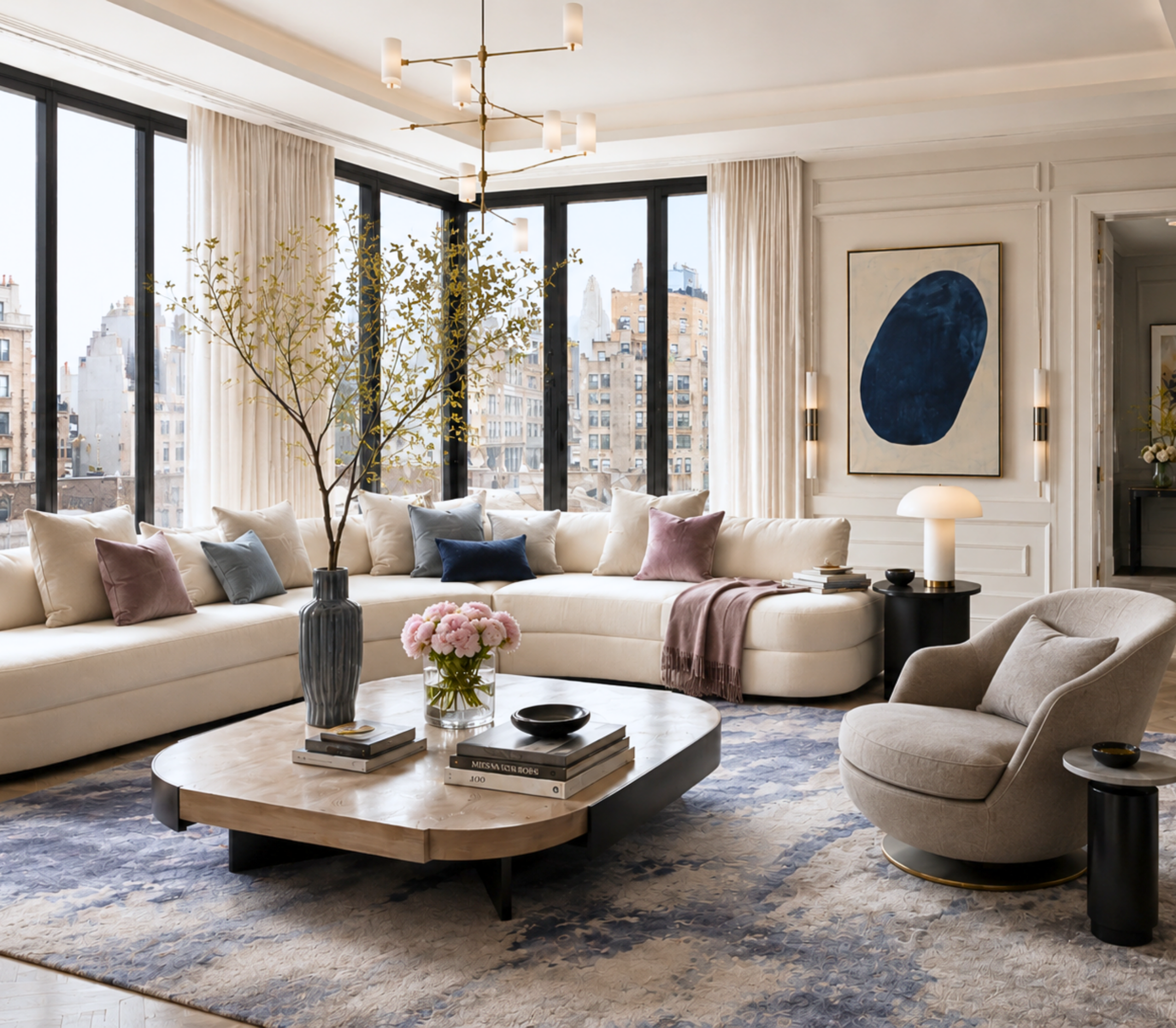
Designer Tips, Color Palettes, Design Trends Abode Above Interiors 7/13/26 Designer Tips, Color Palettes, Design Trends Abode Above Interiors 7/13/26 Rhinestones: A Sweet, Bold Palette With Steel Underneath Read More
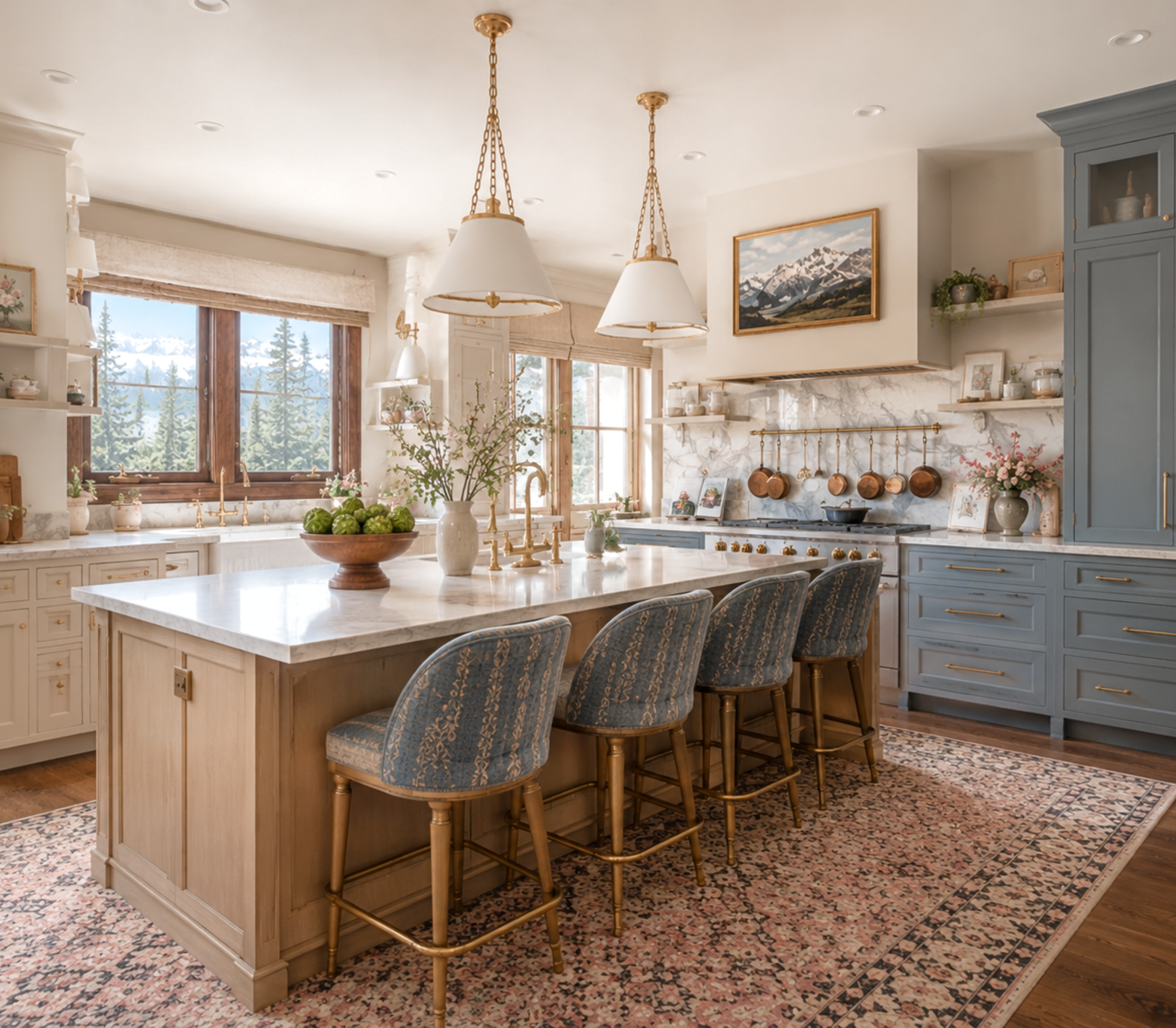
Designer Tips, Color Palettes, Design Trends Abode Above Interiors 7/12/26 Designer Tips, Color Palettes, Design Trends Abode Above Interiors 7/12/26 Becoming: An Elevated, Grounded Palette in Sage, Plum, and Gold Read More
Designer Tips, Color Palettes, Design Trends Abode Above Interiors 7/11/26 Designer Tips, Color Palettes, Design Trends Abode Above Interiors 7/11/26 Schoolhouse: A Joyful, Colorful Palette Rooted in Warmth Read More
Designer Tips, Color Palettes, Design Trends Abode Above Interiors 7/10/26 Designer Tips, Color Palettes, Design Trends Abode Above Interiors 7/10/26 Cerulean: A Sophisticated Blue Palette With a Point of View Read More
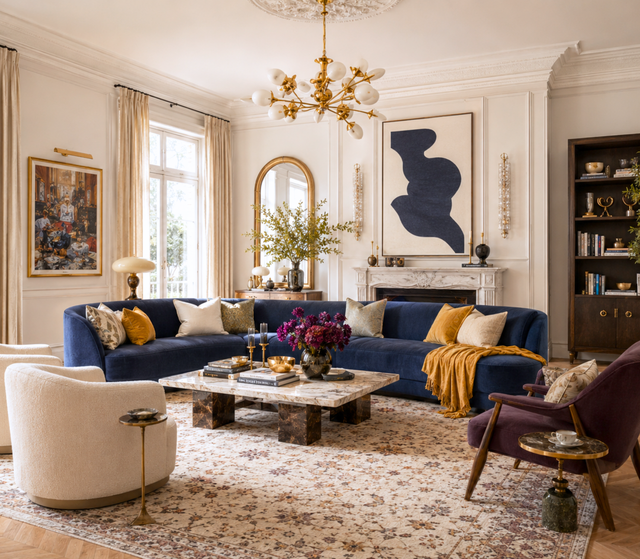
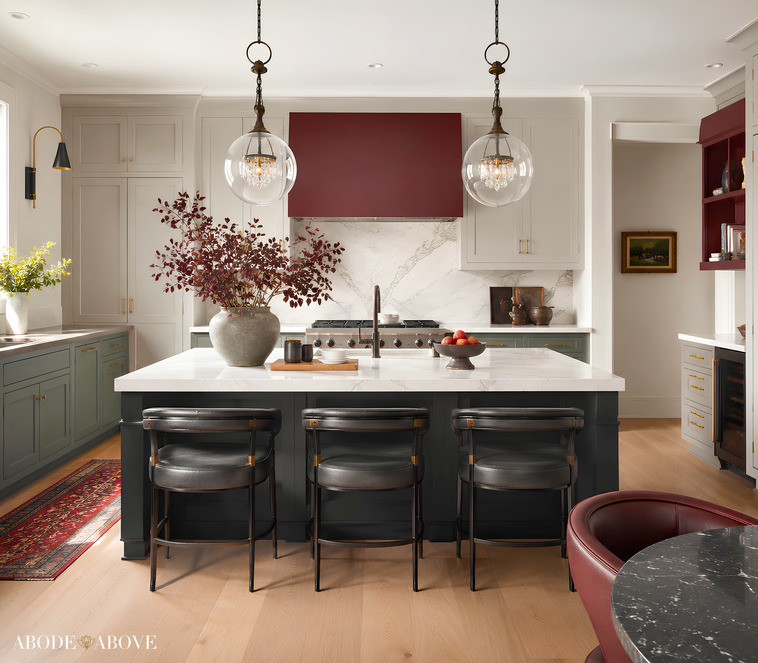
Designer Tips, Color Palettes, Design Trends Abode Above Interiors 7/9/26 Designer Tips, Color Palettes, Design Trends Abode Above Interiors 7/9/26 Diamonds & Leather: A Moody, Edgy Palette With One Fearless Red Read More