Annie Hall: A Tailored, Menswear-Inspired Neutral Palette
Some palettes are about color. This one is about cut. Annie Hall is a nine-color Sherwin-Williams scheme built on the idea that a great room, like a great outfit, is really about tailoring: crisp whites, warm camel, charcoal like good suiting, and one soft chalky blue to keep it all breathing. If your taste runs classic, structured, and a little androgynous, this is the palette I made with you in mind.
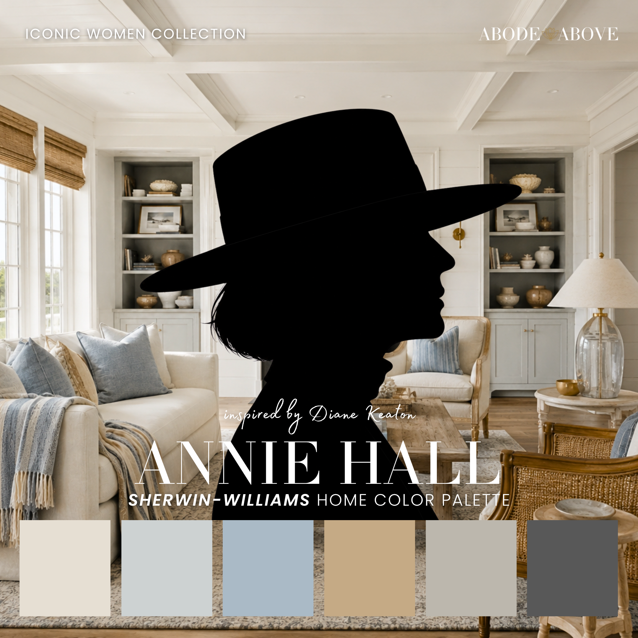
The Woman Behind the Palette
Annie Hall is inspired by Diane Keaton, who has spent fifty years making the same quietly radical argument: borrow from the menswear rack, add total conviction, and you will never once be out of style.
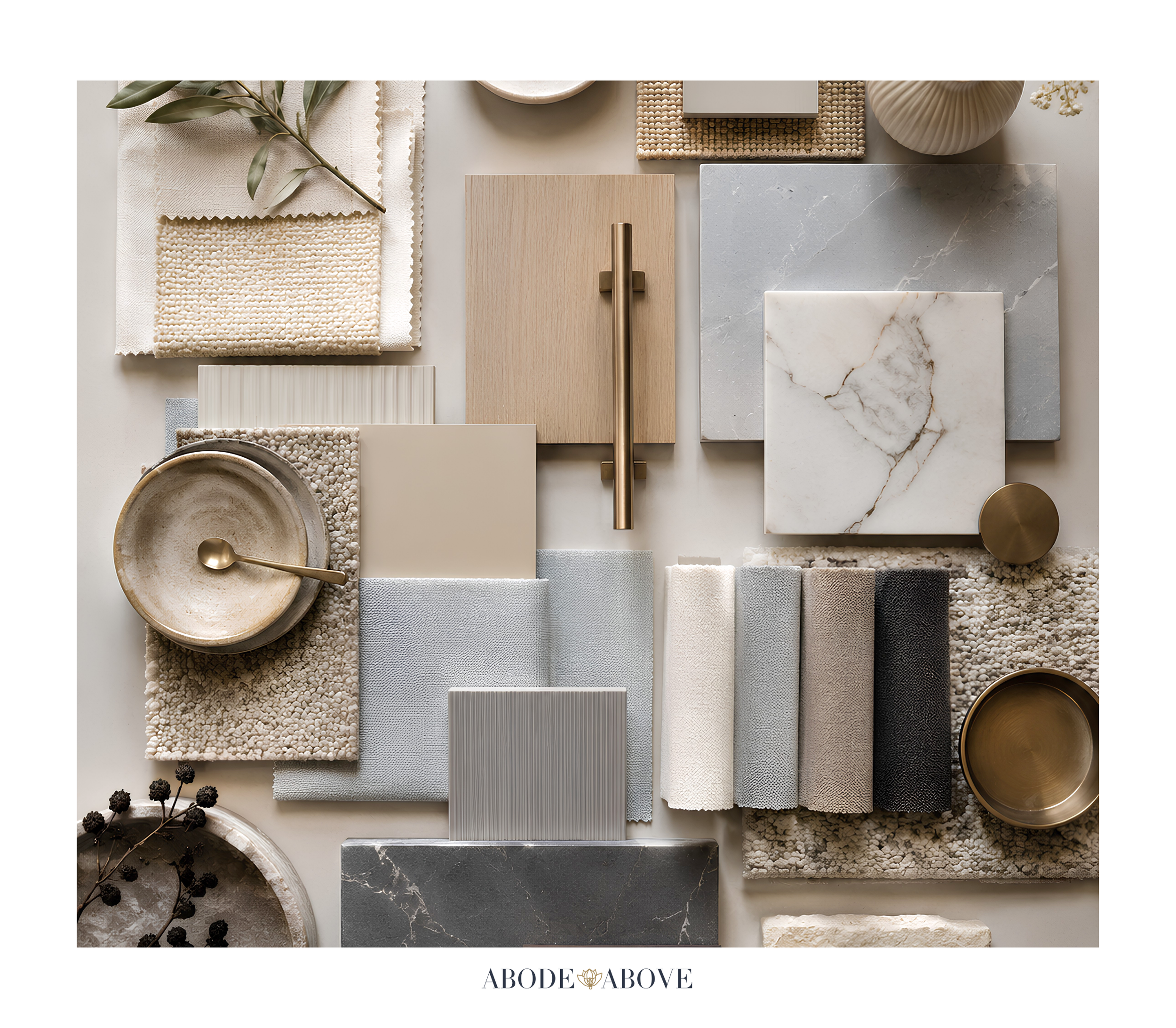
The wide-brim hats, the crisp white shirts buttoned to the top, the oversized blazers, the head-to-toe black and white. She took tailoring, which can read cold and corporate, and made it feel deeply personal. She never chased a trend and she never apologized for having a uniform, which is exactly why she has never looked dated. That is the dream for a home, isn't it? Not the room that is fashionable this year, but the room that will still look intentional and elegant in twenty. Diane Keaton's whole aesthetic is a masterclass in the idea that confidence is more timeless than trendiness, and this palette is built on that same principle.
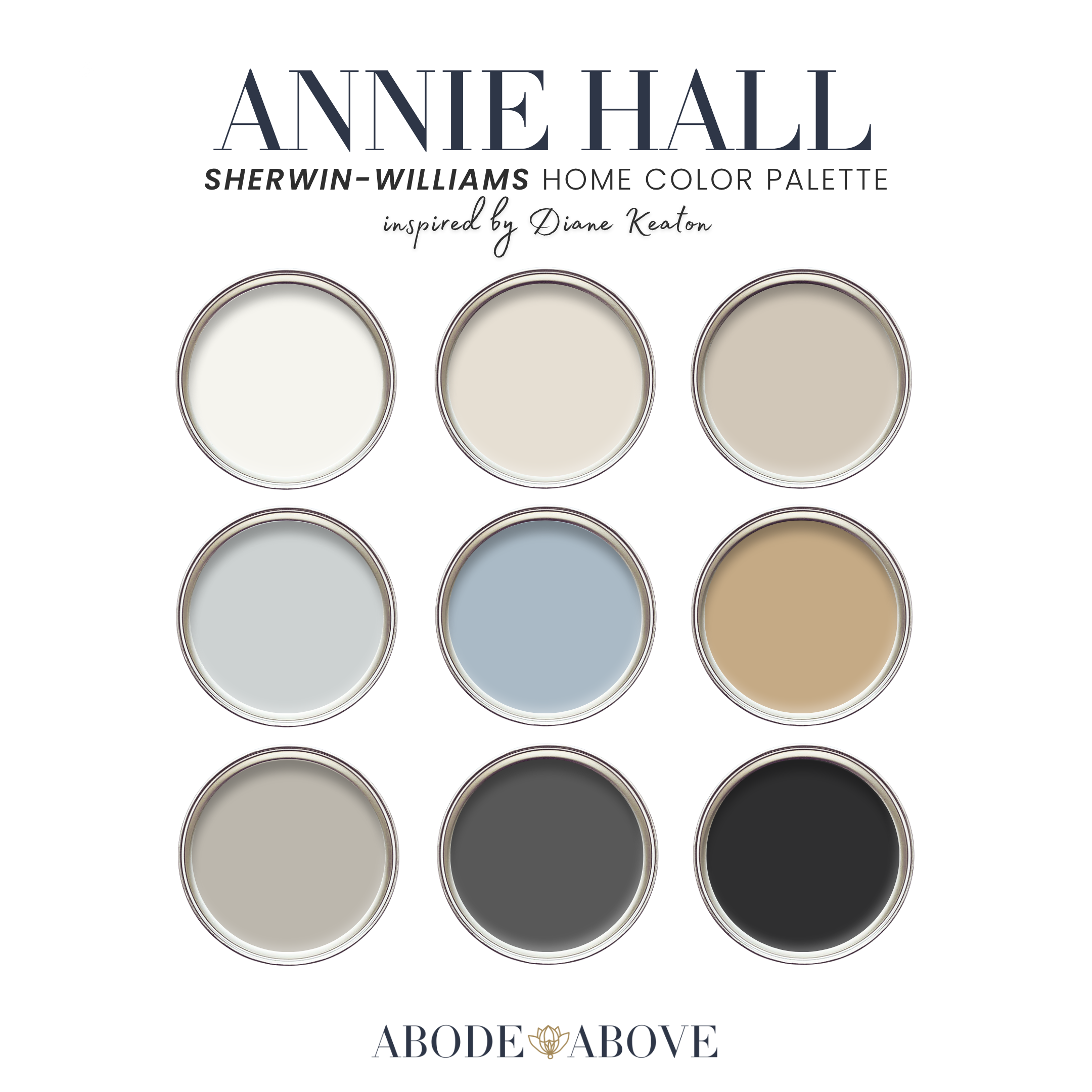
The Palette at a Glance
Annie Hall follows the structure I use for every client palette: two carefully chosen whites, a set of livable mid-tones, deep grounding shades, and a single accent that keeps the whole thing from feeling severe. The whites here do a lot of work. One is the crispest white in the collection, the equivalent of a freshly pressed button-down, meant for trim and ceilings. The other is a soft warm white that keeps rooms from feeling clinical. In the middle sit a khaki-toned beige, a true camel, and a warm herringbone gray. At the deep end, a charcoal suiting gray and a true black provide the tailoring. And running through it all, one soft chalky blue, the oxford shirt of the palette, keeps everything human.
This is a palette of neutrals, but do not mistake neutral for boring. The whole point is contrast and texture: the sharpness of black against white, the warmth of camel against gray, the softness of that one blue against all that structure. Done right, an all-neutral room is the most sophisticated room in the house.
How to Use Annie Hall in Your Home
Neutral palettes live or die by proportion and restraint, so the classic 60-30-10 ratio is your best friend here. About 60 percent of each room goes to a main color, 30 percent to a secondary, and the last 10 percent to your accents. With a scheme this tailored, that discipline is what separates elegant from flat.
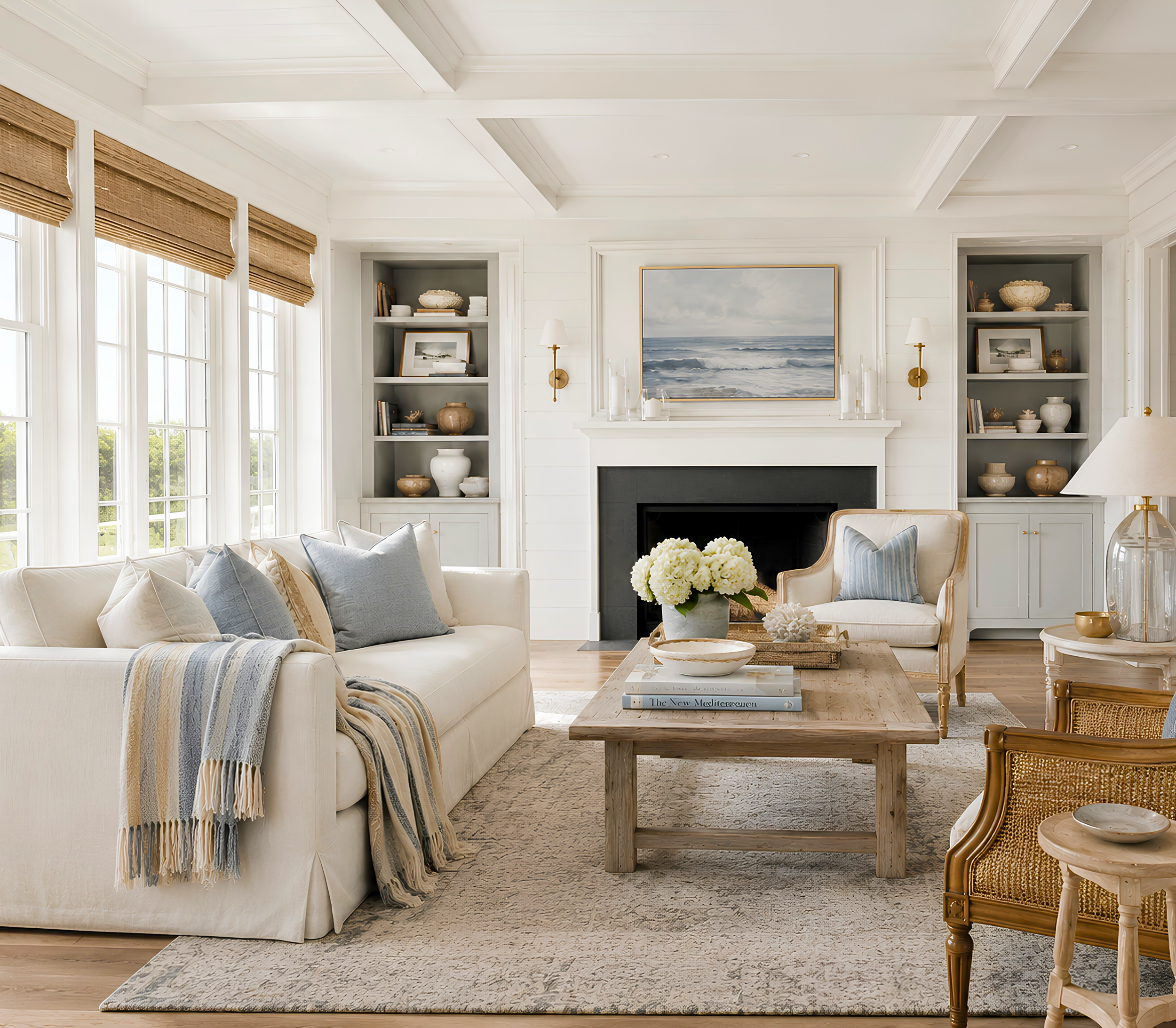
The Living Room
Run the soft warm white on your main walls to keep the space inviting, and reserve the crispest white for all your trim and moldings, which is where this palette's tailored quality really shows. Bring in the khaki beige as a grounding secondary through a large rug or upholstery, then layer the camel in generously: a leather chair, a throw, a pair of ottomans. Camel is the camel coat of the room, and it makes everything around it feel richer. Use the charcoal and black in small, sharp doses on frames, lamp bases, and hardware. The result is a living room that feels collected and quietly luxurious, never stark.
The Home Office or Study
This palette was practically made for a study. Take the charcoal suiting gray onto the walls or a wall of built-in shelves for a room that feels focused and serious without being gloomy. Balance it with the warm white on the trim and plenty of camel and natural wood in the furniture. A study in these tones feels like the inside of a beautifully made blazer, structured, warm, and completely timeless. Add the black on the window frames or a library ladder for that final tailored edge.
The Bedroom
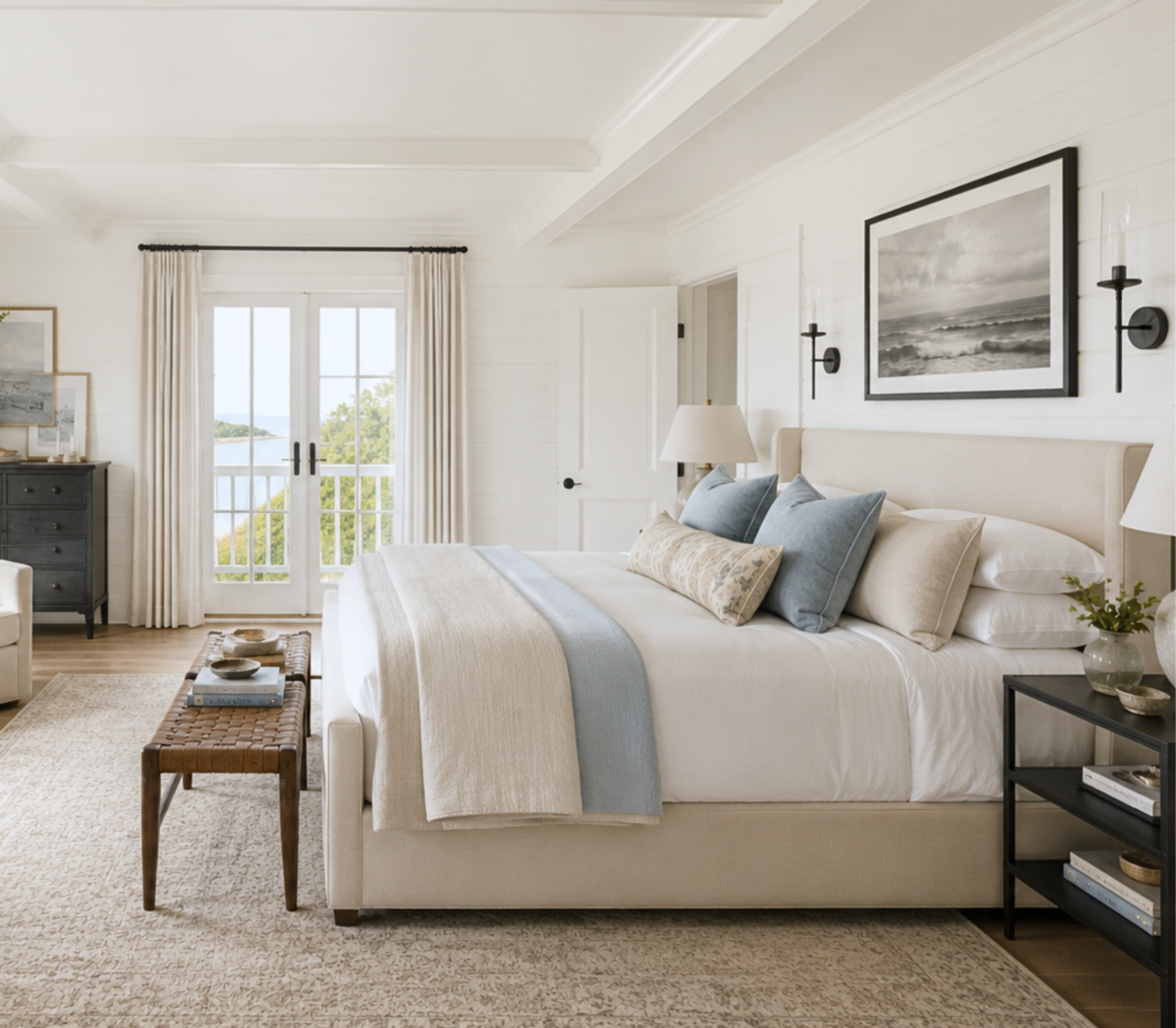
Bring the soft blue forward here. As a main wall color it reads like a chambray shirt, calm and easy to wake up in, and it pairs beautifully with the warm white and a healthy dose of camel in the bedding and headboard. Keep the charcoal for accents, a bench at the foot of the bed, the lampshades, a picture frame or two, so the room stays restful. This is how you get a bedroom that feels tailored but never cold.
The Entryway
An entry is a small space that sets the tone for the whole home, which makes it a perfect spot for a confident move. Consider the charcoal or even the true black on the entry walls or the interior of the front door, with crisp white trim outlining it. It reads like a sharp black-and-white photograph the moment someone steps inside, and it makes every warmer room beyond it feel like a pleasant surprise.
Making It Work in Your Light
A quick but important word of advice. Neutrals are the trickiest colors to get right, because they shift more than any other family depending on your light. A camel can go orange in a warm western room, and a gray can turn cold and blue in a north-facing one. This is not a reason to be nervous, it is a reason to sample. Order peel-and-stick samples or sample pots, put them on multiple walls, and study them morning, noon, and night before committing. With neutrals especially, the ten dollars you spend sampling will save you from the single most common and most frustrating paint mistake there is.
Bring an Icon Home
Annie Hall is for the home that values timelessness over trend, structure over noise, and quiet confidence over anything flashy. If that is the home you are trying to build, this palette is ready for you in my Etsy shop, Abode Above Colors. Every download includes all nine exact paint colors and codes, the specific role each one plays, room-by-room guidance, and ready-to-use combinations so you know exactly how much of each color to use and where.
And if you love the tailored feeling but want to explore, Annie Hall is part of a whole collection of palettes, each inspired by a woman whose personal style works like a signature. There is a warm, glamorous gold palette, a moody jewel-tone one, a soulful, layered scheme full of amber and plum, and a quiet-luxury neutral if you want something even softer than this. Come find the one that feels most like you, paint something you are proud of, and then share a photo with me. I would love to see it.
You can shop the full Iconic Women Collection at Abode Above Colors on Etsy, and if you are in the Delaware Valley and want the full-service version of this kind of color confidence, you know where to find me.

Images in this post are AI-generated for illustrative purposes only.