Golden Hour: A Warm, Glamorous Paint Palette Inspired by an Icon
There are homes that whisper and homes that make an entrance. If you have always wanted yours to be the second kind, this is the palette I built for you. Golden Hour is nine Sherwin-Williams colors arranged around warmth, glamour, and one unforgettable pop of red, and it is the first palette in my Iconic Women Collection for a reason. It is my favorite. Let me tell you why, and then let me show you exactly how to use it in a real home.
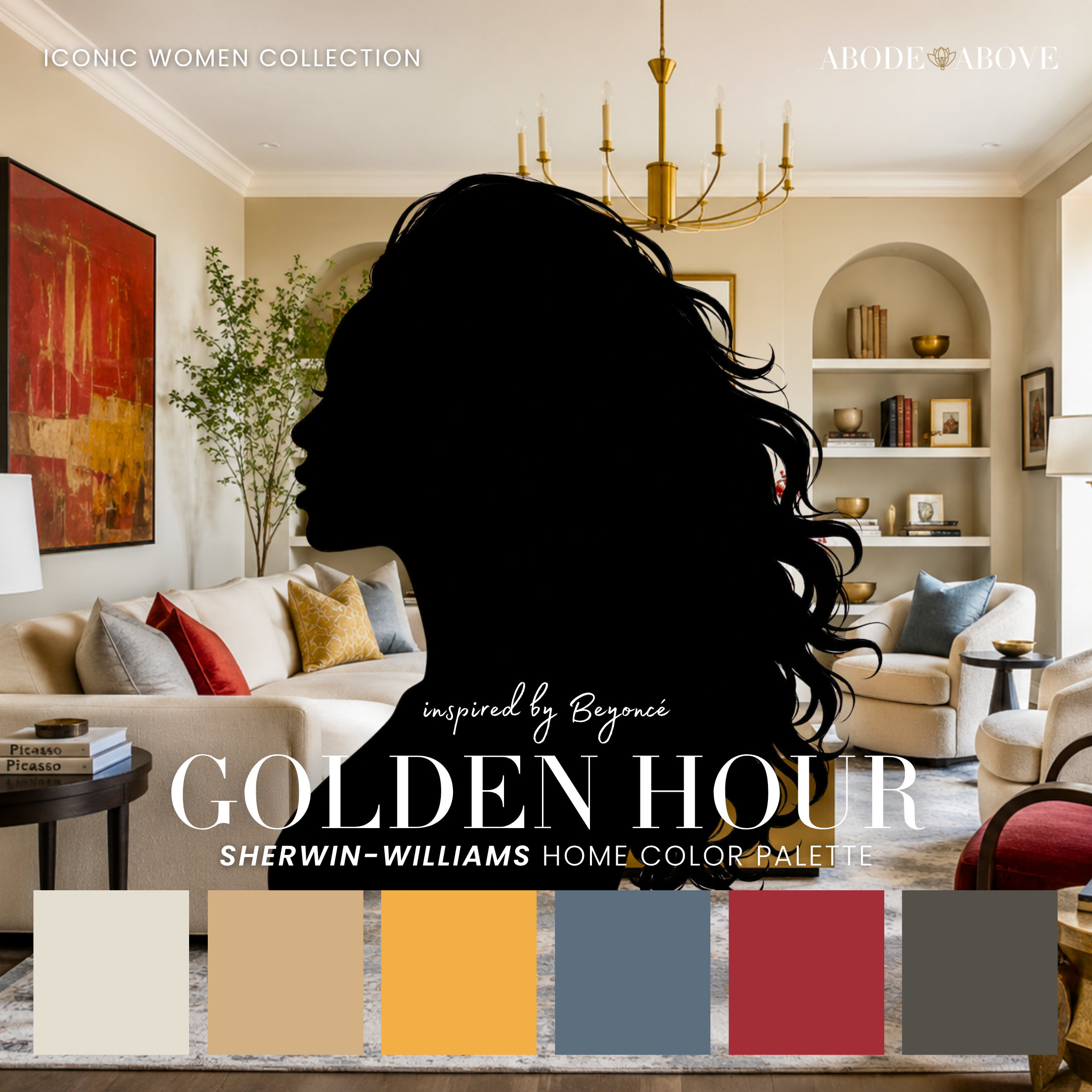
The Woman Behind the Palette
Golden Hour is inspired by Beyoncé, and honestly, no one else could have anchored this collection.
For more than two decades she has been the blueprint for reinvention done right. She has moved through eras the way a great designer moves through a home, with intention in every room. The golden glow has always been hers, but think about the range around it: the chrome and silver of the Renaissance era, the denim and Americana of Cowboy Carter, the deep reds, the dramatic blacks of a stage gone dark. Each era is completely distinct, and each one is unmistakably her.
That is the lesson I kept coming back to while I built this palette. A signature is not one note played over and over. It is a point of view strong enough to hold many notes together. She has never been afraid to try something new, and she has never once lost herself doing it. That combination of range and consistency is the rarest thing in style, whether we are talking about a stage or a living room. That is what I want for your home, and it is exactly what Golden Hour is designed to give you.
The Palette at a Glance
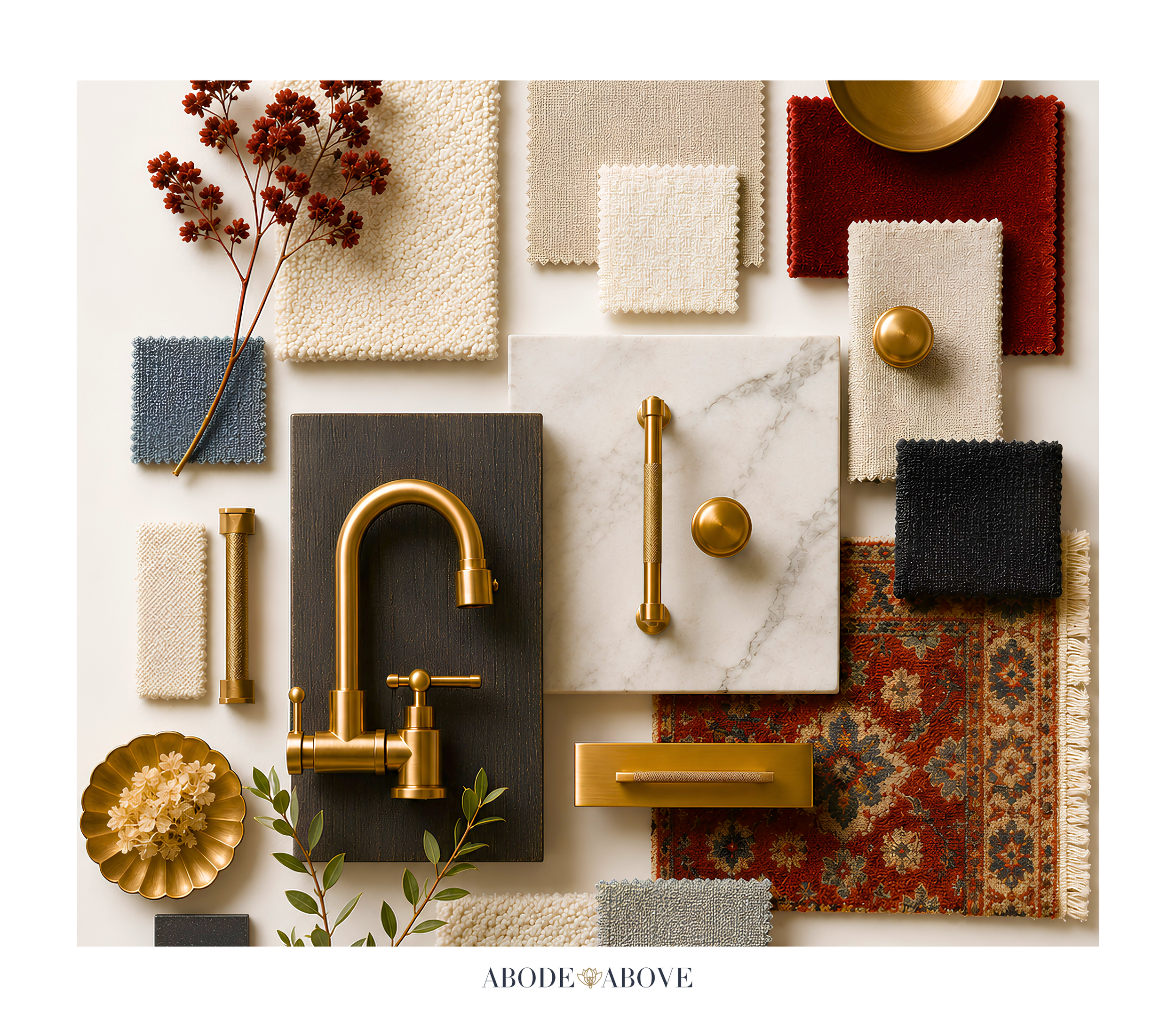
Golden Hour is built the way I build every palette for my clients: two whites chosen specifically for their undertones, a band of livable mid-tones, deep grounding shades for weight, and statement colors that earn their moment. Here, the whites are warm and clean so the golds can glow without going muddy. Two golds, a quiet honeyed one and a brighter statement, carry the theme. Then the palette opens up: a sleek silver gray, a worn denim blue, one confident red, a smoky bronze, and a dramatic near-black.
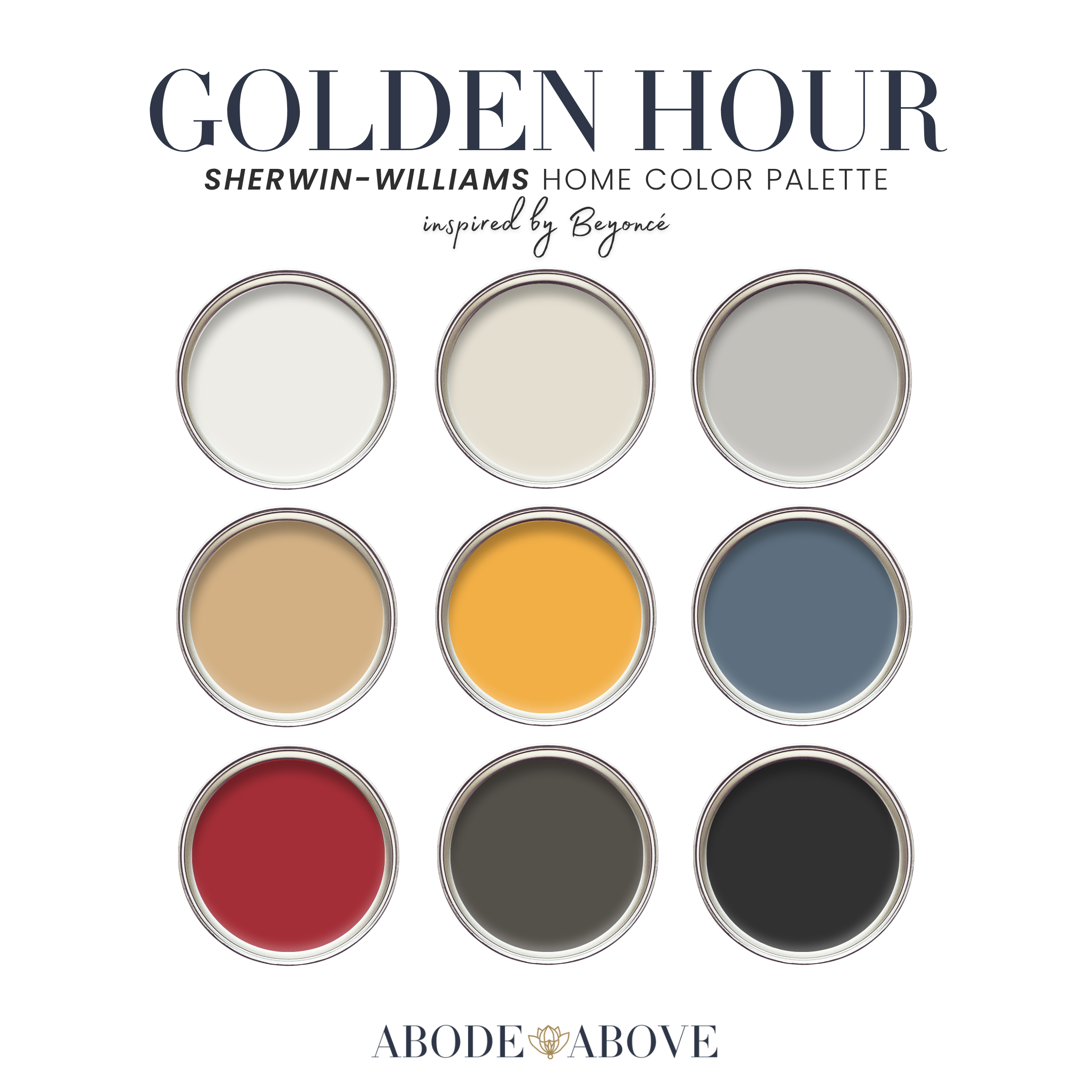
The magic is in the restraint. When I first designed this palette, it was all gold, top to bottom. It was pretty. It was also only one era of her. The moment I pulled it back to two golds and let the silver, denim, red, and bronze breathe, it went from a nice palette to a complete one. That is the whole philosophy of good color work in a single story: boldness lands hardest when it is surrounded by things that know when to be quiet. A room does not become sophisticated by adding more. It becomes sophisticated when every color has a job and does it well.
How to Use Golden Hour in Your Home
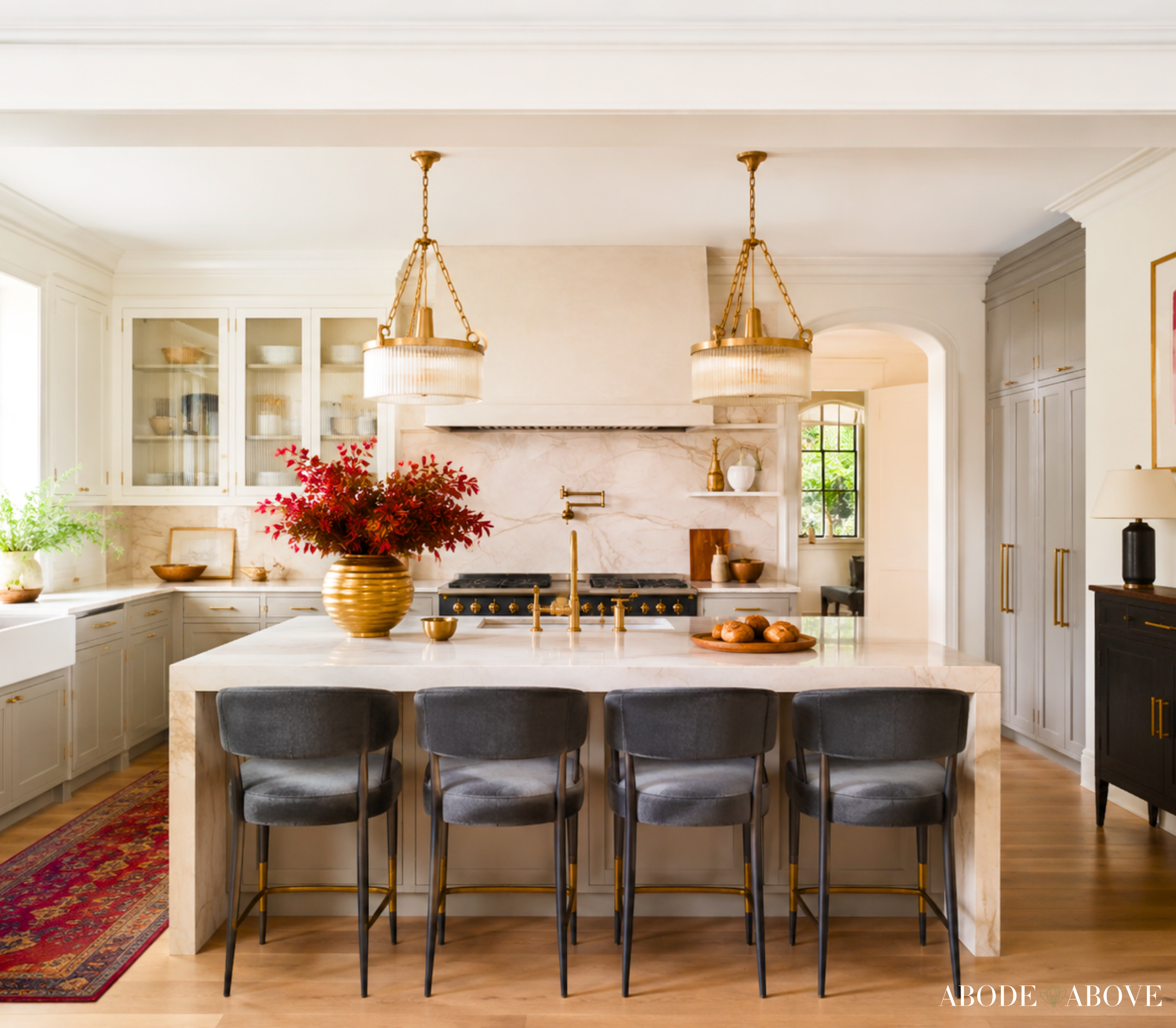
A palette is only as good as the plan behind it, so here is how I would actually deploy these colors, room by room. My rule of thumb is the classic designer ratio: about 60 percent of a room in your main color, 30 percent in a secondary, and the last 10 percent split between your accents. It keeps a bold palette from tipping into chaos, and it is the single most useful thing you can learn about using color at home.
The Living Room
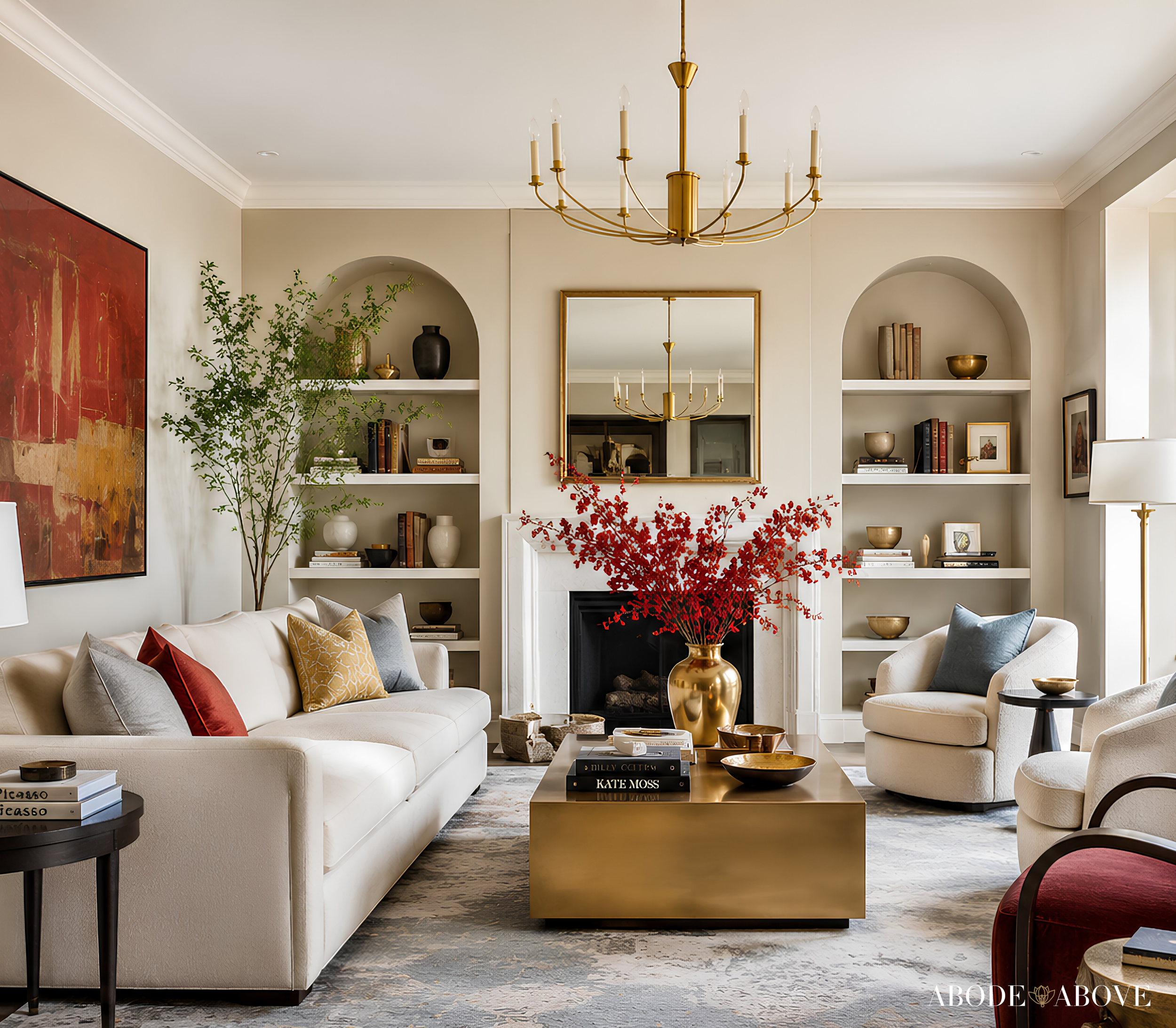
Start with the warm neutral white on your main walls. It carries that sunlit warmth without reading as yellow, which lets your golds stay the stars of the room. Bring in the honeyed gold as your secondary through an accent wall, drapery, or a large upholstered piece. Then let the statement gold appear in smaller doses: a pair of lamps, a gilt mirror, a velvet pillow. Ground the whole thing with the smoky bronze on built-ins or a fireplace surround, and use the dramatic black sparingly on hardware and picture frames. The effect is a room that feels lit from within, glamorous but genuinely livable. This is a space that photographs beautifully and, more importantly, feels wonderful to actually sit in.
The Dining Room
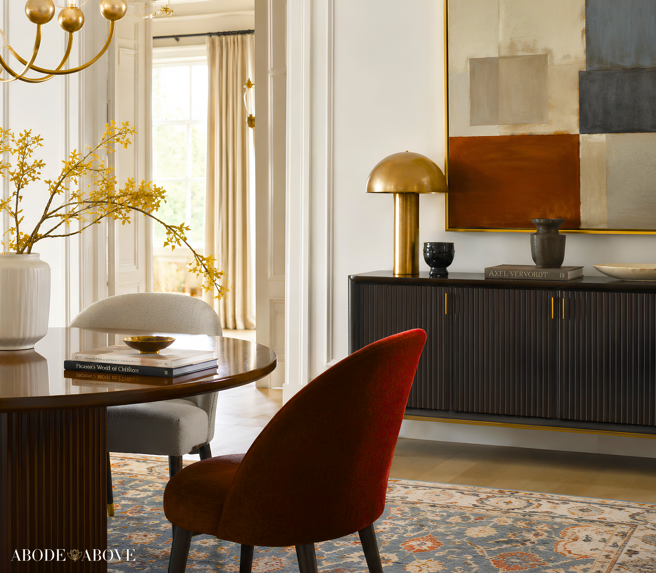
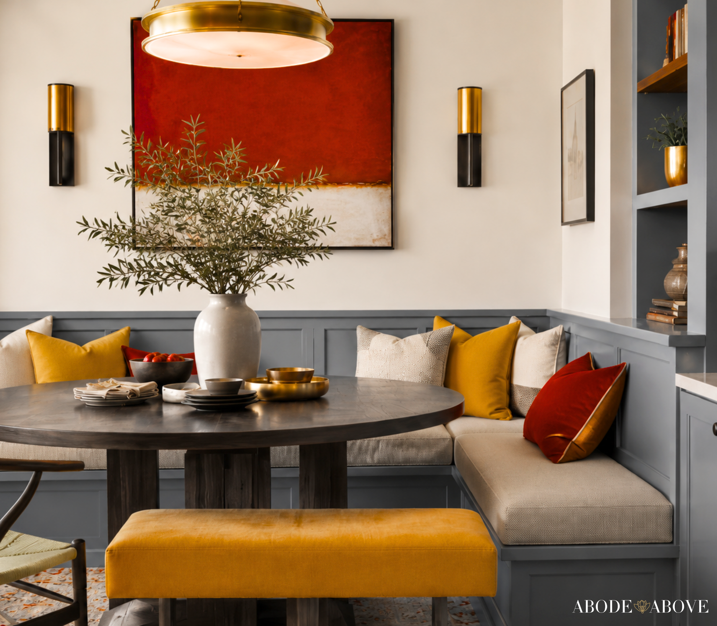
This is where Golden Hour gets to perform. A dining room is a space people expect to feel a little more dressed up, so lean into it. Consider the deep bronze on the walls for a cocooning, candlelit mood, with the warm white on the trim and ceiling to keep it from closing in. Then let the statement gold and even a touch of the red come through in the art, the chairs, or a single lacquered console. This is the room where a bold choice pays off, because you are usually in it at night, when warm light makes these tones sing. If you have ever hesitated to paint a dining room something dramatic, this is your permission.
The Powder Room
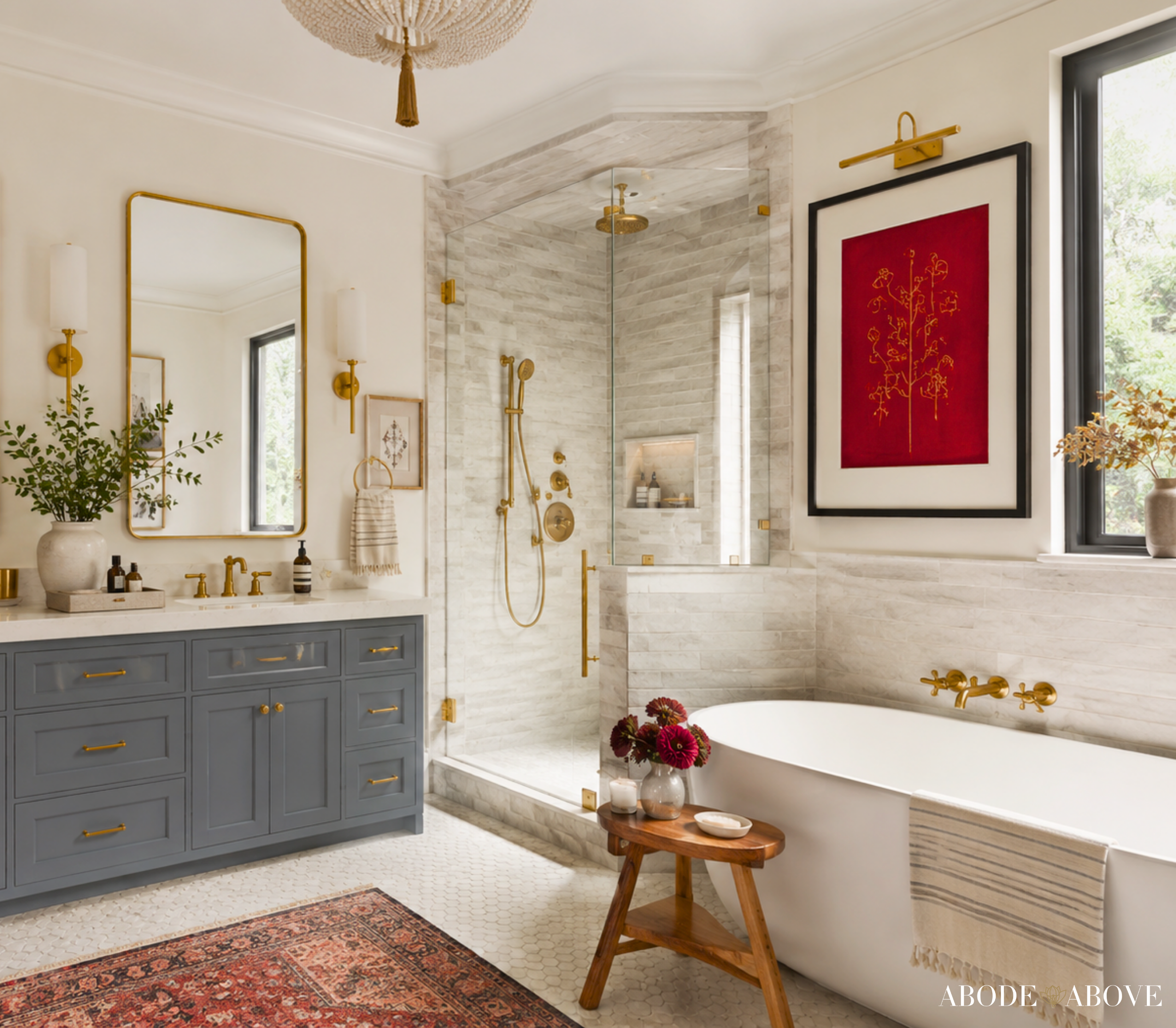
Small rooms are the perfect place to be brave, because the commitment is low and the payoff is high. A powder room in the statement gold, or in the red on a single wall or the vanity, becomes the space guests remember. Pair it with the silver gray or a bit of black on the fixtures and you have a jewel box. This is the easiest, lowest-risk way to bring the boldest part of this palette into your home, and it is almost always the room where my clients end up the happiest they took a risk.
The Primary Bedroom
For a bedroom, pull the palette toward its calmer members. The worn denim blue makes a restful, grounding wall color, especially with the warm white and honeyed gold as soft accents in the bedding and window treatments. Save the red for one small, deliberate moment, a single piece of art or a lamp, so the room reads serene with just a spark of drama. Bronze and black on the hardware tie it back to the rest of the home so the bedroom still feels like part of the same story, just told a little more softly.
The Front Door
If you want one high-impact, low-effort way to use this palette, paint your front door. The red, the statement gold, or the dramatic black all make a confident first impression, and a front door is the definition of a five percent accent: tiny footprint, enormous personality. It is the first thing anyone sees and one of the least expensive things in your home to change.
Making It Work in Your Light
One designer-to-friend note before you commit to anything. Every one of these colors will shift depending on your light, your walls, and the time of day. The golds especially will read warmer in a south-facing room drenched in afternoon sun and cooler in a north-facing space. Always order samples, paint them on more than one wall, and look at them in the morning, at noon, and at night before you buy your gallons. Several years of color decisions have taught me that the few dollars you spend on samples is the cheapest insurance in all of home design. Screens lie. Lighting tells the truth.
Bring an Icon Home
Golden Hour is for the home that knows exactly what it is: warm, confident, glamorous, and unafraid of a little drama. If that sounds like you, this is your palette, and it is waiting in my Etsy shop, Abode Above Colors. Each download gives you all nine exact paint colors and codes, the role every color plays, room-by-room placement guidance, and ready-to-use color combinations so you know precisely how much of each shade to use and where.
And if Golden Hour is not quite your energy, it has many siblings in the Iconic Women Collection, each one inspired by a woman whose style is so fully her own it works like a signature. There is a tailored menswear-inspired neutral palette, a moody jewel-tone stunner, a fresh garden-inspired farmhouse scheme, and a joyful, family-friendly one, among many others. Come find the palette that feels like you, paint something you love, and then send me a photo. I genuinely want to see what you do with it.
You can shop the full collection at Abode Above Colors on Etsy, and if you are local to the Delaware Valley and want the full-service version of this kind of color confidence, you know where to find me.

Images in this post are AI-generated for illustrative purposes only.