A Complete Guide to Our Color Palettes To Date (And How to Actually Use Them)
Here's something I've learned after years of standing in front of paint chips: picking a color is the easy part. Picking colors that work together, across a whole home, in real light, on real walls, is the part that trips almost everyone up. That's the gap our palettes were built to close.
Every palette in our shop is a curated, tested set of Sherwin-Williams colors that already know how to behave with one another. No guessing which white plays nice with which greige. No painting a wall three times because the "warm" beige went pink on you at 4 p.m. Just a cohesive scheme, ready to go.
The collection has grown to over 200 palettes now, which is a lot of color to hand someone without a map. So I've organized this the way I organize them in my own head, by aesthetic family. Find the family that matches how you want your home to feel, and you'll find your palette inside it.
Think of this as the full tour, one room of the shop at a time.
Before we start, one idea that will make every palette here easier to use. A good scheme is a hierarchy, not a democracy. You've got a base (your walls and big surfaces, usually your lightest and most livable colors), your mid-tones (the connective tissue that ties rooms together), and at least one color with real backbone (your contrast, your drama, the thing that keeps a room from going flat). The magic isn't in the six colors. It's in knowing which color does which job. I'll point that out as we go.
Let's get into it.
Warm Neutral and Modern Organic
This is the biggest family in the shop, and that's no accident. Warm, organic neutrals are where so much of design lives right now, and for good reason: they make a whole home feel calm, current, and intentional without asking you to be brave. If color makes you nervous, start here.
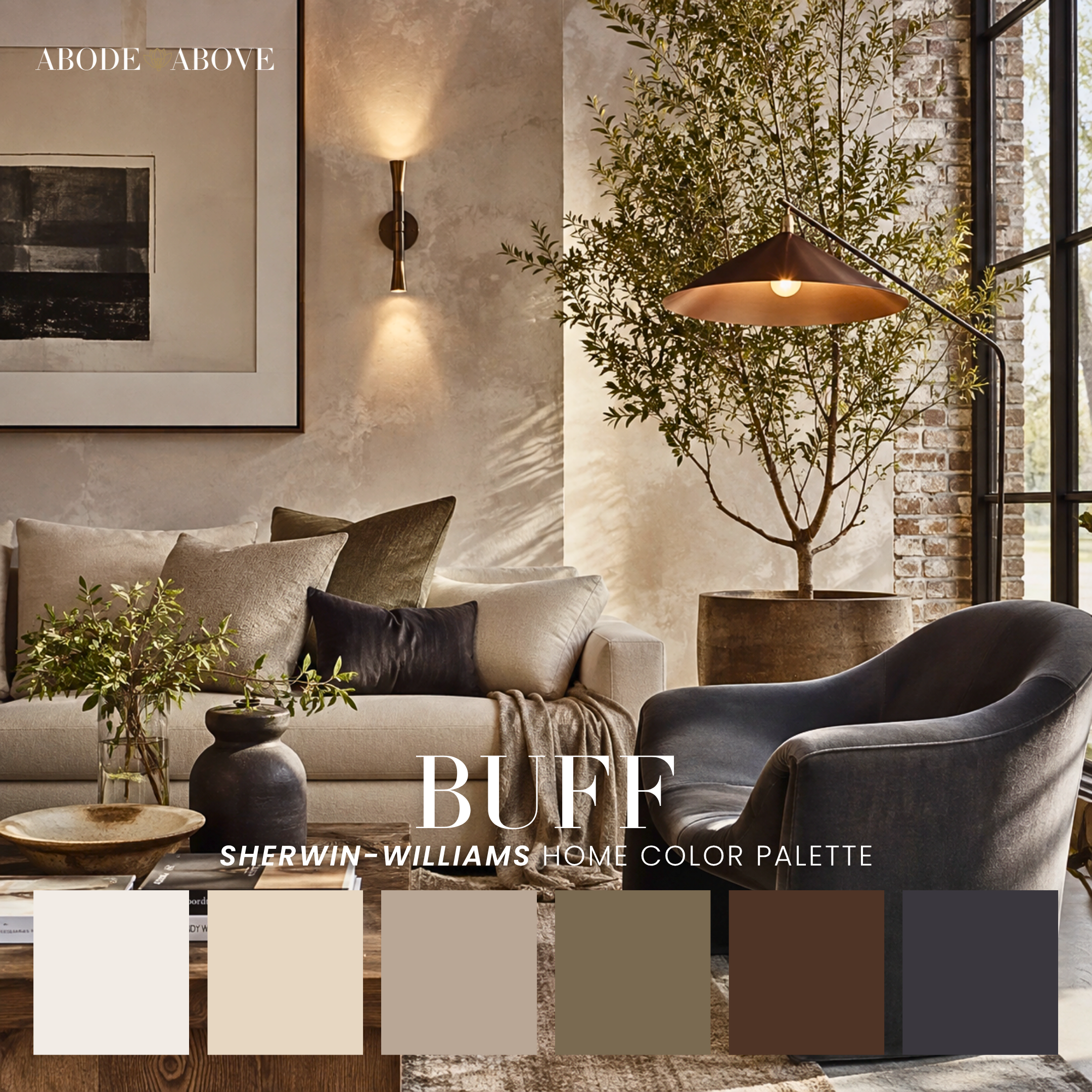
Neutralista is our flagship, and the one I reach for most with clients doing an open-concept main floor. It runs from creamy whites through soft tan and greige into caramel, then grounds itself with a deep olive-brown. That last color is the whole trick. Without it you have a nice, safe beige scheme. With it, you have contrast and sophistication. Creole, Buff, and Chinchilla are close cousins, each working golden ochre, rust, or clay into that neutral foundation for a little more earthiness.
The modern-organic subset leans quiet and Japandi-calm: Mystery, Organic, Meander, Lustre, and Namaste all pair cream and tan with sage, muted blue, or slate in a muted, wabi-sabi key. Morning and Jasmine Tea add the softest breath of peach and blush. The mistake people make with palettes this serene is using them flat. Layer your textures instead, and let the deepest color show up in small, deliberate doses.
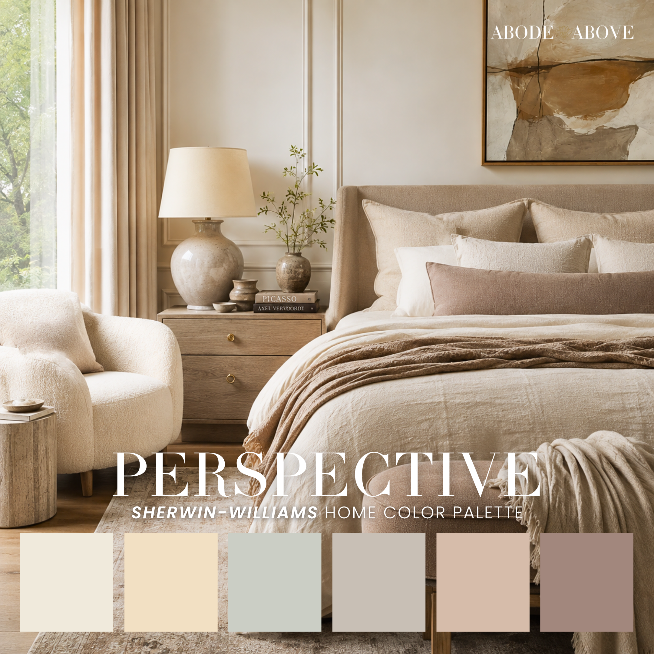
Then there's the quiet-luxury end, where neutrals turn elegant: Gossamer, Perspective, Sovereign, Atelier, and Snowbound are refined, layered, and calm, made for a living room or bedroom you want to feel expensive without trying. Warmstone and Steadfast bring a spa softness that's lovely in a bathroom. Truffles and London go moodier, folding in plum, charcoal, or deep slate for depth.
And the warmer, spiced neutrals earn their own mention: Gingersnap, Safari, Mojave, Quietude, and Mocha all carry terracotta, clay, or espresso through a neutral base for a grounded, desert-modern calm. Encore, Nomad, Jhené, Euphoric, Umami, and Upward add a whisper of lilac, mauve, gold, or slate blue so the neutral never reads boring. Rounding out the family: Sundance, Emerald, Ubiquity, Distance, Sunlit, Urbane, Iron Ore, Chateau, Tibetan, Accessible, Windfall, and Effortless, each a slightly different temperature of the same grounded warmth. This is the family to live in if you want a home that feels like a long exhale.
Warm Minimalist and Quiet Luxury
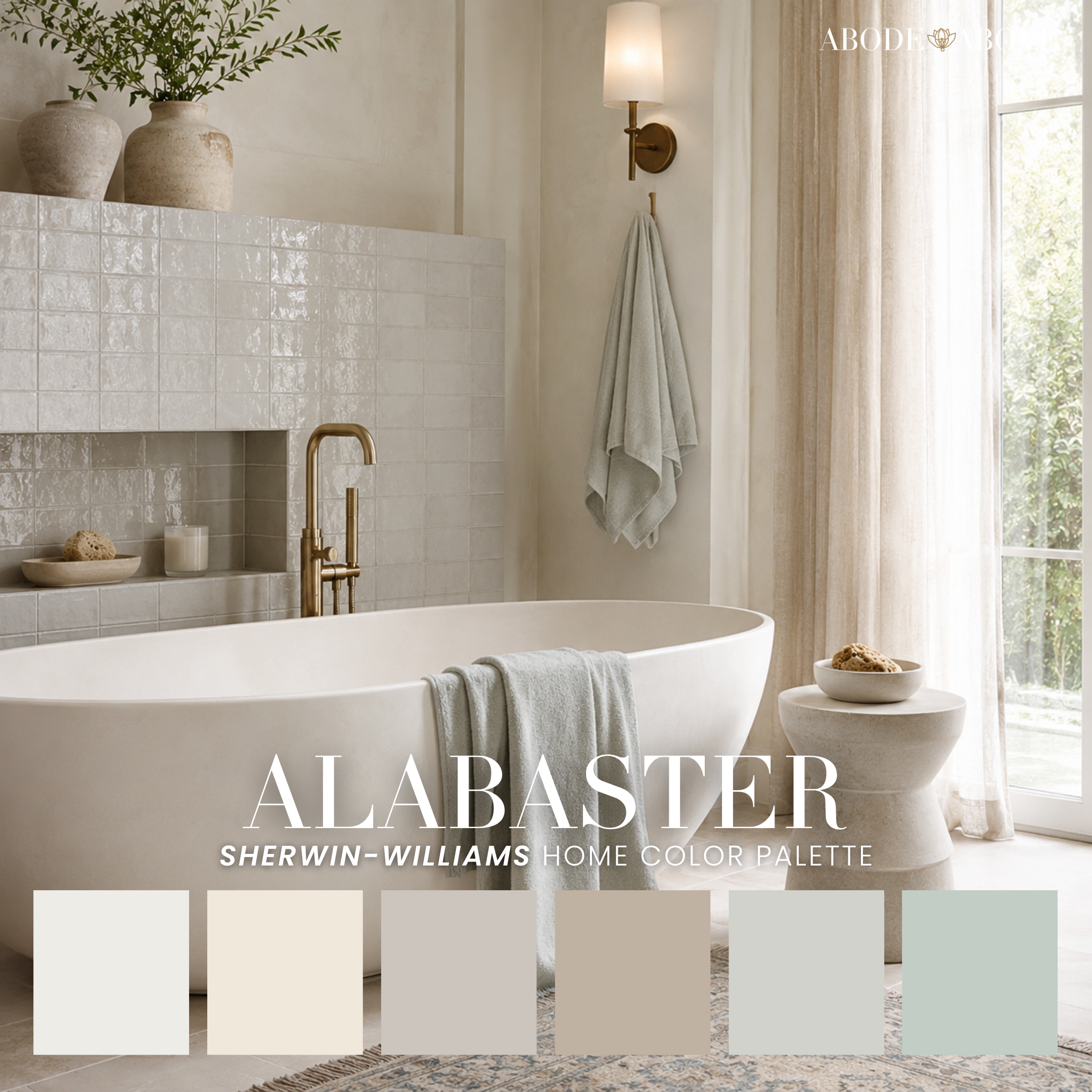
A small, focused group for the "expensive and calm" look done with real restraint. Lo-Fi Mood is the anchor, a moody-neutral scheme of warm taupe, mushroom, dusty blue, and deep slate that feels like money without shouting. Walking Trail is its warmer sibling, greige and wheat-gold and camel with soft sage. Mystical and Alabaster go lighter and more ethereal, cream and greige lifted by lilac or celadon. If you love neutrals but want them to feel deliberate rather than default, this is your shelf.
Coastal and Coastal Neutral
I have a soft spot for a good coastal palette, mostly because so many bad ones exist. Coastal done wrong is a wall of pale blue and a starfish. Coastal done right is about light, air, and restraint. Ours lean into that.
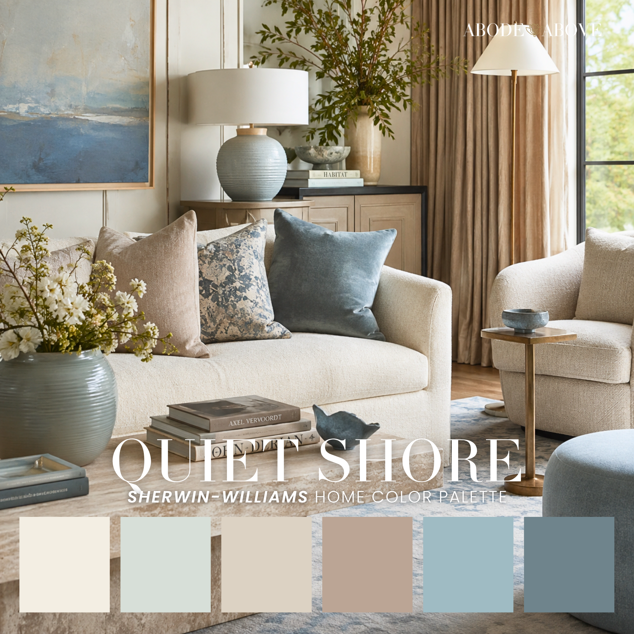
Quiet Shore and Skyscape are the classics, soft blues and warm sand in that relaxed "coastal grandmother" flow. The coastal neutrals are where this family really shines for whole-home use: Crisp, Moonstone, Pebble, Agreeable, Naturale, and Annie Hall keep the blues quiet and the neutrals warm, so a home feels airy without ever feeling cold. Cold coastal is a crime, and none of these commit it.
The warm coastal palettes are some of my favorites in the whole shop. Pink Sand slips blush and dusty rose into the mix; Renewed, Grecian, and Boardwalk add peach, coral, and golden yellow for a sun-warmed glow. By the Lake, Denim, and Patagona take the concept rustic with terracotta, wheat gold, and denim blue, made for indoor-outdoor living. PB Living delivers that easy, collected Pottery Barn ease. And Princess Diary and Peachy round things out, one crisp and preppy with navy and red, the other a warm coastal-boho with terracotta and sage.
Coastal Spa and Blue Forward
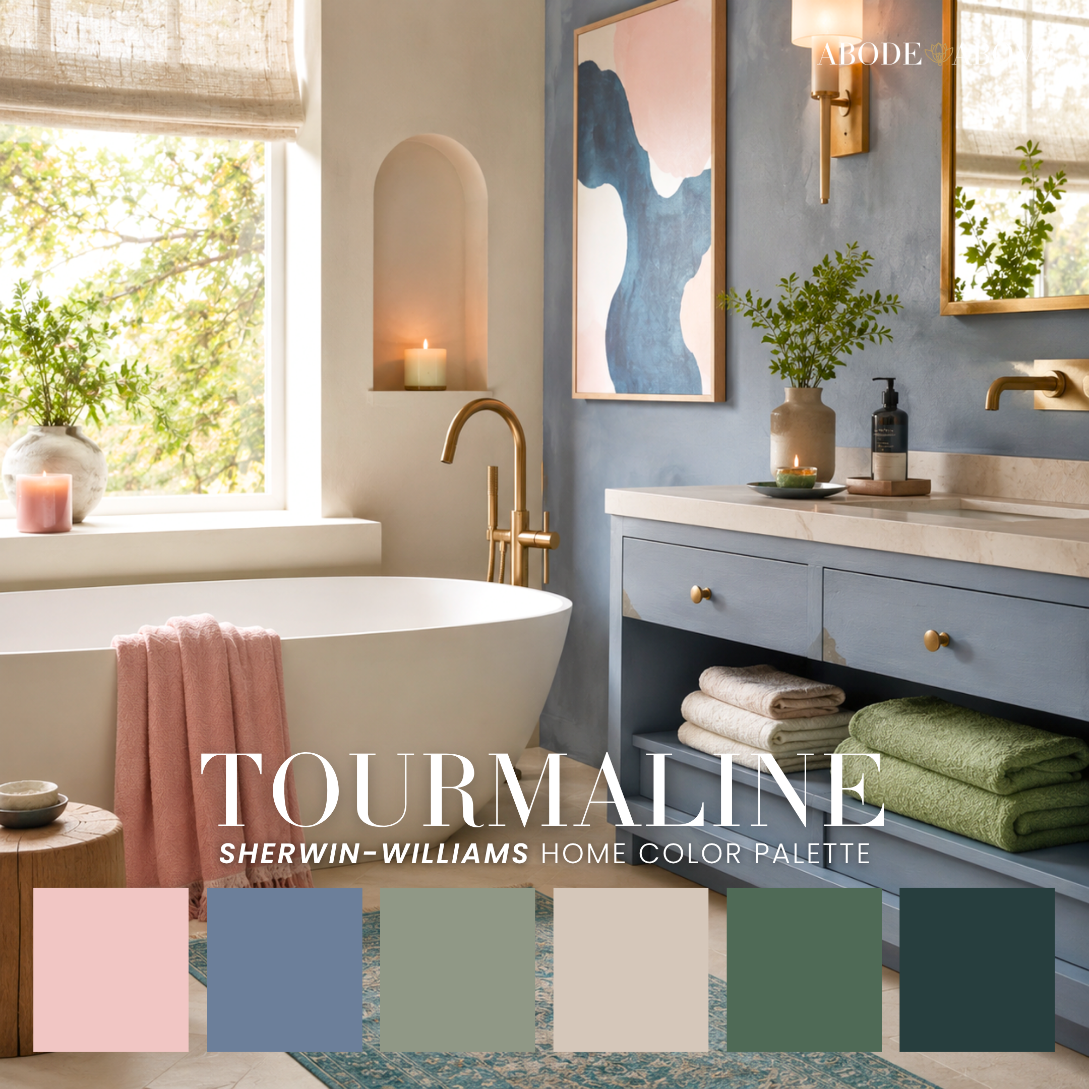
When you want coastal to feel like an actual retreat, come here. Cool Mist, Saltwater, Tourmaline, and Dark Seas are spa-like schemes built on seafoam, teal, and slate, grounded by navy or charcoal so they never float away. Dark Seas in particular gives you that moody, polished-concrete wet-room look that's stunning in a powder room.
For the blue lovers, Blue Iris, Bluettes, Sapphire, Amalfi, and Nordic are genuinely sophisticated blue-forward schemes. Blue goes cold fast, and these don't, because each one is quietly anchored by a warm tan, a sage, or a greige doing the balancing work behind the scenes. Sapphire leans traditional and library-ish; Amalfi breathes Italian-coast; Nordic is all Scandi serenity.
Moody, Luxe, and Dark Academia
Moody is having a long moment, and for good reason. Done well, a moody room feels enveloping and expensive and a little cinematic. The key, and I cannot stress this enough, is that moody is not the same as dark. The best moody palettes always keep a soft neutral in the mix to give your eye somewhere to rest.
The gentle entry points first: alongside Lo-Fi Mood, the softest here are Wallflower, Catwalk, and Inkwell, romantic with dusty blush, lavender, or greige carrying most of the room and the deep color used sparingly. Start here if moody scares you.
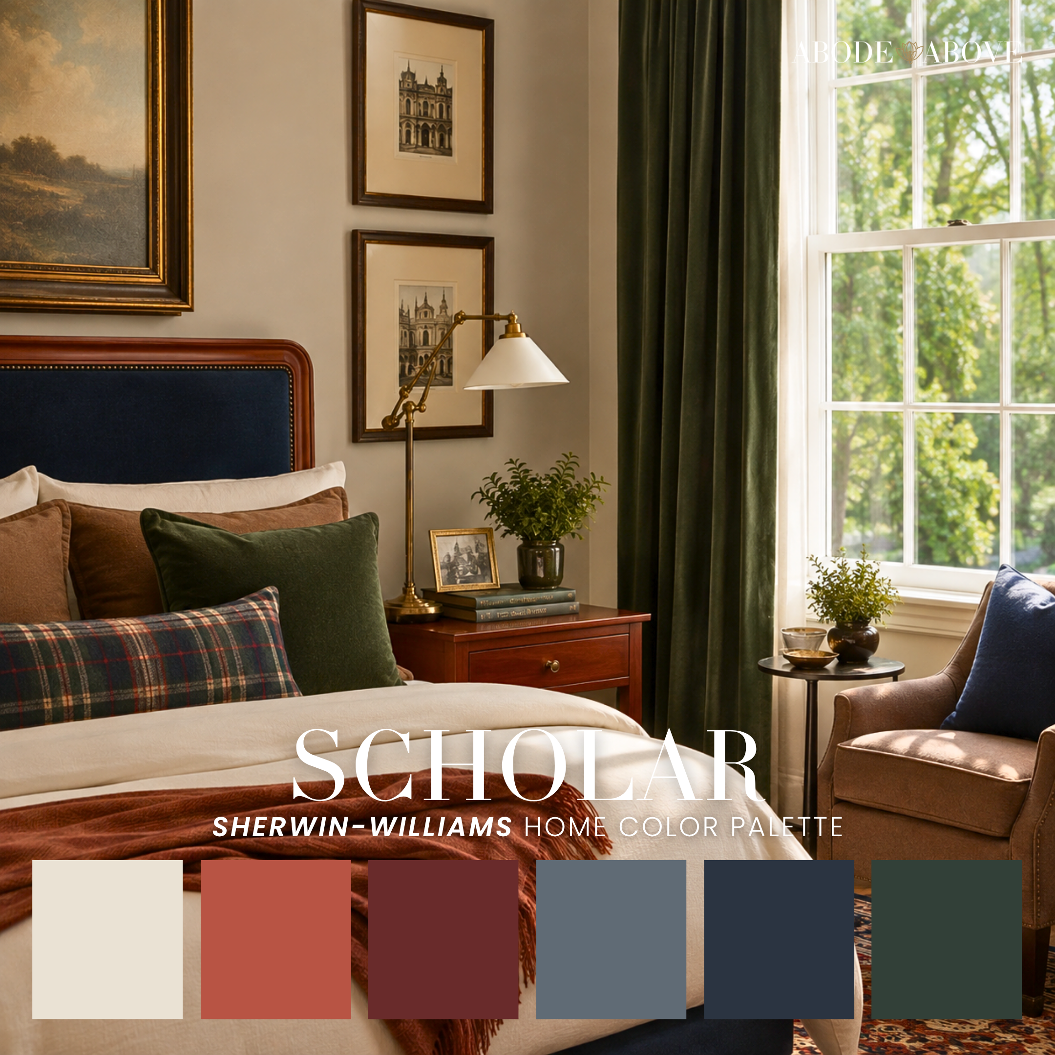
The dark-academia set is for full commitment: Fellow, Scholar, Argyle, Esoteric, and Bricks run charcoal, forest green, burgundy, and navy into cream, that gentleman's-study, lower-your-voice richness. Perfect for an office, study, or a moody kitchen (yes, kitchen, Bricks and Esoteric are worth being brave for).
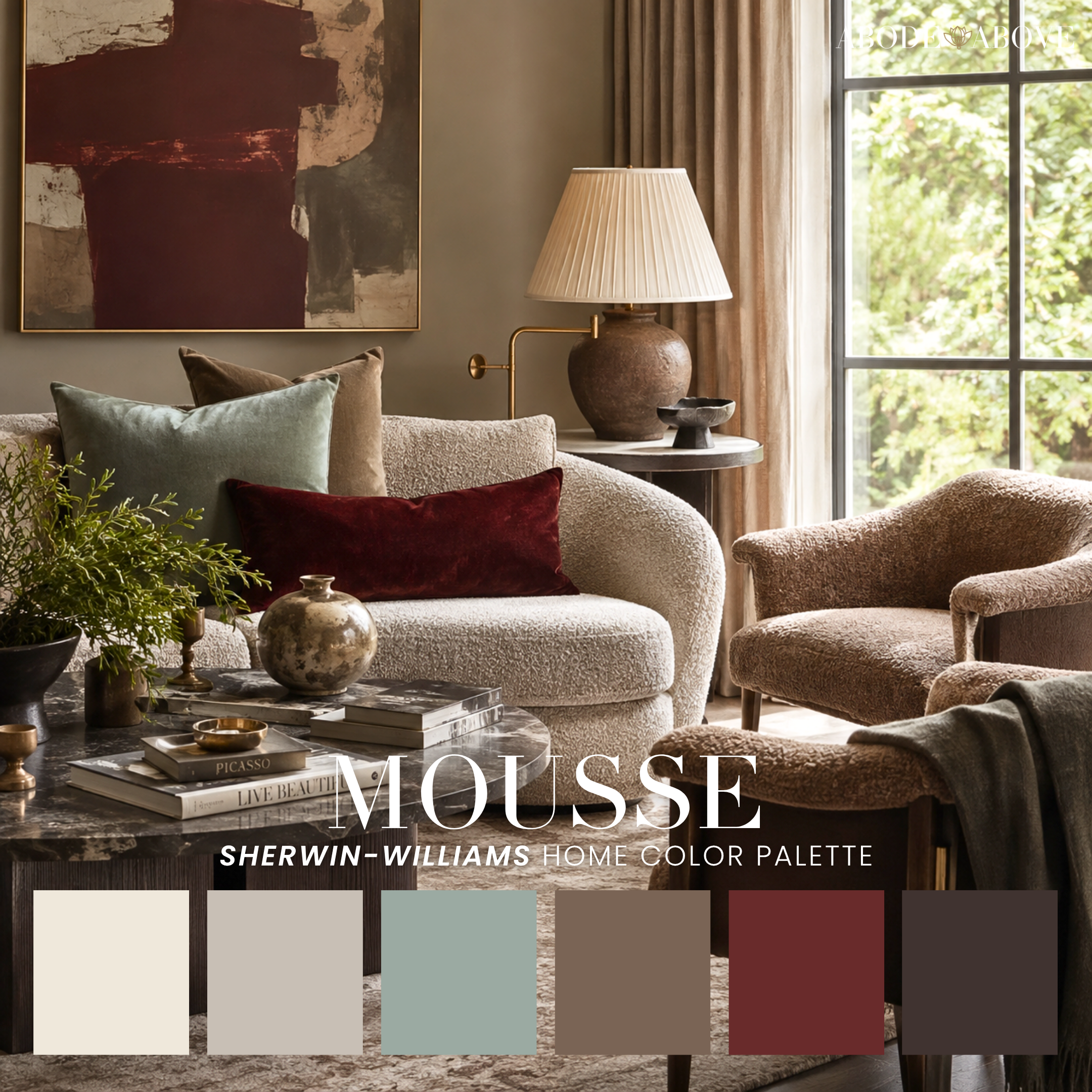
The jewel-toned moody palettes bring the drama with a soft landing: Wilde Night, Suede, Artiste, Paisley, and Diamonds & Leather layer plum, navy, magenta, and deep green over a warm neutral base. Velvet is the moody kitchen sleeper of the group, mustard-olive and forest green and deep aubergine, the kind of layered warmth that grounds a whole cooking space. And the luxe end, Mercury, Concorde, Violette, Mousse, and Strut, is where moody meets glamour, all antique gold, copper-rust, and deep teal with an art-deco polish. James deserves a nod as the moody-modern one, a mid-century mix of teal, rust, and marigold that feels like a very cool record collection.
Traditional and Grandmillennial
There's a whole movement of younger homeowners falling back in love with the colors their grandmothers used, and honestly, good. These palettes are collected, classic, and built to outlast every trend cycle.
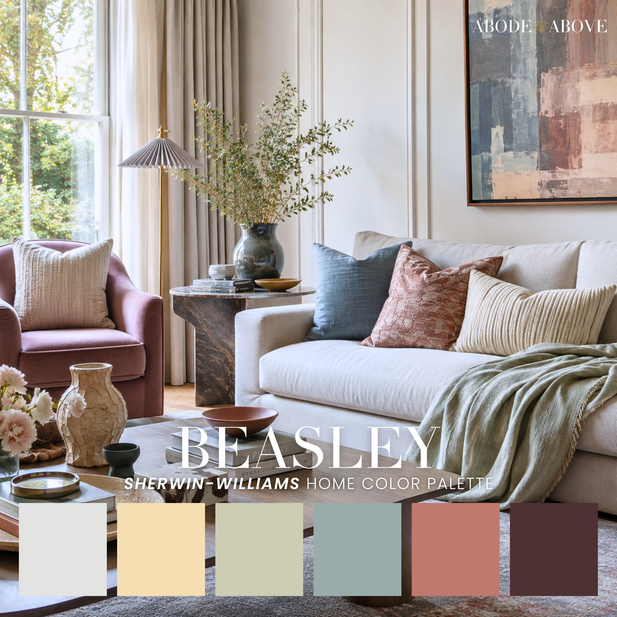
Heritage, Dress Blues, Waterpolo, and Madam are the navy-and-gold classics, that crisp, preppy, blue-and-white spirit with a Ralph Lauren backbone. Blissful, Beasley, Esteem, Cool Uncle, and Dublin bring the English-country warmth with sage, gold, and terracotta. The softer, more refined traditionals, Estate, Willa, Parisian, Alnwick, and On the Vine, work French-country and grandmillennial grace with muted blues, sage, and dusty lavender. And the jewel-accented ones, Revel, Cascades, Golden Hour, and Becoming, add a glamorous teal or deep red so tradition never tips into stuffy. Colony rounds it out with a rustic-study warmth.
Cottage and English Country
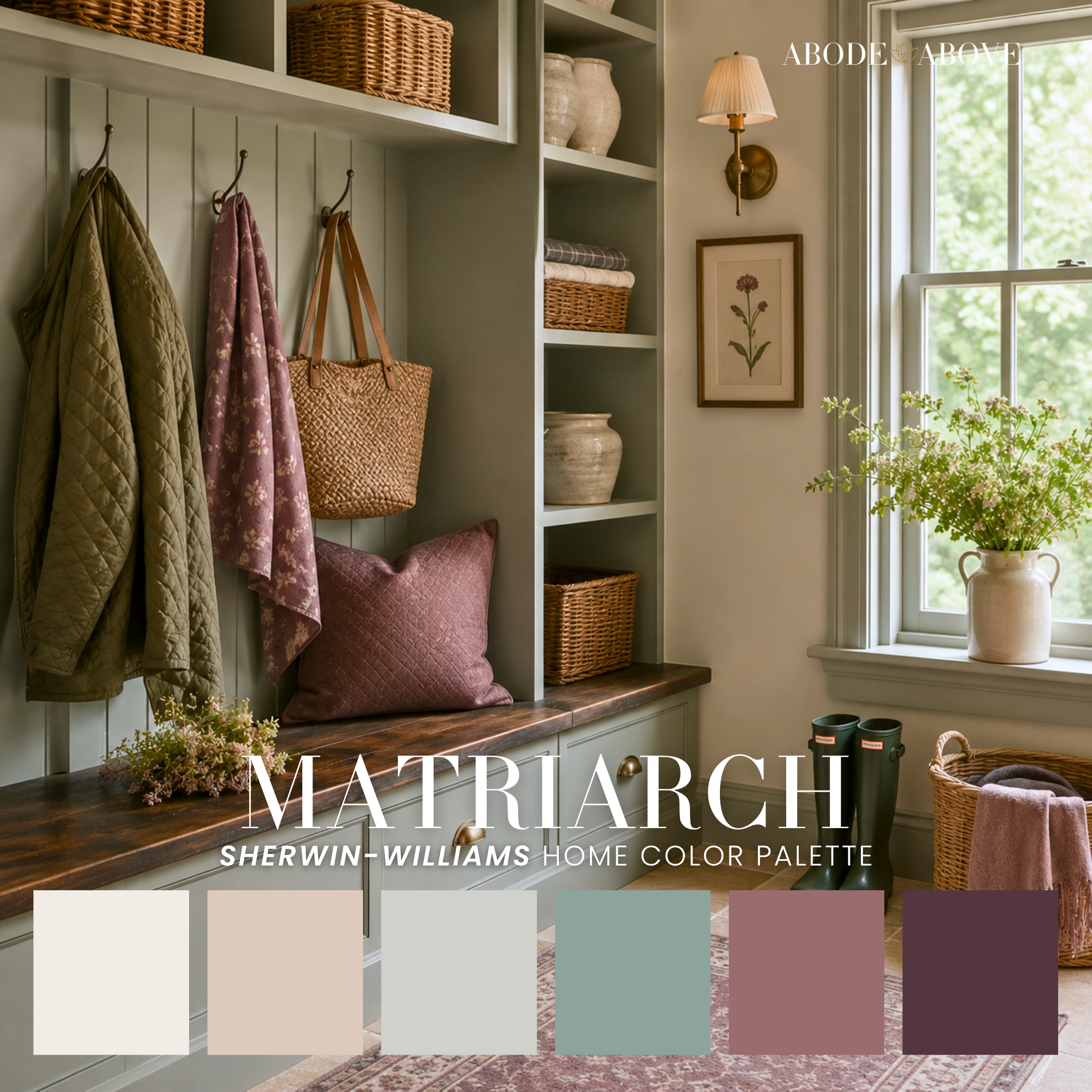
Cottage style is about warmth and a slightly imperfect, gathered-over-time feeling. Bloom is the sunny one, cream and blush and golden yellow. Matriarch is the romantic cottagecore one, sage and dusty teal and deep plum. Cheshire and Charmed are cheerful and layered with coral, gold, and clay. Dahlia goes deeper and more floral with burgundy, and Rhinestones is the sweetest of the bunch, buttery yellow and blush and raspberry. All of them feel like a hug. Use them in bedrooms, mudrooms, and bathrooms where a little softness goes a long way.
Mediterranean, Southwest, and Boho
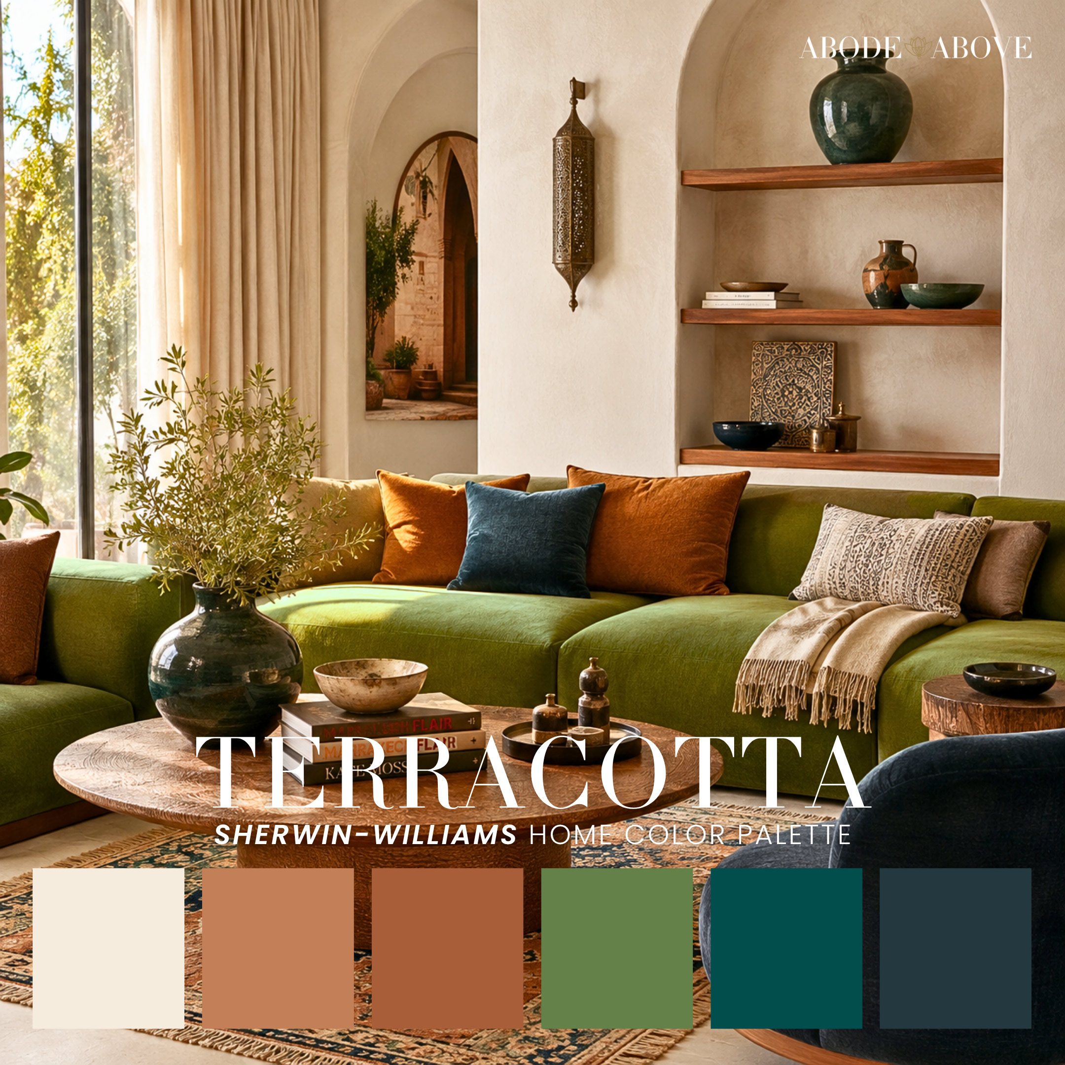
This family pairs warm earth tones with a grounding dark, and that combination is the secret to earthy color that reads rich instead of muddy. Realm, Risa, Terracotta, and Marchioness work the Mediterranean and Moroccan angle with terracotta, bronze, and saturated teal. Milaje, Free Spirit, Bohême, Bohemia, Rooted, and High Desert bring the southwest-boho soul with mustard, clay, ochre, and deep navy. Yara and Long Walk lean warm and organic with terracotta and plum, and Ankh is our fearless maximalist here, magenta and orange and teal for someone who knows exactly who they are. Across all of them, let the lighter earth tones lead and the deep anchor punctuate.
Rustic and Modern Mountain
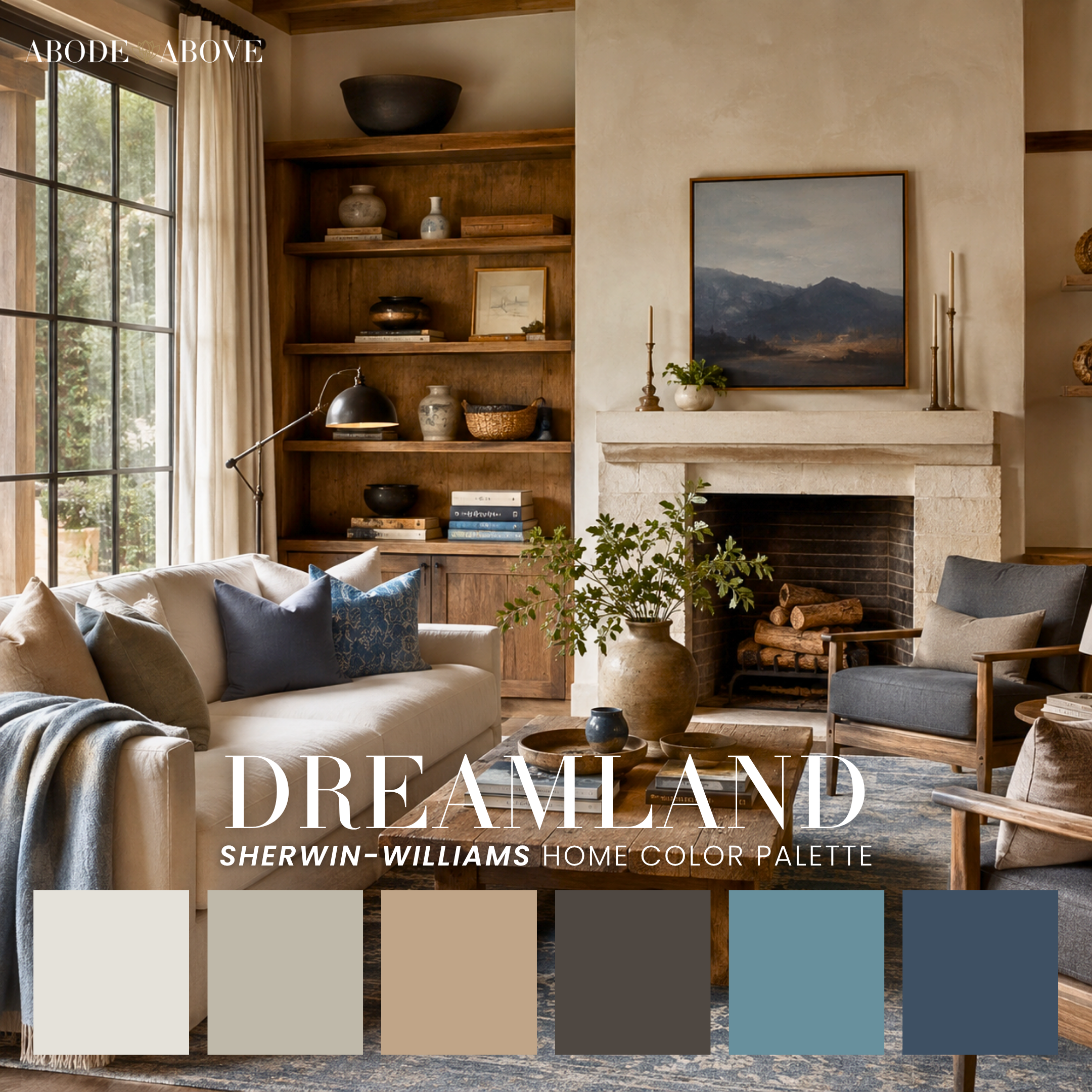
A cozy little family for lodge warmth with a current edge. Dreamland is the refined modern-mountain look, creamy beige and camel and charcoal with two grounding blues. Spiced brings rich autumn depth with mustard-gold and burgundy. Dusk softens things with peach and sage over a rustic base. Cozy but never dated, made for a whole home with real warmth.
Warm Earthy and Autumn
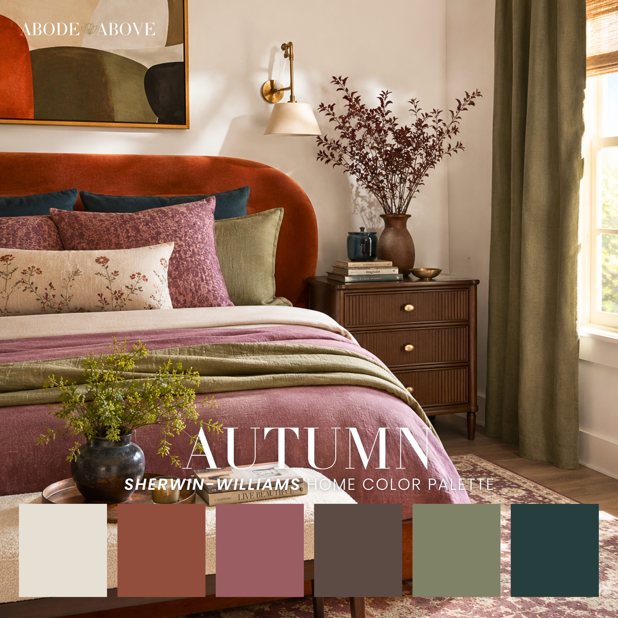
For the person who wants fall to last all year. Autumn, Hearth, Serenity, Manifest, and Favorite Things all layer rust, sage, terracotta, and deep teal or plum into a warm base. Enveloping and grounding, with enough depth to feel sophisticated rather than seasonal. Manifest even works beautifully as a garden-room or patio palette.
Warm Modern and Mid-Century
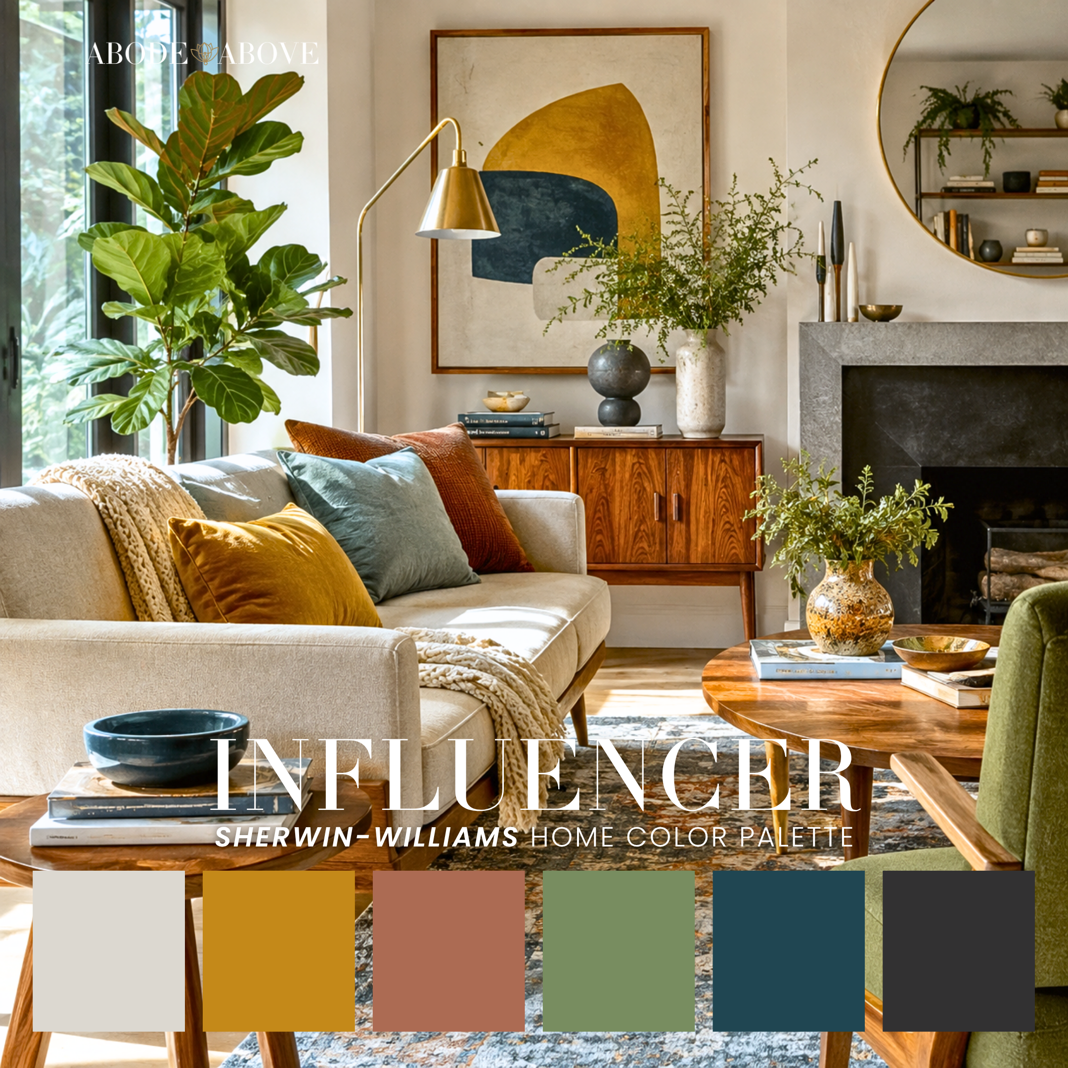
This is where clean-lined furniture finds its color match. Charisma, Influencer, Westie, Angelou, and Coogi live in that confident, warm mid-century space with gold, rust, and dusty teal. Janet, Curator, Jaded, Defiant, and Good Thing lean modern-organic, layering sage and green into a grounded warmth. Figure, Windfall, Restful, and Socrates bring a gallery-calm sophistication with navy, charcoal, and chartreuse accents. And the softer, more playful moderns, Arthaus, Modish, Retreat, and City of Stars, work blush, buttery yellow, and coral into a mid-century ease. If you want color that matches the energy of good, simple furniture, this is your family.
Bold and Colorful Maximalist
These are the palettes for people who walk into a beige room and feel a little sad about it. The trick to using saturated color without overwhelming a space is the same as always: neutral base, bold accents. You're seasoning the dish, not drinking the salt.
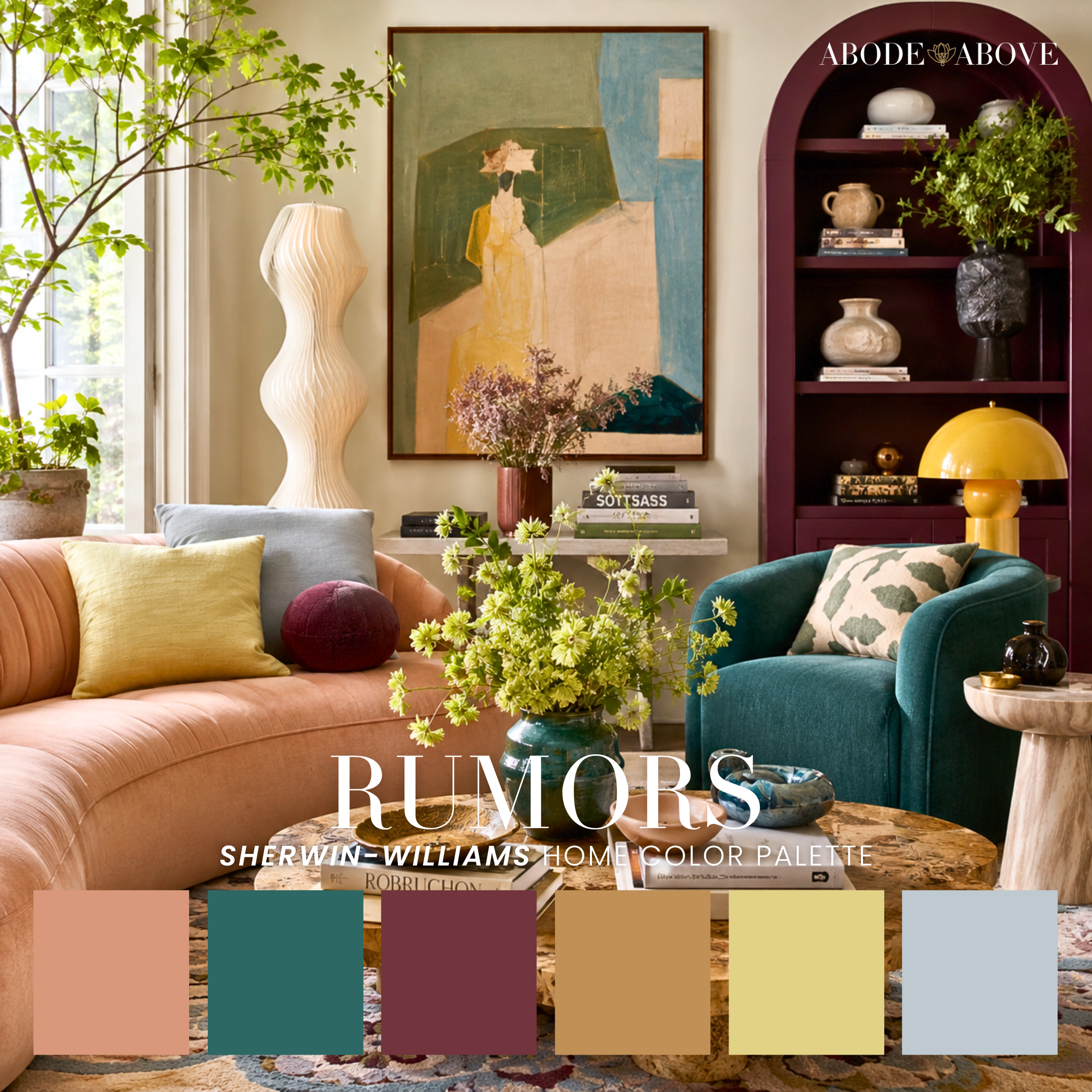
The warm, sunset-toned maximalists, Smooch, Carnival, Rumors, Farah, Oleander, and Casa Azul, glow with coral, marigold, and berry. The bright, playful ones, Vivrant, Riot Act, Indulgent, Sprinkles, Stockholm, Moments, and Schoolhouse, mix pink, lime, aqua, and cobalt with real joy. The glam maximalists, Cosmic, Aerie, Stunner, Calypso, and Grace, add an iridescent, jewel-box polish. And the retro-leaning ones, Valencia, Orchid, Donna, Flair, Prime, and Irreverent, channel mid-century and Bauhaus energy. Every single one still has structure underneath the fun. Colorful doesn't mean chaotic.
Tropical and Botanical
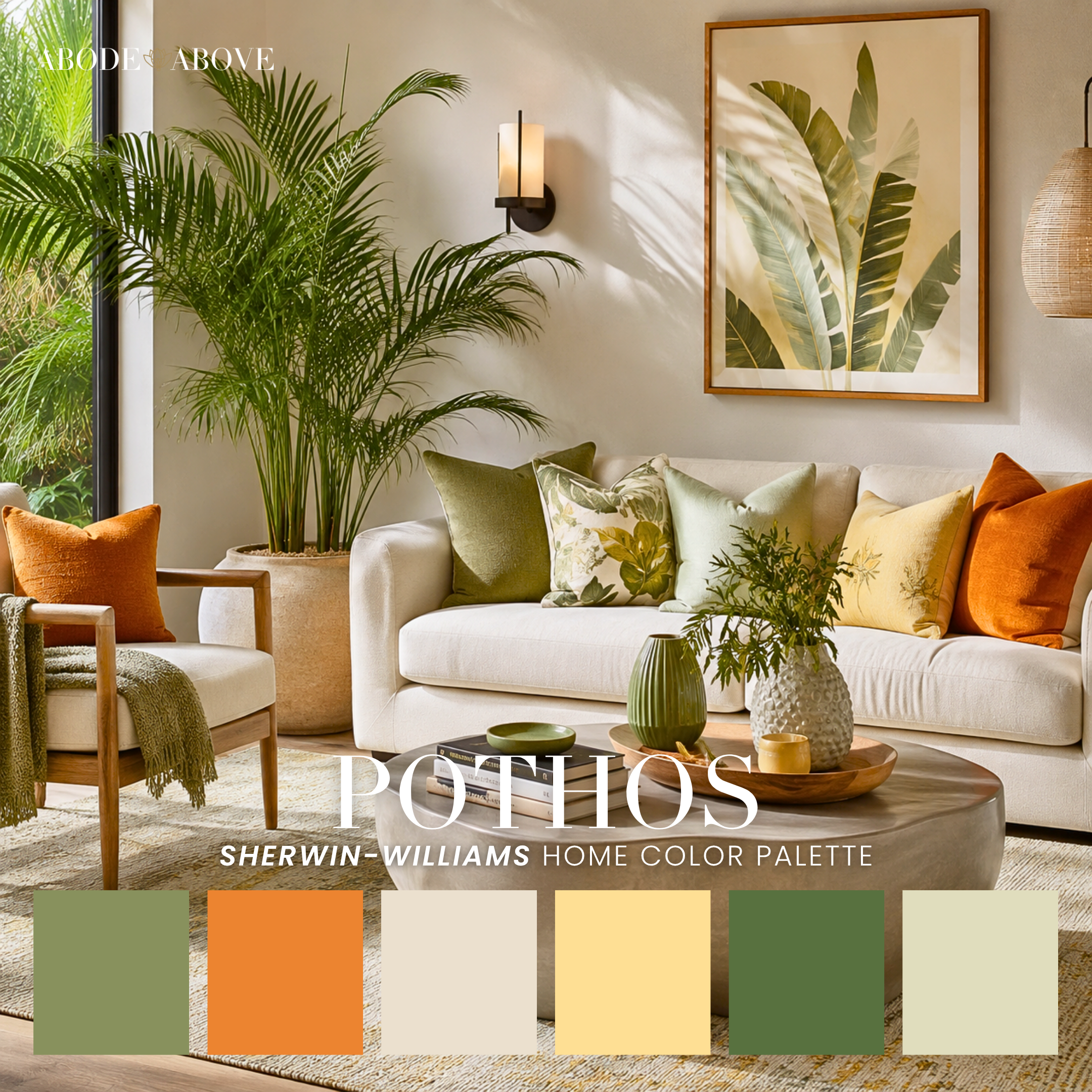
A small, fresh pairing for the plant people. Pothos is lively and tropical, sage and bright orange and fern green, made for a room that's slowly becoming a jungle. Succulent is its calmer, more organic cousin, all soft sage, spruce, and deep forest. Both make green feel intentional rather than accidental.
Soft Glam, Pastel, and Romantic
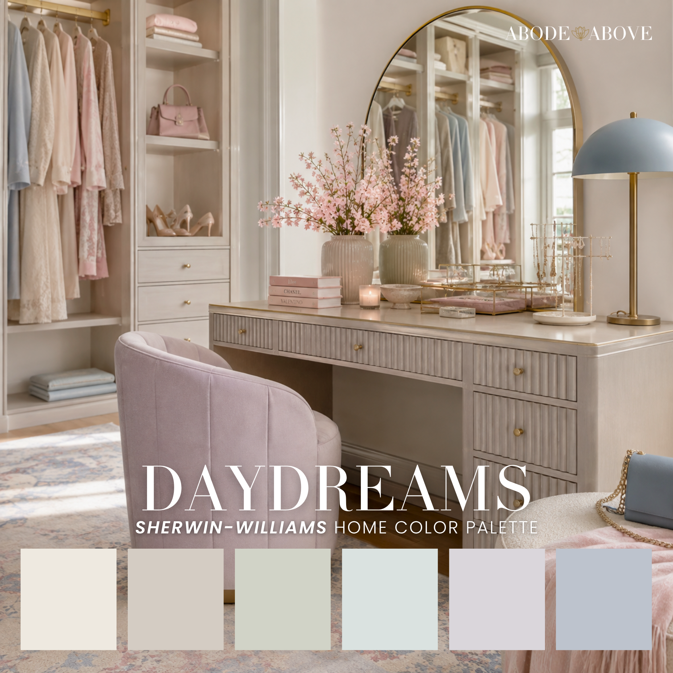
Quiet luxury with a little shimmer. Socialite, Saga, Glassy, Radiant, and Cerulean are the romantic-glam anchors, lavender, mauve, dusty purple, and blush-rose with a Parisian elegance. Daydreams, Cotton, Peonies, and Flapper go softer and more pastel, with mint, sage, aqua, and blush for a dreamy, feminine calm. Brunch brings a French-country warmth with peach and buttery yellow. Use the light tones generously and let the one deep color, a plum or a teal, anchor a headboard wall or a set of drapes.
Kids and Nursery
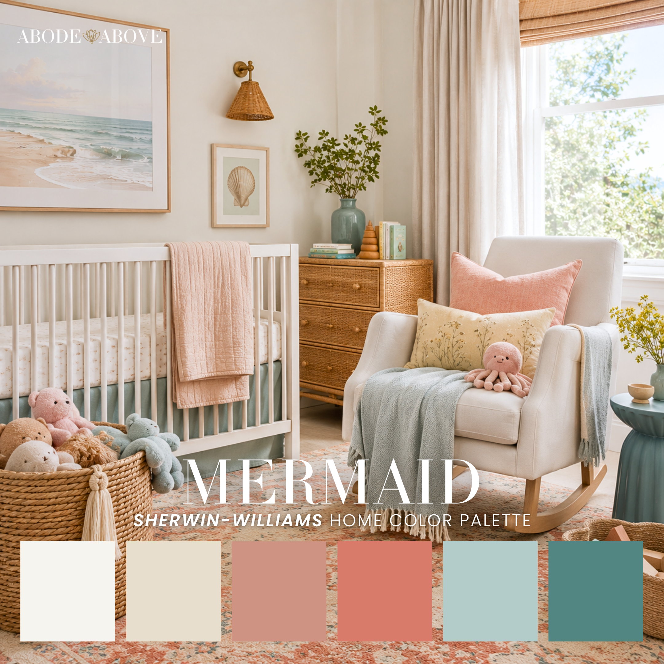
Designing for little ones is its own skill, and the goal is always the same: cheerful without being cloying, and ideally something you won't hate repainting in three years. Playdate, Ticklish, Junie, and Sing Along are the brighter, playful options. Bassinet, Sorbet, Fluffy, and Mermaid are the gentlest, softest pastels, perfect for a baby's room. What I love about thsee is that they're built on the same principles as every grown-up palette in the shop: a base, mid-tones, and an anchor, just in a softer key. Good design for kids isn't dumbed-down design. It's the same rigor, more joy.
How to Choose (and How to Use)
If you've made it this far, you're clearly serious, so let me leave you with the advice I give every client.
First, choose the palette that matches how you want the room to feel, not the color you think you're supposed to like. Feeling comes first. Every palette here was built around a mood, which is exactly why they're grouped this way.
Second, respect the hierarchy. Your walls and big surfaces want your lightest, most livable colors. Your mid-tones tie the room together. Your one or two deep, saturated colors are for the things you want to notice: a door, an island, a built-in, a piece of furniture. Never split them evenly.
Third, test in your own light. Every palette we make holds together beautifully, but your north-facing bedroom and your neighbor's south-facing kitchen will read the same colors differently. Get samples up on the wall and live with them for a few days before you commit.
And finally, if it all still feels like a lot, that's exactly what I'm here for. Curating color is the part of this work I love most, and there's a real difference between a set of pretty colors and a home that feels like you. Whether you take one of these palettes and run with it or you want a set of hands to help you place every color in every room, you don't have to do it alone.
Now go pick something you love!