Sovereign: A Soft, Quiet-Luxury Palette in Warm Neutrals and Olive
The most refined homes never have to announce themselves. Sovereign is the palette that proves it: a nine-color Sherwin-Williams scheme of soft warm whites and champagne neutrals, one gentle blush, and a single muted olive, grounded in smoky taupe and warm bronze. It is quiet luxury with California ease, and if you love clean, light-filled, effortlessly refined spaces, this palette was made for you.
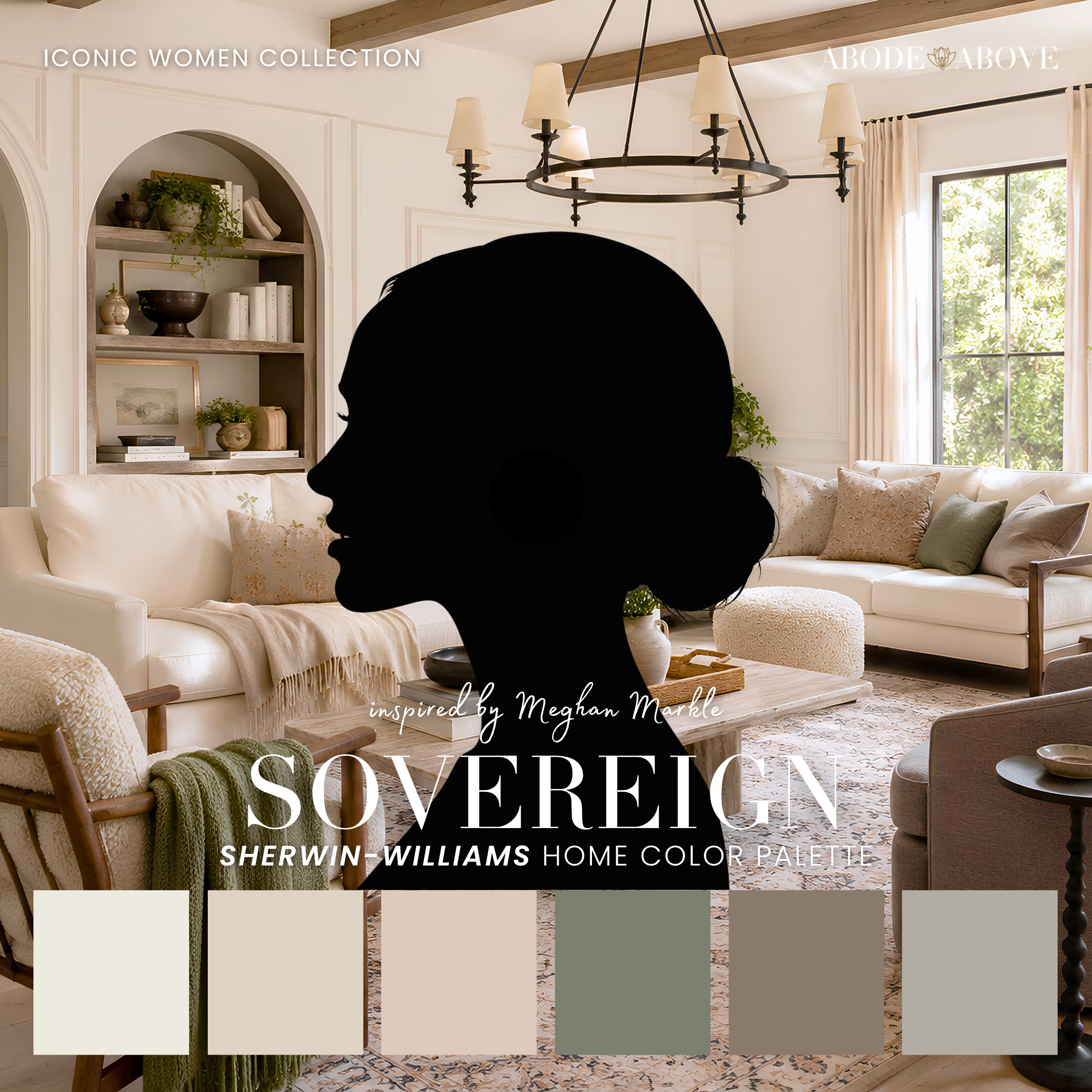
The Woman Behind the Palette
Sovereign is inspired by Meghan Markle, whose modern sensibility is defined by understated elegance and California ease.
Her aesthetic is all about restraint and refinement: clean lines, natural light, warm neutrals, nothing overdone. It is a look that reads expensive precisely because it never tries to. There is a calm confidence to it, the sense of someone who knows that true luxury is soft, quiet, and effortless rather than loud. Her sense of home reflects a life of natural materials, neutral palettes, and understated polish, elegance that whispers instead of shouts.
That quiet, refined ease is exactly what I built into this palette. Sovereign is the most understated scheme in the whole collection, and deliberately so. It is designed for tone-on-tone layering, for the kind of serene, light-filled space that feels like a deep breath. One gentle blush and a single muted olive provide the only real color, so the whole palette stays soft, calm, and effortlessly luxurious.
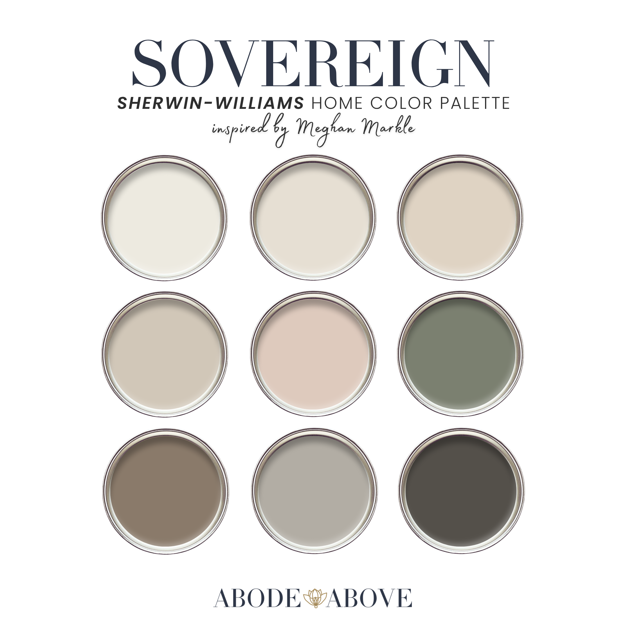
The Palette at a Glance
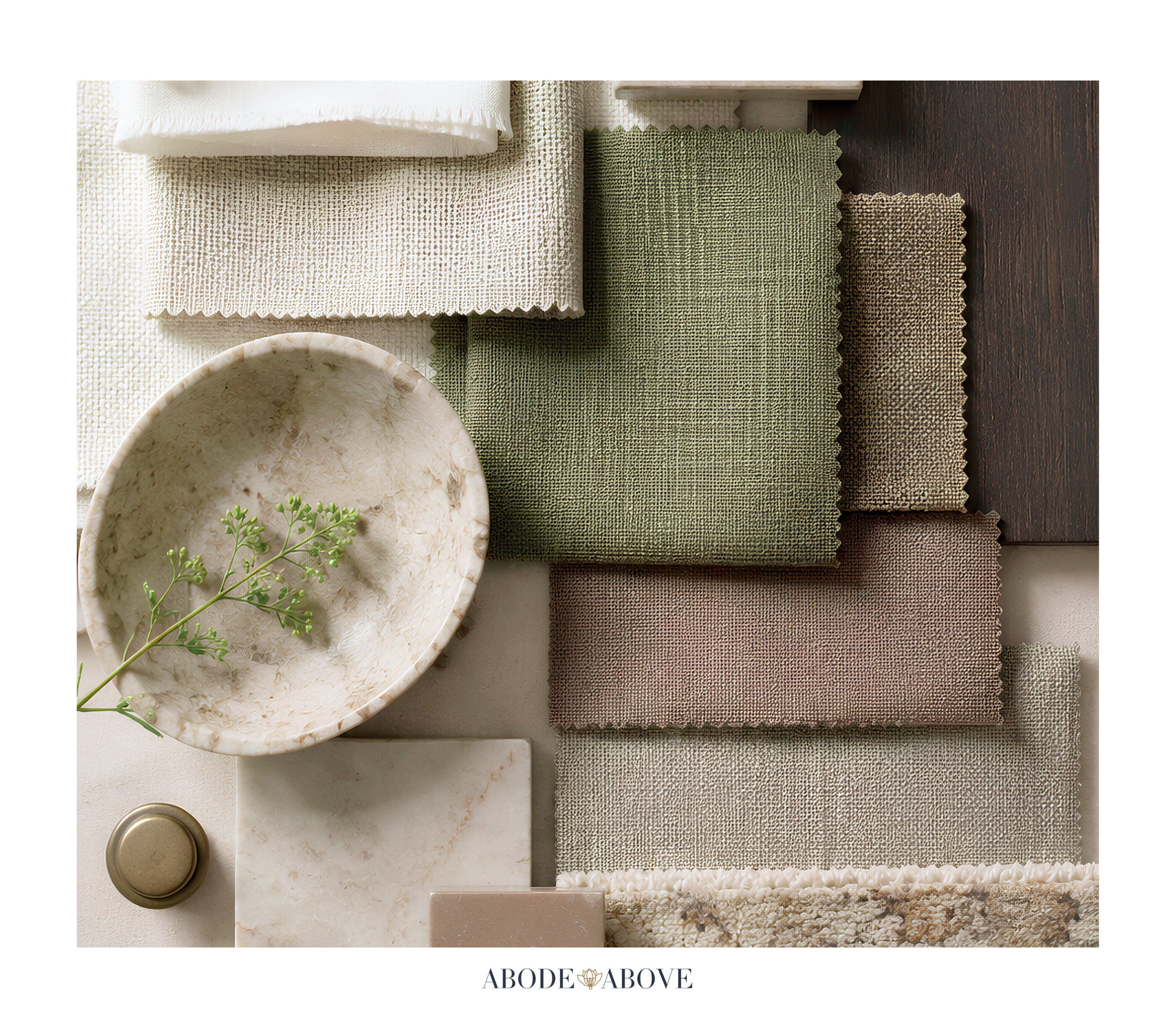
This palette follows my usual architecture: two warm whites, a band of soft neutrals, deep grounding shades, and minimal, restrained color. The whites here are warm and gracious, the serene foundation of the scheme. A champagne neutral and an approachable greige carry the mids, soft and light-filled. Then the palette's only real color: a gentle blush for warmth, and a single muted olive as the one restrained pop. A smoky taupe and a warm bronze provide grounding and polish.
The luxury of this palette is in its restraint. With so few true colors, the whole scheme relies on subtle shifts of warm neutral, layered tone on tone, with just a whisper of blush and olive. It is quiet, soft, and endlessly refined, the kind of palette that feels calm the moment you walk in.
How to Use Sovereign in Your Home
A tone-on-tone palette relies on the 60-30-10 ratio in a slightly different way: about 60 percent of a room in your main neutral, 30 percent in a secondary neutral, and the last 10 percent in your subtle color and grounding accents. With Sovereign, the artistry is in the layering rather than the contrast.
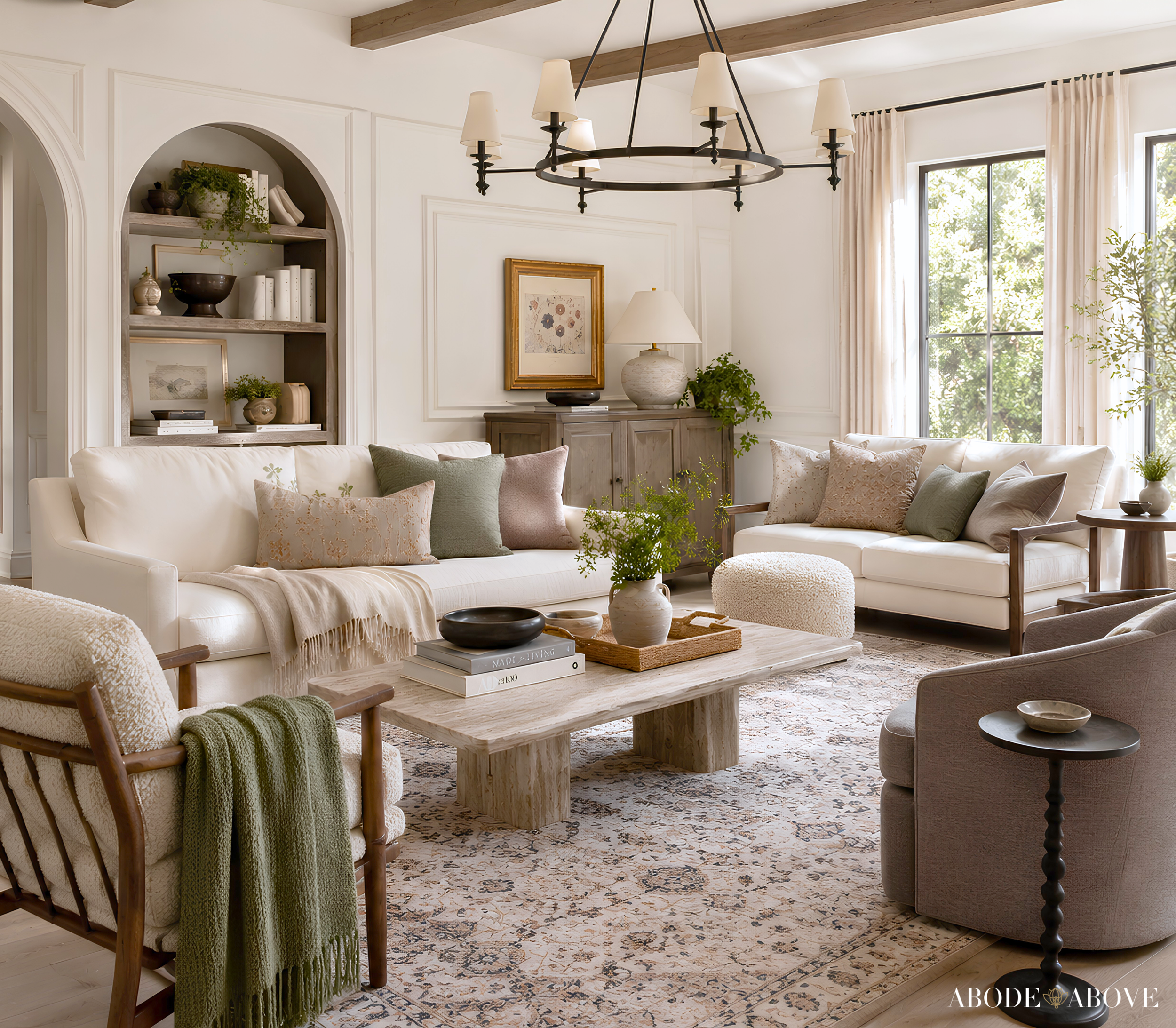
The Living Room
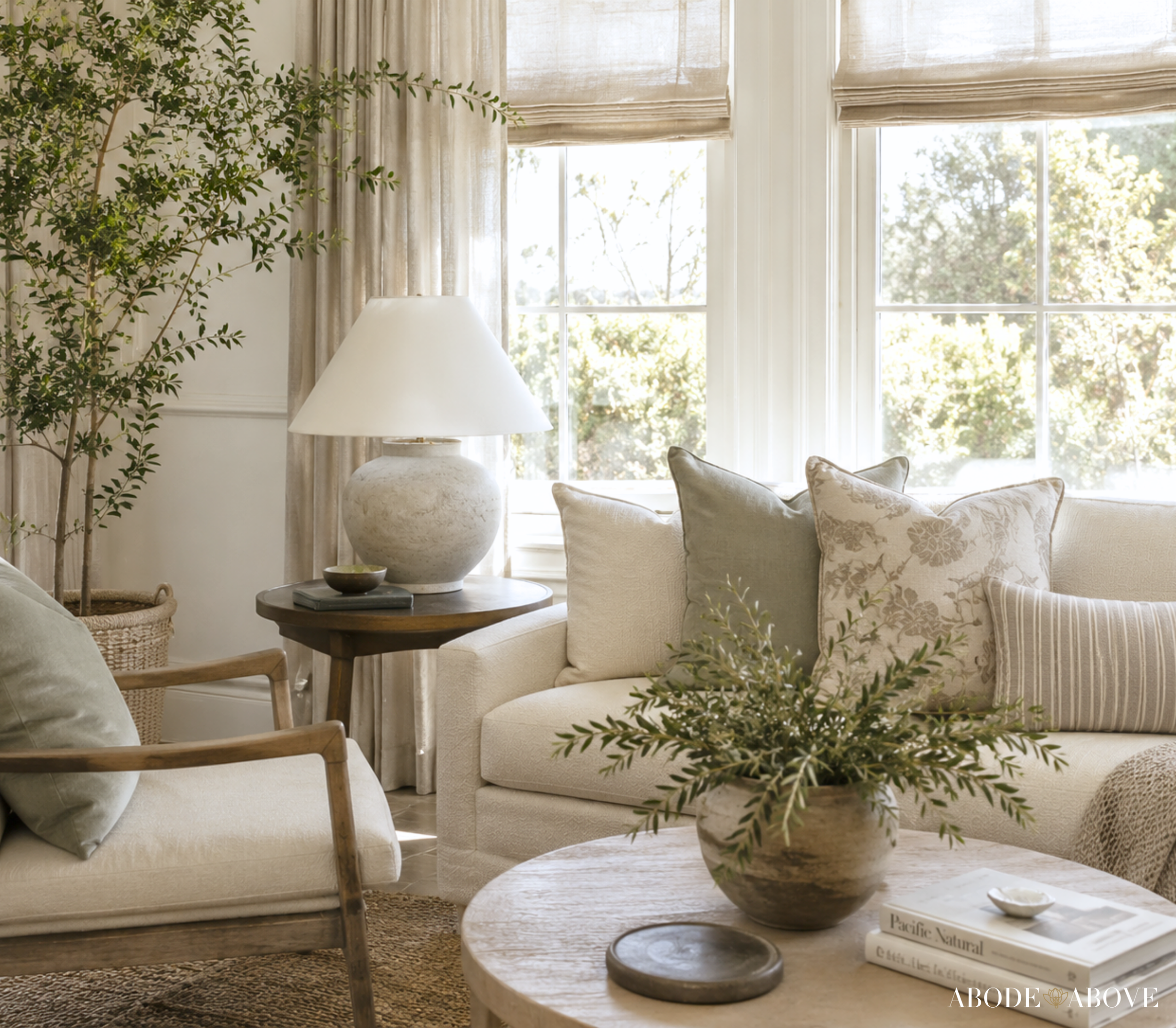
Anchor the room with one of the warm whites on your main walls for a serene, light-filled foundation. Layer the champagne neutral and greige through upholstery, drapery, and a rug, building depth through subtle tonal shifts rather than contrast. Then bring in the gentle blush in soft accents and the smoky taupe and bronze in the deeper details, on lamp bases, frames, and hardware. Natural materials like linen, plaster, and warm wood complete the look. The result is a living room that feels calm, soft, and quietly luxurious, refined without a hint of effort.
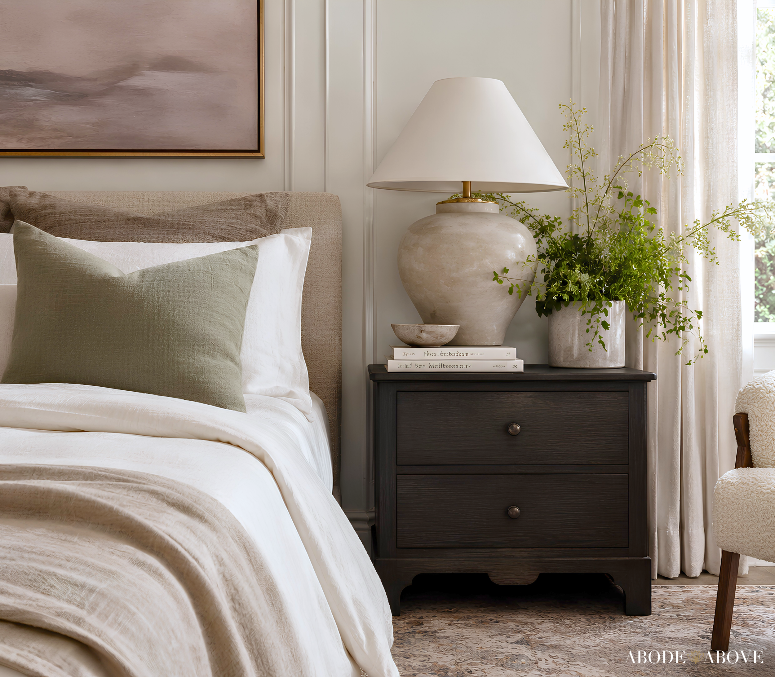
The Primary Bedroom
Bedrooms are the perfect home for this palette's soft restraint. Use a warm white or the champagne neutral on the walls, layer the greige and gentle blush in the bedding and drapery, and keep everything tonal and serene. A touch of smoky taupe grounds the space. It is a bedroom that feels like a luxury retreat, calm, soft, and utterly restful, the kind of room that helps you exhale.
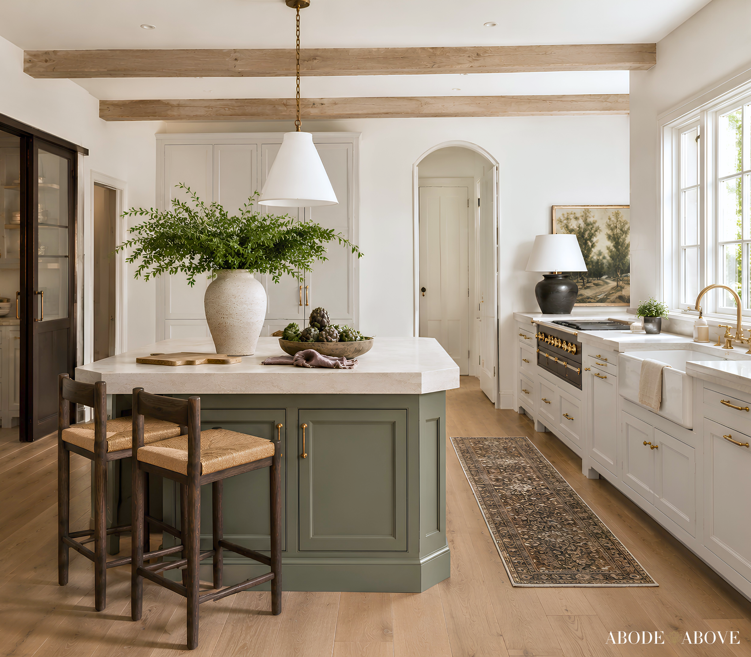
The Home Office
For a refined, calming workspace, take the muted olive onto the walls, the one place this palette lets a real color lead. It is soft, grounded, and quietly sophisticated, ideal for focus, and it pairs beautifully with the warm whites and natural wood. The smoky taupe and bronze add subtle depth. It is an office that feels serene and elevated, a lovely place to think.
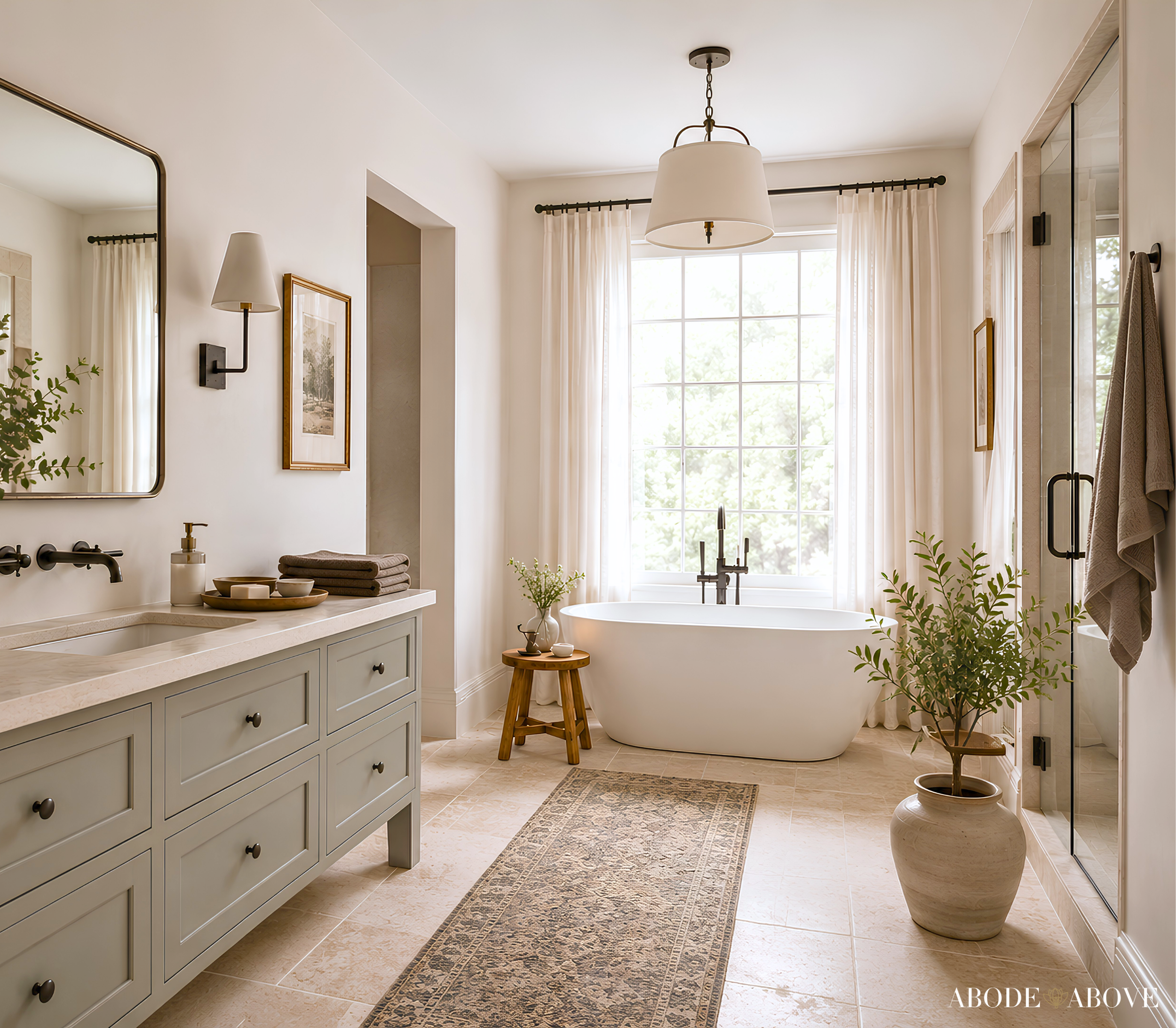
The Bathroom or Dressing Room
For a spa-like bathroom or a refined dressing room, layer the warm whites and champagne neutrals tone on tone, with the smoky taupe on a vanity for subtle depth and a bronze accent for polish. A whisper of blush keeps it warm. It feels custom and serene, the kind of quiet-luxury space that makes getting ready feel like a small daily indulgence.
Making It Work in Your Light
A practical word that matters even more with a palette this subtle. Warm neutrals are the trickiest colors to get right, because they shift more than any others depending on light, often revealing undertones you did not expect. A greige can lean warm in one room and cool in another, and a soft blush or olive can nearly disappear or come forward depending on the hour. Because this whole palette lives in those subtle shifts, sampling is absolutely essential. Order samples, live with them on more than one wall, and study them morning, noon, and night. With a tone-on-tone scheme like this, it is the only way to get the layering exactly right.
Bring an Icon Home
Sovereign is for the home that wants to feel soft, serene, and quietly luxurious, refined and effortless without ever trying too hard. If that sounds like you, this palette is ready in my Etsy shop, Abode Above Colors. Every download includes all nine exact paint colors and codes, the role each color plays, room-by-room placement guidance, and ready-to-use combinations so you know exactly how much of each shade to use and where.
And if you love this soft, quiet-luxury approach, Sovereign belongs to a whole collection of palettes, each inspired by a woman whose style works like a signature. There is a serene jade green, a quiet-luxury desert scheme with range, a timeless ivory-and-chocolate palette, and a tailored menswear-inspired neutral. Come find the one that feels most like you, create something serene and beautiful, and then send me a photo. I would love to see it.
You can shop the full Iconic Women Collection at Abode Above Colors on Etsy, and if you are local to the Delaware Valley and want the full-service version of this kind of color confidence, you know where to find me.

Images in this post are AI-generated for illustrative purposes only.