Fall, All Year Long: 5 Warm Earthy Palettes for Rooms That Feel Like October
A designer's guide to our warm earthy and autumn paint palettes, layered, grounding color schemes full of rust, terracotta, sage, and deep anchors that bring the coziness of October into a home year-round. If you want real color and real depth rather than quiet neutrals, this family delivers warmth you can sink into. Below, an in-depth look at all five, how to layer earthy color for depth, the materials that complete it, and where each palette belongs room by room.
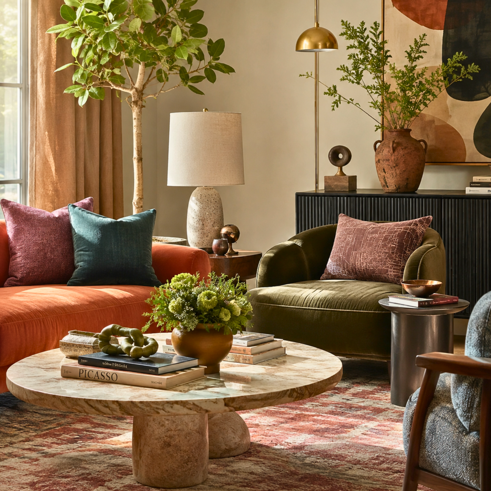
I have a theory that most people, if they're honest, want their homes to feel the way a good October afternoon feels. Warm light, deep color, that cozy-but-alive quality, sweater weather made into a room. This family is exactly that. Warm and earthy, layered and grounding, these are the palettes that carry the richness of autumn into a home you get to live in all twelve months.
What sets this group apart from the neutrals or the boho palettes is the depth. These aren't quiet, barely-there schemes; they have real color and real contrast, rust and terracotta and deep teal and plum, layered over warm neutrals. That layering is the whole point. A warm earthy room should feel like it has depth you can sink into, and the way you get there is by building warm tones up against a genuinely deep anchor. Let me walk you through all five.
Autumn: cozy and enveloping
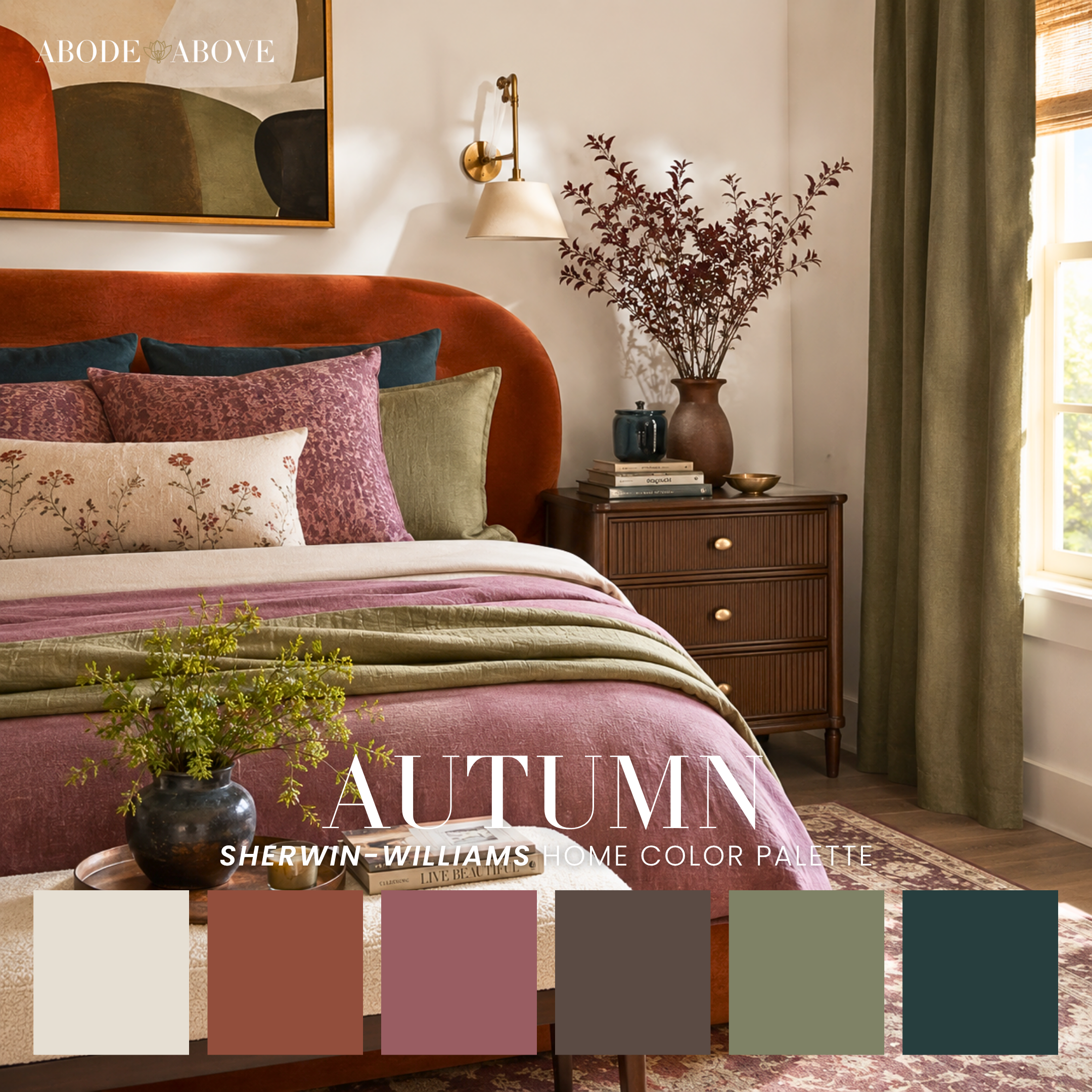
Autumn is the palette that gives the family its name, and it delivers exactly what it promises. Cream and rust with dusty mauve, warm gray-brown, sage, and a deep teal. It's warm and enveloping with real depth, the kind of scheme that makes a bedroom feel like the coziest room in the house, especially a slightly moody one.
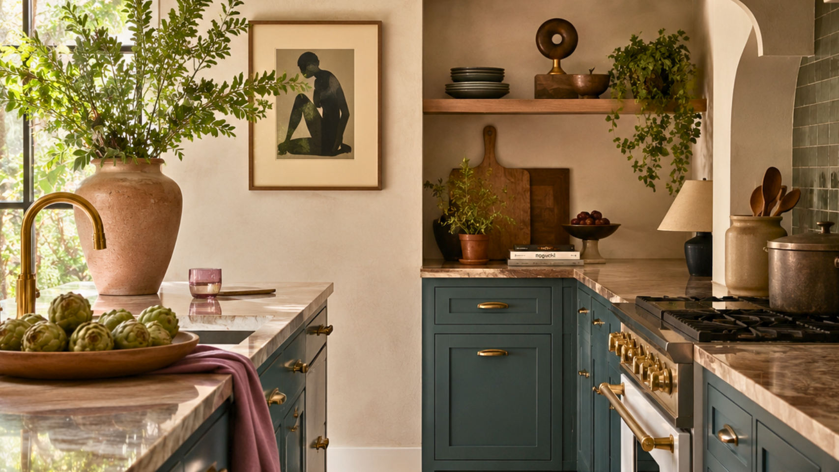
The magic here is the interplay between the warm rust and mauve and that grounding deep teal. The teal is cool and deep enough to keep all the warmth from feeling one-note, and it gives the palette a moody richness that's genuinely enveloping. Lead with the cream and warm gray-brown, let the rust and dusty mauve build the autumnal warmth, weave the sage through as a grounding mid-tone, and use the deep teal as your anchor. Made for a moody bedroom, it also carries beautifully through a whole home for anyone who wants that fall feeling year-round.
Serenity: earthy but calm
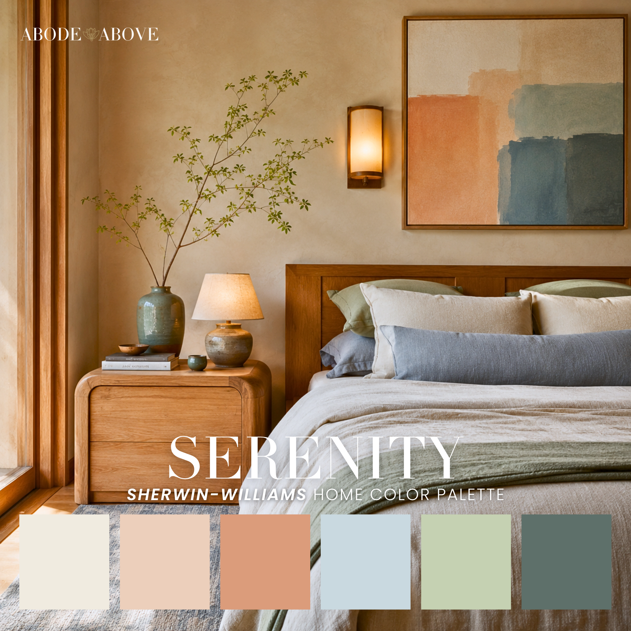
Serenity is the restful member of the family, proof that earthy doesn't have to mean dark or heavy. Cream and warm peach with terracotta, soft blue, sage, and a deep spruce. It's grounded and calming with a gentle southwest warmth, softer and airier than Autumn but still rooted in real earth tones.
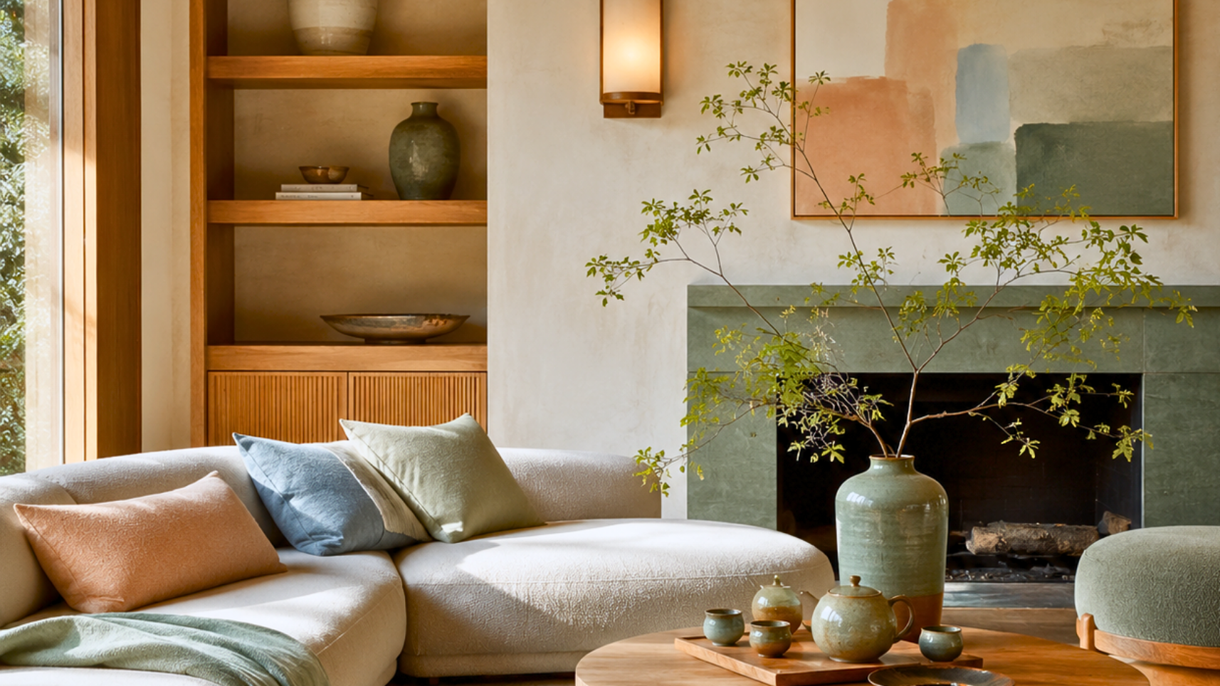
What I love about Serenity is how the soft blue and sage lighten the earthy palette without stripping its warmth. It feels sun-warmed rather than cozy-dark, which makes it wonderful in a serene bedroom or a whole home where you want warmth and calm together. Lead with the cream and warm peach, let the terracotta bring the earthy richness, use the soft blue and sage as your calming counterweights, and let the deep spruce ground the scheme. It's the warm earthy palette for someone who wants restful over enveloping.
Hearth: layered autumn warmth
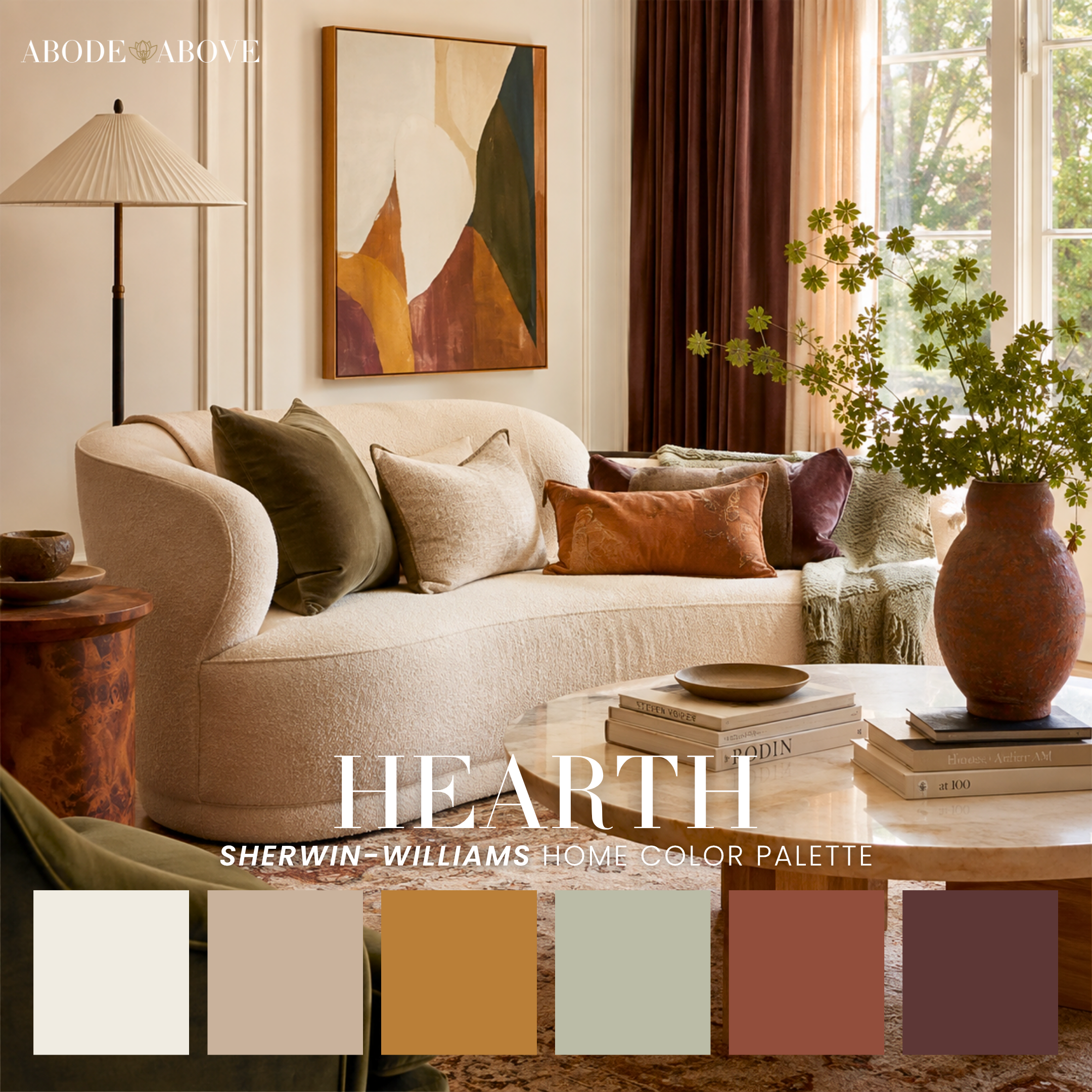
Hearth is the classic cozy-earthy living room in palette form. Cream and warm tan with golden ochre, sage, rust, and a deep plum. It's layered and grounding with a real autumn warmth, and it has that gathered, natural-depth quality that makes a living room feel welcoming and rich.
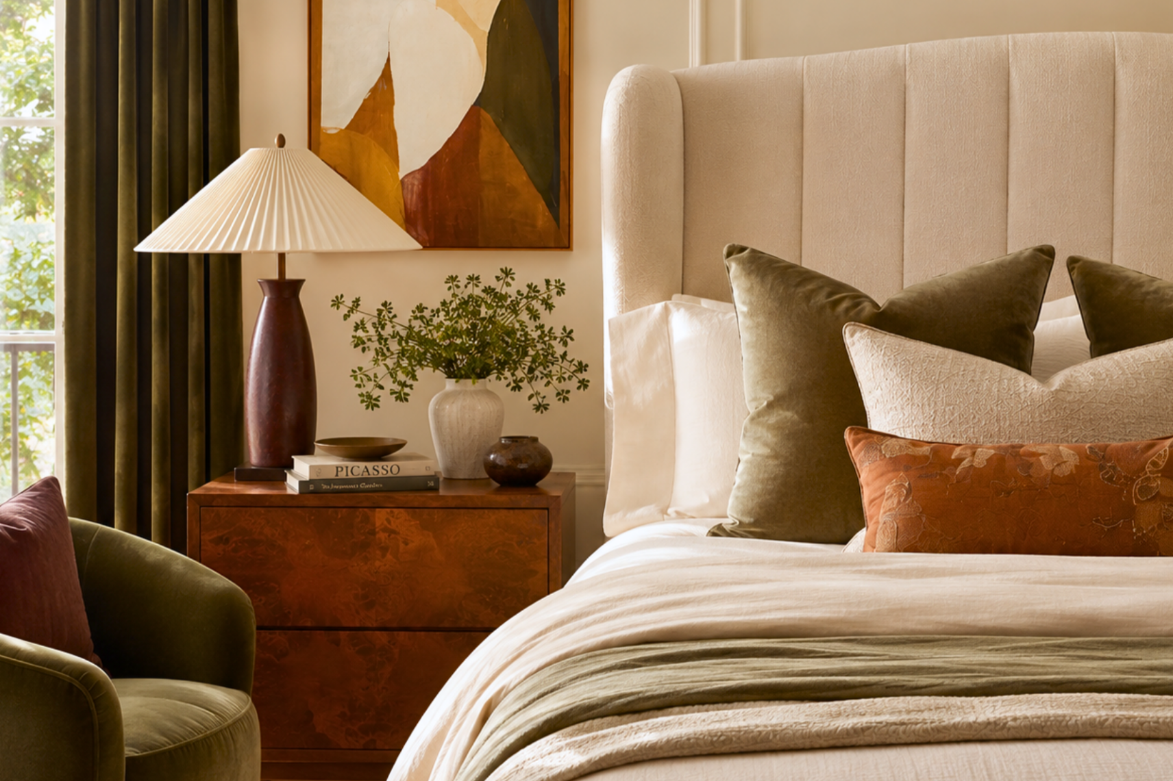
The golden ochre and rust give Hearth its glowing warmth, while the deep plum anchors everything with a sophisticated richness. The sage keeps it earthy and natural rather than purely warm. Lead with the cream and warm tan, build the golden ochre and rust through your mid-tones and textiles, weave the sage in for natural grounding, and let the deep plum be your anchor, on an accent, a piece of upholstery, or a bit of trim. Made for a living room, it's a whole-home scheme with genuine natural depth, the kind of warmth that makes people want to stay a while.
Manifest: fresh, garden-room warmth
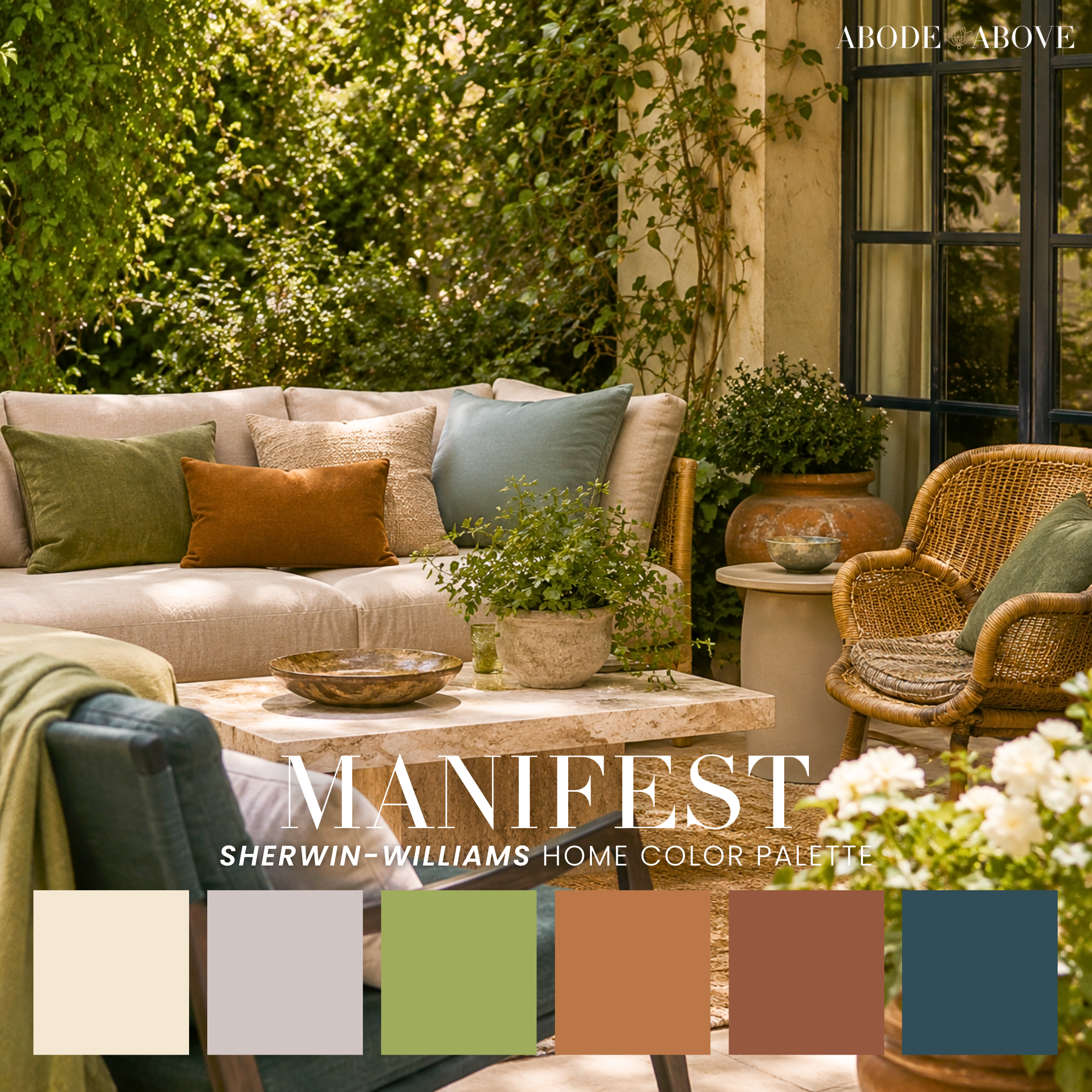
Manifest is the freshest and most unexpected of the five. Cream and dusty lilac-gray with apple green, terracotta-clay, brick, and a deep teal. It's warm and earthy but with a garden-room brightness, the apple green and dusty lilac-gray lift it into something livelier than the rest of the family.
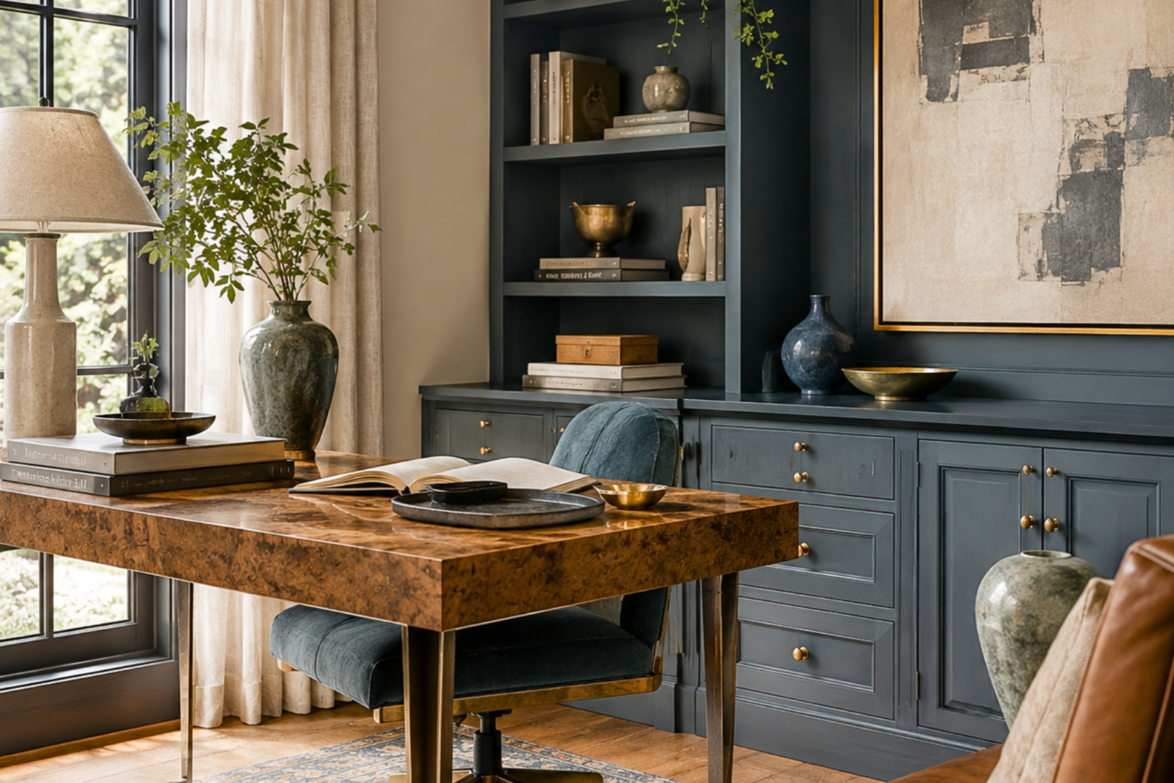
This is the earthy palette for someone who wants warmth with a little life and freshness in it. The apple green is a genuine surprise, a fresh, growing note against all the warm clay and brick, and it makes Manifest feel especially wonderful for indoor-outdoor living, a garden room, a sunroom, a space that connects to the outside. Lead with the cream and dusty lilac-gray, let the terracotta-clay and brick bring the earthy warmth, let the apple green add its fresh lift, and use the deep teal to ground it all. It's earthy color with the windows open.
Favorite Things: grounded and inviting
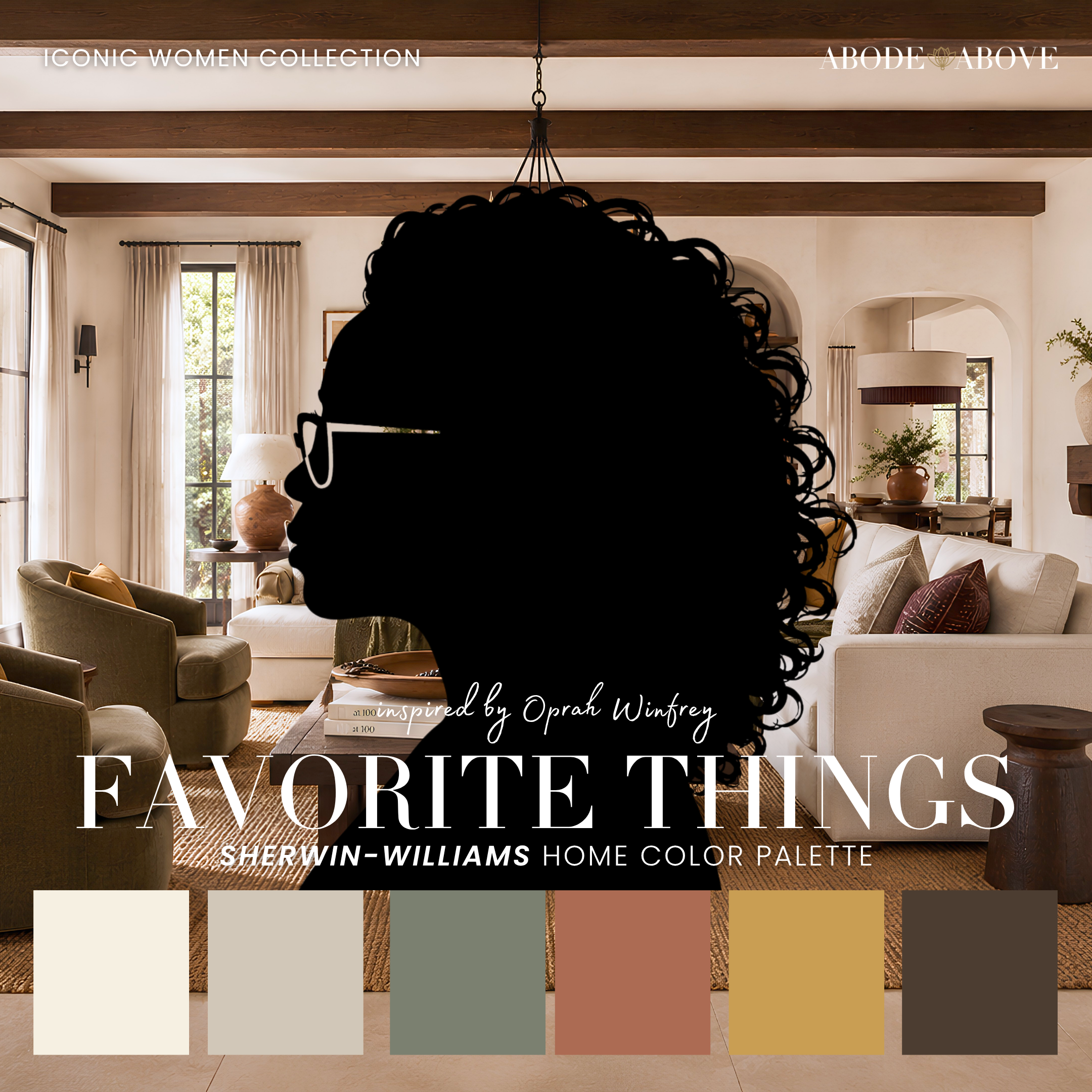
Favorite Things rounds out the family with a modern-organic, southwest calm inspired by THE Oprah Winfrey, as part of our Iconic Women Collection. Cream and warm greige with sage-green, terracotta-rust, golden mustard, and a deep brown. It's grounded and inviting, sitting right at the intersection of warm earthy and modern organic, which makes it one of the most livable, versatile palettes in the group.
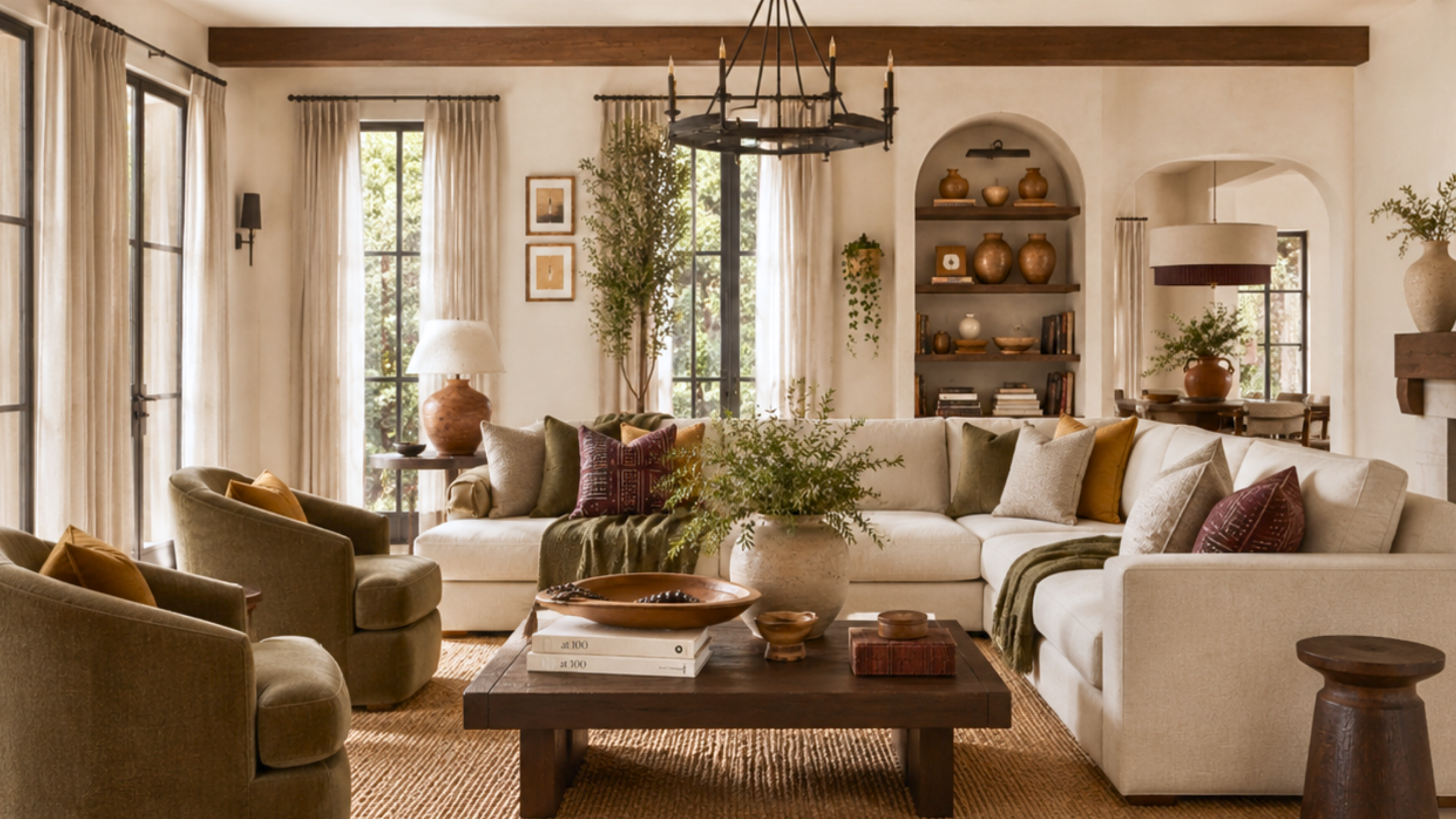
The sage-green and warm greige give it a modern-organic calm, while the terracotta-rust and golden mustard bring the earthy warmth, and the deep brown grounds everything naturally. Lead with the cream and greige, let the sage carry the calm, build the terracotta and mustard warmth through your mid-range, and use the deep brown as your grounding anchor. Made for a living room, it's a beautiful whole-home scheme for someone who wants earthy warmth delivered with a calm, modern hand.
Putting it to work, room by room
Warm earthy color has cozy homes throughout a house, and each palette has a room where it shines.
In a bedroom, Autumn and Serenity lead. Autumn is enveloping and moody, perfect for a cocooning retreat; Serenity is softer and calmer, restful without going dark. Both make a bedroom feel warm and grounded.
In a living room, Hearth and Favorite Things are the standouts, layered, welcoming, and rich, the kind of space where people settle in and stay. Lead with the neutrals, build the warmth, and let the deep plum or brown anchor.
In a dining room, the deeper, richer palettes create wonderful gathering spaces. A dining room can take enveloping warmth beautifully, because it's a room meant to feel like an occasion, especially by candlelight and warm lamplight.
In a sunroom or garden room, Manifest is made for it, that fresh apple green and terracotta bringing the outside in.
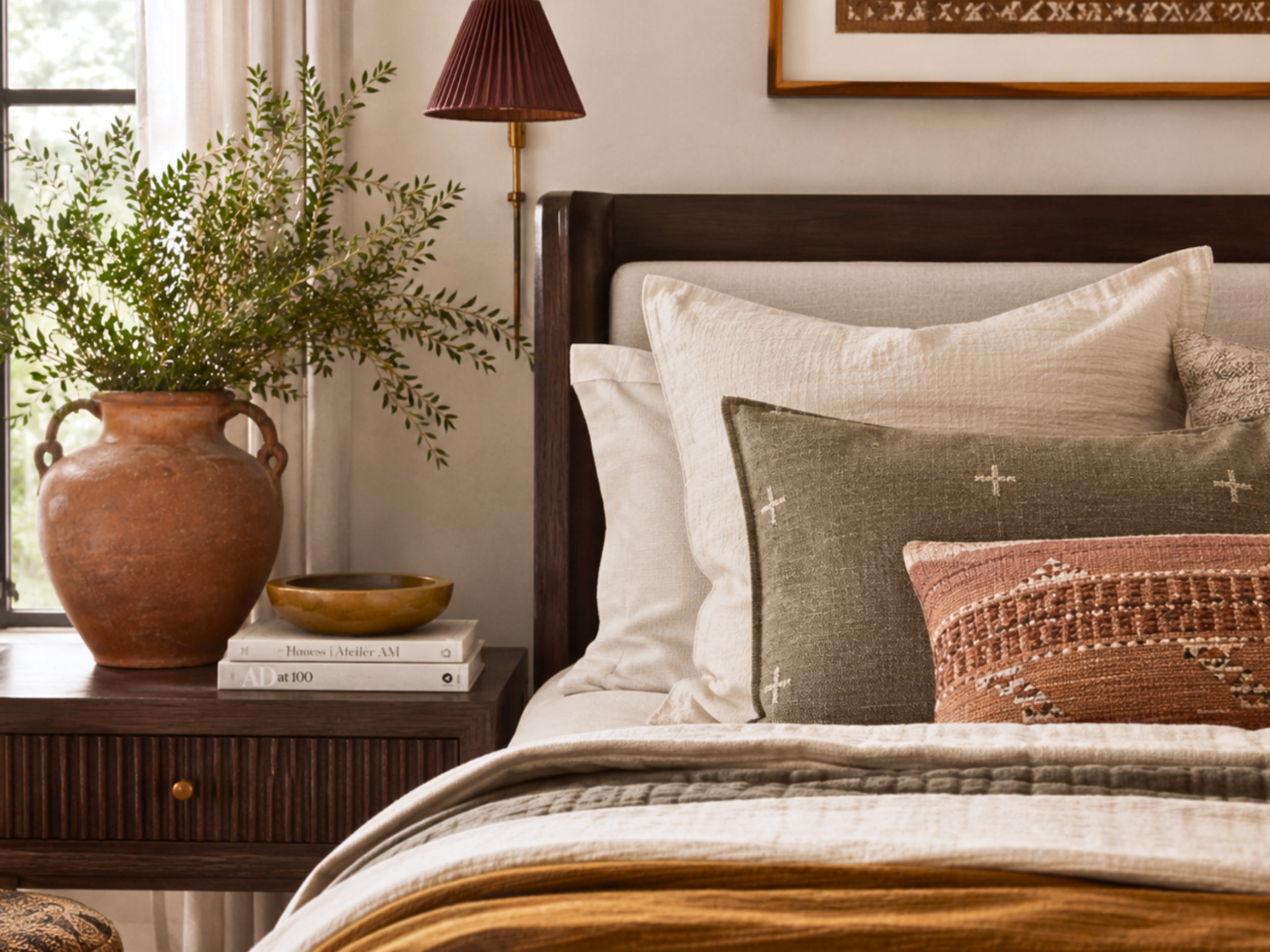
In a kitchen, Favorite Things and Hearth both work beautifully, warm and grounded, with the deep anchor making a rich island or lower-cabinet color against warmer walls.
Light, texture, and making earthy depth glow
Warm earthy palettes are made for warm light, and they reward it. In south and west light, rust, terracotta, golden ochre, and mustard glow with a golden-hour richness that's the entire appeal of this family. In cooler north light, the warmth is forgiving and still reads well, but you'll want to lean on the richest members (Autumn, Hearth) and fill in with warm lamplight so the colors keep their glow rather than going flat. These are palettes that come alive under warm bulbs and layered lighting and can lose their soul under cool overhead light alone, so light them warmly and generously.
Texture is what turns "warm and brown" into "warm and rich." Because these palettes carry real depth, they want materials with real character to match: nubby wool, chunky knits, leather, aged wood, jute and sisal, hand-thrown ceramics, and woven baskets. Natural fibers and matte finishes soak up and soften the warm light beautifully, while a little warm metal, brass, bronze, aged copper, picks up the golden tones in the palette and adds a subtle glow. The deep anchor in each scheme (the teal in Autumn and Manifest, the plum in Hearth, the spruce in Serenity, the brown in Favorite Things) is your best tool for grounding all that warmth; give it a real home on a wall, a cabinet, or a substantial piece of furniture so the room has depth and contrast rather than a single warm wash.
The whole feeling you're chasing here is the best day of fall, warm, layered, a little cozy, full of natural richness, and the way you get there is by pairing these deep, warm colors with equally warm, natural, tactile materials and warm, layered light.
How to work with warm earthy color
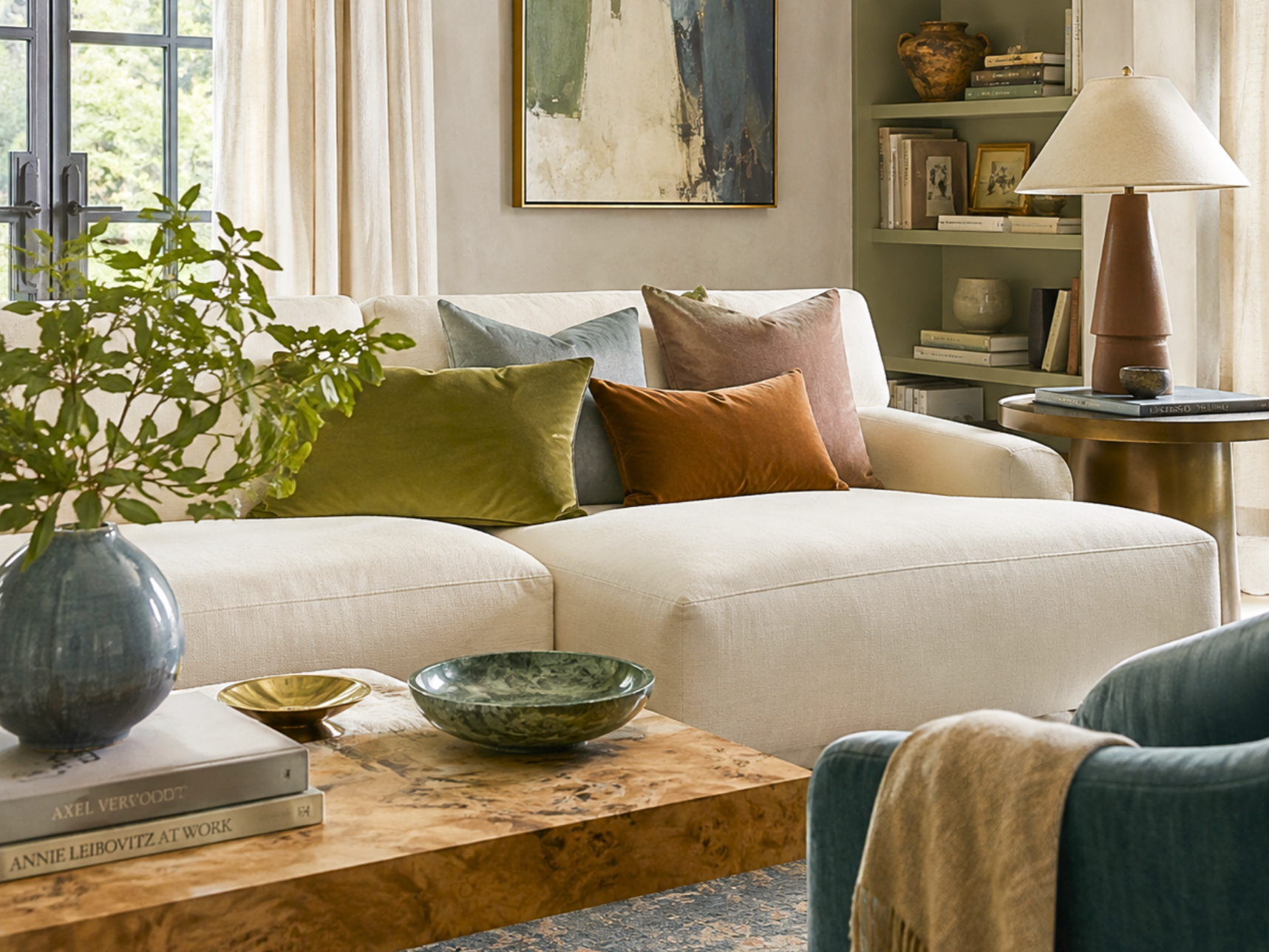
This family is all about depth and layering, so here's how to do it well.
Build warmth in layers, don't dump it. The richness in these palettes comes from stacking warm tones, tan, ochre, rust, terracotta, in deliberate layers, not from painting everything one warm color. Lead with your neutrals, then build the earthy tones up gradually through mid-tones, textiles, and accents. Layered warmth reads as depth; flat warmth reads as brown.
Respect the anchor. Every palette here has a deep, grounding color, the deep teal in Autumn and Manifest, the plum in Hearth, the spruce in Serenity, the brown in Favorite Things. That anchor is what gives the warmth its depth and keeps the whole scheme from feeling one-note. Use it with intention.
Let natural light and warm lamplight do the rest. Warm earthy palettes glow in warm light and can feel a little flat under cool overhead lighting. Lean into warm bulbs, layered lamps, and the natural light your rooms get, and these colors will reward you with that golden-hour feeling all day.
These are deeply comforting palettes to live with, and getting the layering and the anchor right is what turns "warm and brown" into "warm and rich." If you want help choosing between the enveloping coziness of Autumn, the calm of Serenity, the classic warmth of Hearth, the freshness of Manifest, or the modern-organic ease of Favorite Things, and figuring out how to layer the warmth so your rooms have real depth, that's exactly the kind of cozy, layered project I love most. A great warm earthy room feels like the best day of fall, and building that feeling is worth doing with care.
Now go make October last all year.