Jaded: A Serene Green Palette With One Bold Surprise
The most powerful rooms are not always the loudest ones. Jaded is a nine-color Sherwin-Williams palette built on that idea: silk whites, layered jade green, warm woven neutrals, and exactly one strike of lacquer red. It is graceful, disciplined, and calm, right up until that single red moment reminds you it was never actually quiet. If you love serene, elegant spaces with a hidden edge, this palette is for you.
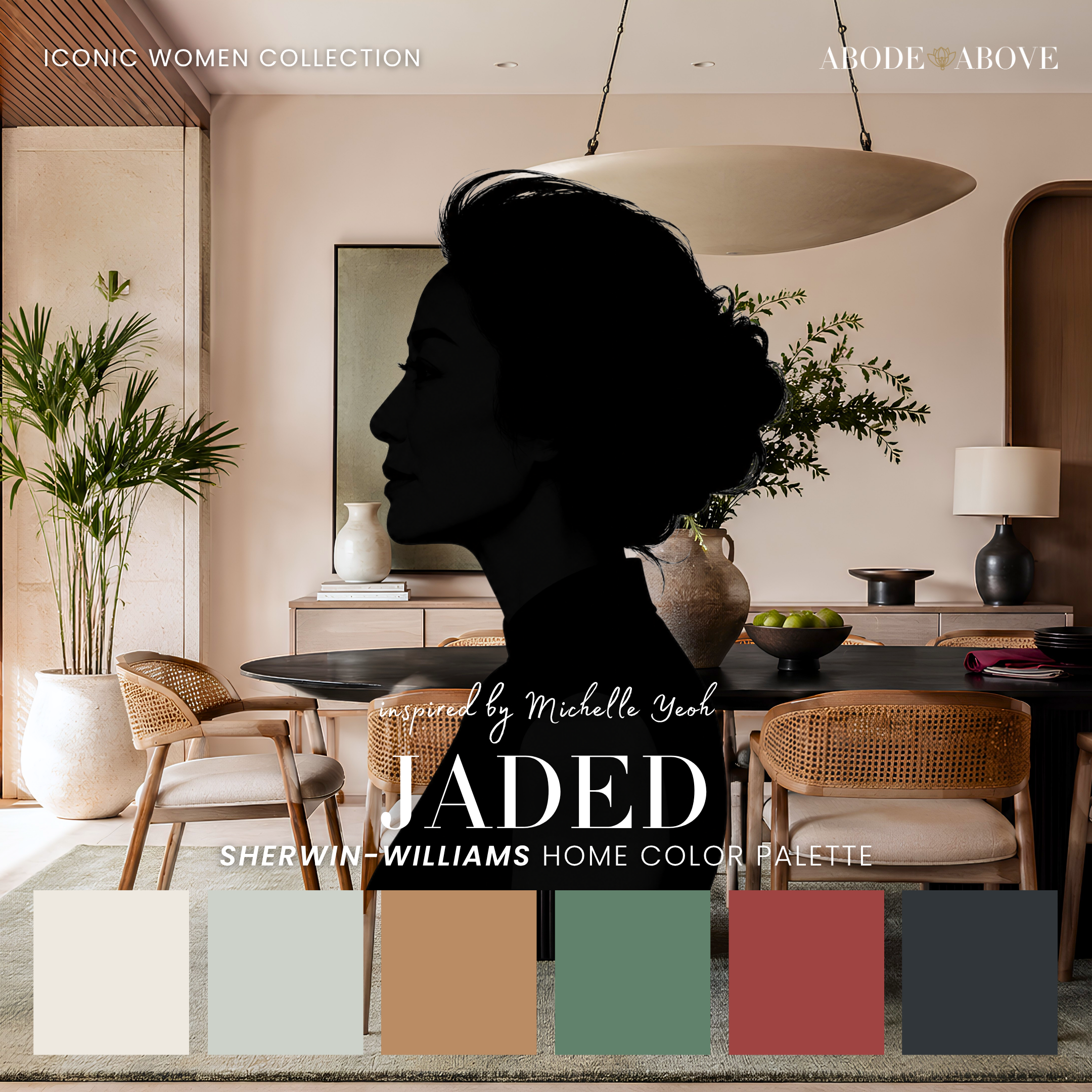
The Woman Behind the Palette
Jaded is inspired by Michelle Yeoh, whose entire presence is a lesson in the power of restraint.
For decades she performed her own stunts with breathtaking grace, moving through some of the most demanding action roles ever filmed while making every motion look effortless. Then, in a moment that meant something to people all over the world, she won the Academy Award and reminded everyone watching never to let anyone tell them they are past their prime. Her style, like her work, is discipline and elegance in equal measure. Nothing is wasted, nothing is loud, and yet the impact is total.
That is exactly how I wanted this palette to feel. So much of good design is knowing what to leave out. A room does not need ten colors and a dozen competing focal points to feel rich. It needs a few beautiful, intentional choices and the confidence to let them breathe. Michelle Yeoh has built an entire legendary career on that kind of precision, and Jaded is my attempt to translate it into paint.
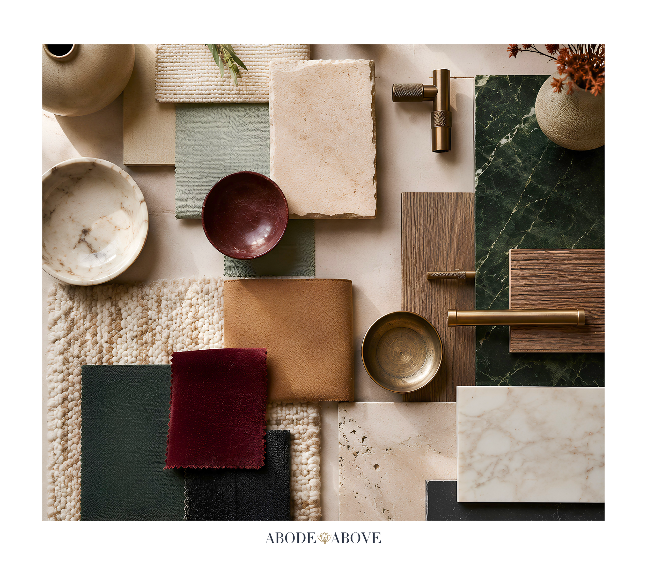
The Palette at a Glance
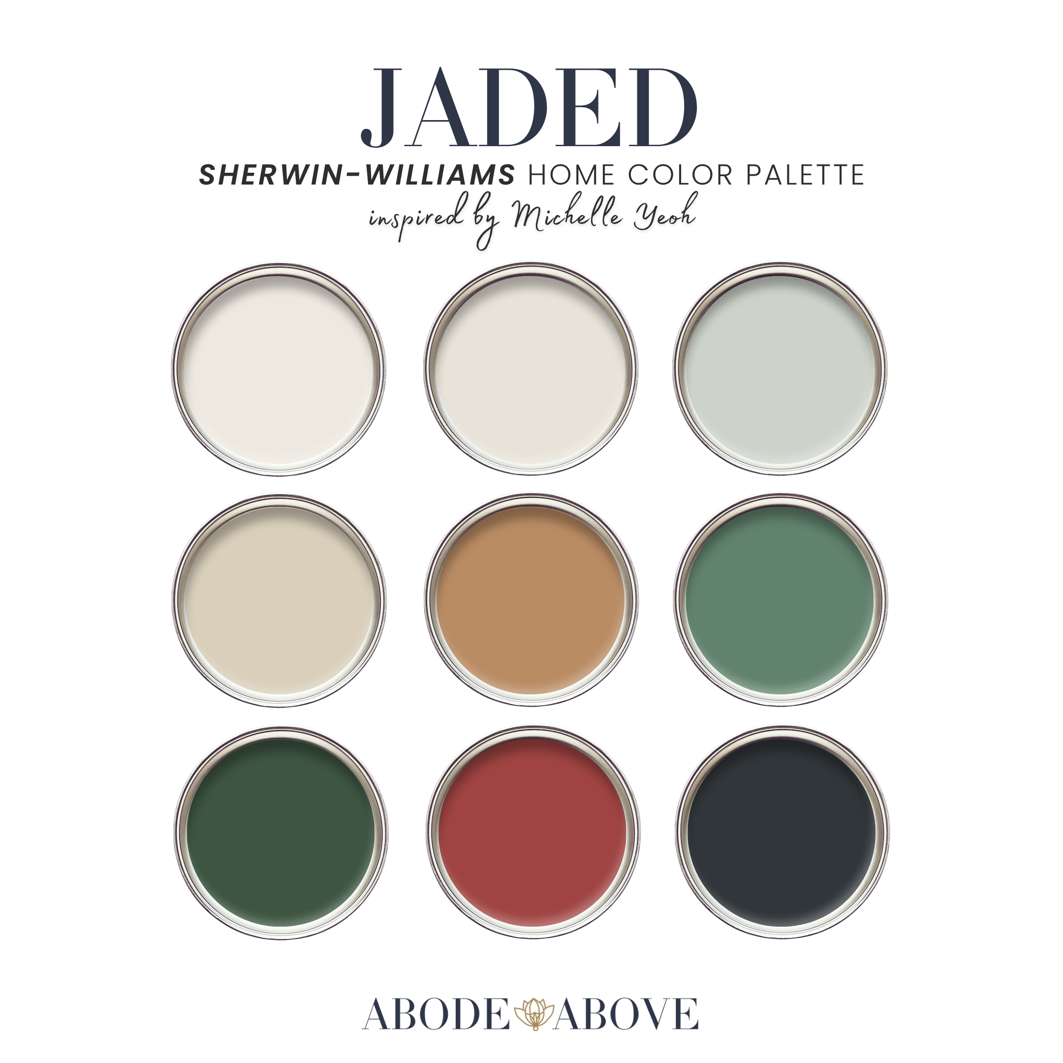
Jaded is composed with the same architecture I use for every client: two undertone-matched whites, a band of livable mid-tones, deep grounding shades, and a single, deliberate accent. The whites here are soft and silken, the kind that diffuse light gently rather than bouncing it around. A pale celadon green whispers the palette's theme before it fully arrives. Warm woven neutrals, a raw-silk tone and a deeper woven tan, bring in earth and texture so the greens never feel cold. Then the heart of the palette: a true jade green and its deeper counterpart, drawn from the same color family for real tonal discipline. Grounding everything is a deep ink black. And the one strike of drama, held in reserve, is a lacquer red.
The discipline is the whole point. The two jades belong to the same family on purpose, so the palette layers seamlessly rather than clashing. And that single red is powerful precisely because it is alone. One perfect accent will always do more than five competing ones.
How to Use Jaded in Your Home
This is a palette that rewards a light hand, so lean on the 60-30-10 ratio: roughly 60 percent of a room in your main color, 30 percent in a secondary, and the last 10 percent in accents. With Jaded, that final ten percent is where the magic hides.
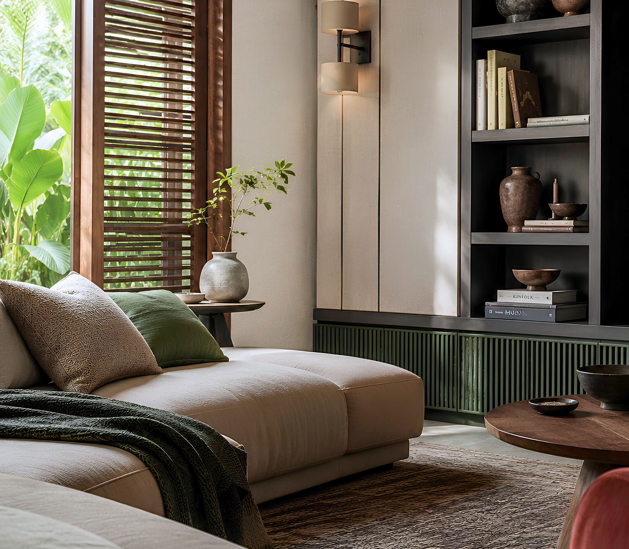
The Living Room
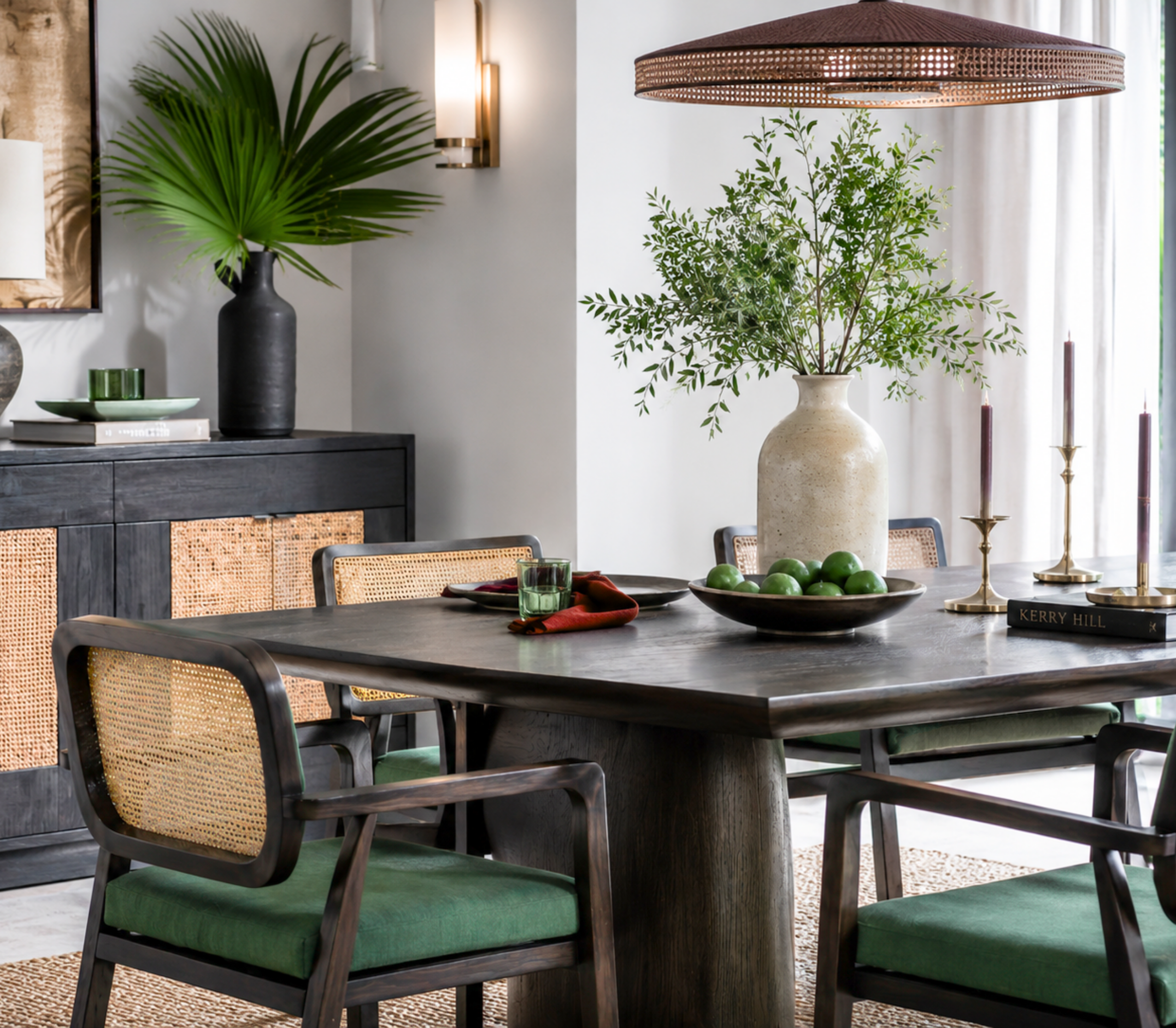
Set the tone with one of the soft silk whites on your main walls, keeping the space calm and full of light. Bring in the warm woven tan as your secondary through natural textures, a jute rug, linen upholstery, wood tones, so the room feels grounded and serene. Then introduce the jade green in considered doses: a velvet chair, ceramics, a stack of books, a single piece of art. Save the lacquer red for one small, breathtaking moment, perhaps a lacquered box or a single lamp. The effect is a living room that feels like a deep exhale, with just enough tension to stay interesting.
The Bathroom
A bathroom is a wonderful place for the celadon and jade to shine. Take the pale celadon onto the walls for a spa-like calm, or go deeper and put the true jade on a vanity for something that feels both fresh and jewel-like. Paired with the silk whites and warm brass fixtures, a jade bathroom feels custom and quietly luxurious. This is one of my favorite ways to use green: it is unexpected in a bath, and it always reads as intentional and high-end.
The Bedroom
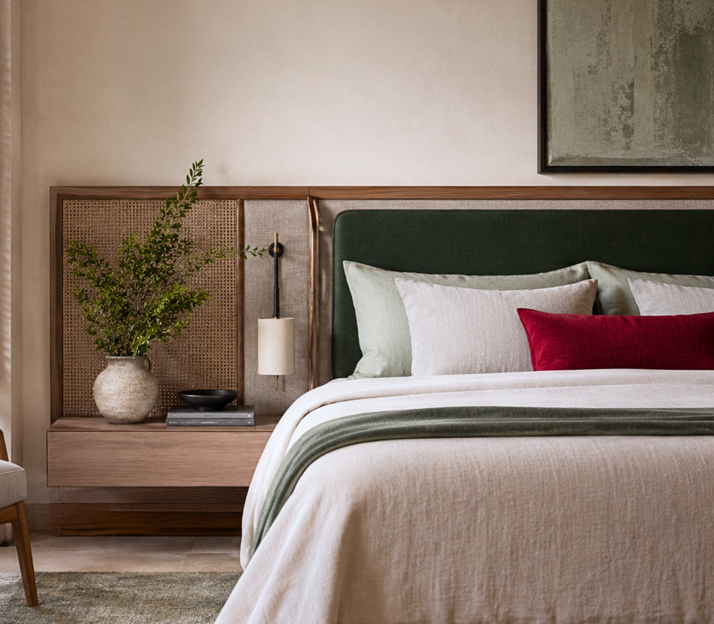
Bring the deeper jade forward here for a cocooning, restful feeling, balanced with the silk whites and woven neutrals so the room never feels heavy. This is a space where the discipline of the palette really pays off: the layered greens create depth and calm at once. Keep the ink black for small accents, the hardware, a lamp base, a picture frame, and let the lacquer red sit out entirely, or appear in a single object if you want one spark.
The Study or Front Door
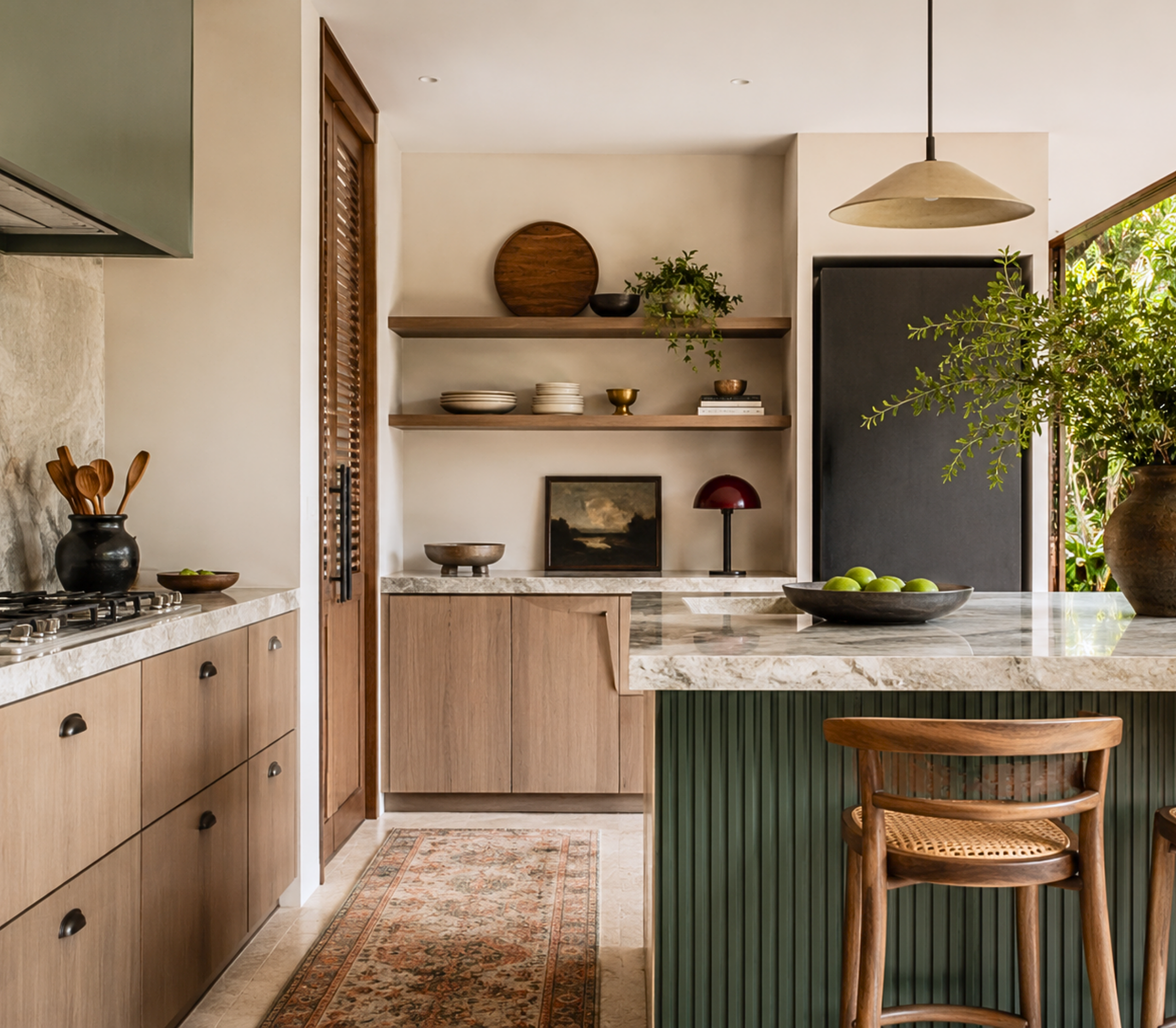
If you want the full drama of that lacquer red, give it one perfect home. A study with jade walls and a single red-lacquered door or cabinet is unforgettable. Or paint your front door the lacquer red against a calm exterior for a first impression that is confident without saying a word. This is the palette's thesis in action: restraint everywhere, then one decisive strike.
Making It Work in Your Light
A note worth taking seriously with this palette. Greens are famously light-sensitive, shifting between fresh, gray, and moody depending on the room. The celadon that looks like a soft mist in one home can read almost gray in another. That variability is exactly why sampling is non-negotiable. Order samples, live with them on more than one wall, and check them across the full day before you buy your gallons. It is the cheapest, smartest step in the whole process, and with greens especially, it is the difference between the color you imagined and a surprise you did not want.
Bring an Icon Home
Jaded is for the home that understands quiet power: serene, disciplined, elegant, with one bold secret. If that is the feeling you are after, this palette is waiting in my Etsy shop, Abode Above Colors. Each download includes all nine exact paint colors and codes, the role every color plays, room-by-room placement guidance, and ready-to-use combinations so you know exactly how much of each shade to use and where.
And if you love this serene, layered approach, Jaded belongs to a whole collection of palettes, each inspired by a woman whose style works like a signature. There is a soft California quiet-luxury scheme, a tailored menswear-inspired neutral, a warm and glamorous gold, and a dramatic emerald palette if you want your green with even more theater. Come find the one that feels most like you, create something beautiful, and then send me a photo. I would truly love to see it.
You can shop the full Iconic Women Collection at Abode Above Colors on Etsy, and if you are local to the Delaware Valley and want the full-service version of this kind of color confidence, you know where to find me.

Images in this post are AI-generated for illustrative purposes only.