Rhinestones: A Sweet, Bold Palette With Steel Underneath
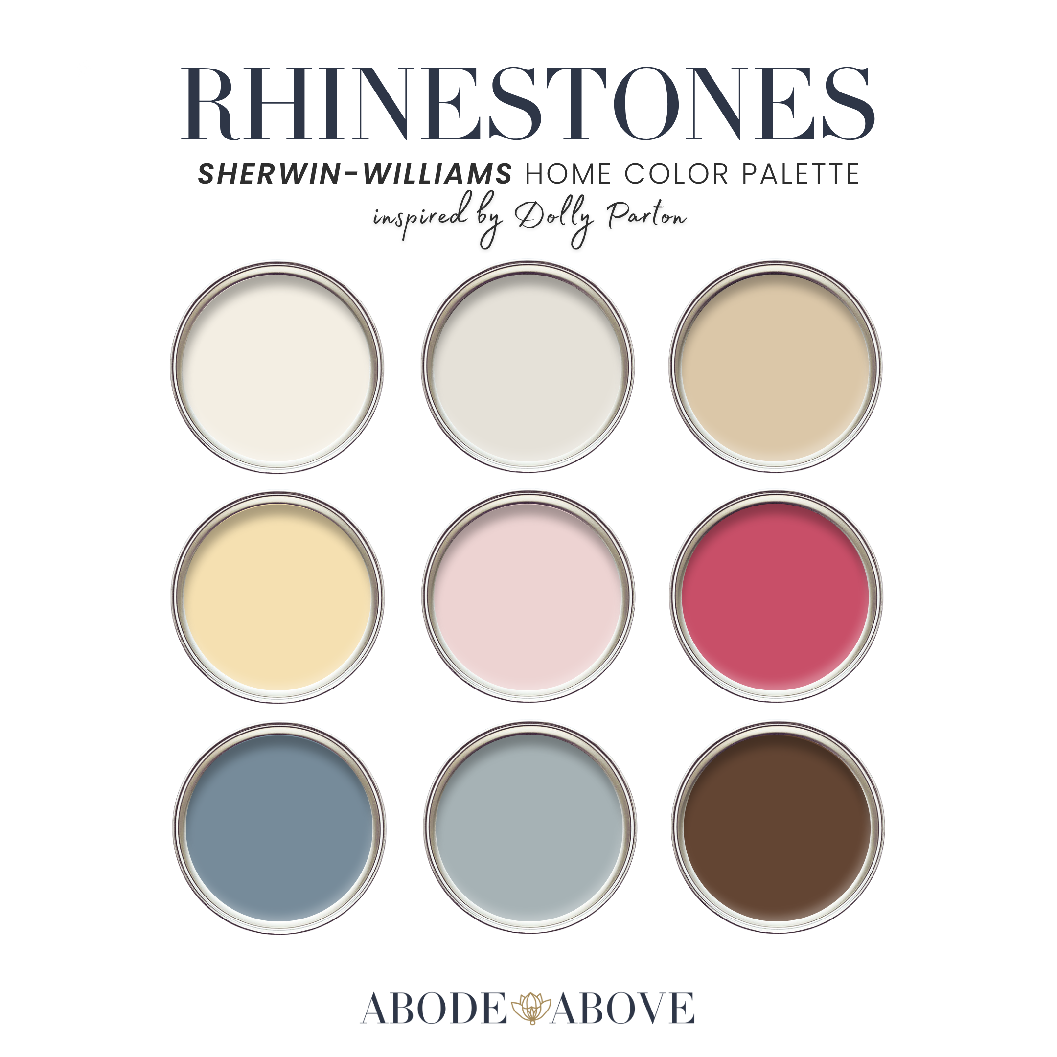
Sweet and strong are not opposites. Rhinestones proves it: a nine-color Sherwin-Williams palette built on butter blonde, two unapologetic pinks, faded workwear denim, and mountain-haze blue, all grounded in deep coffee brown. It is cottage glam with a backbone, and if you love color that is joyful and feminine but never fragile, this is the palette I made for you.
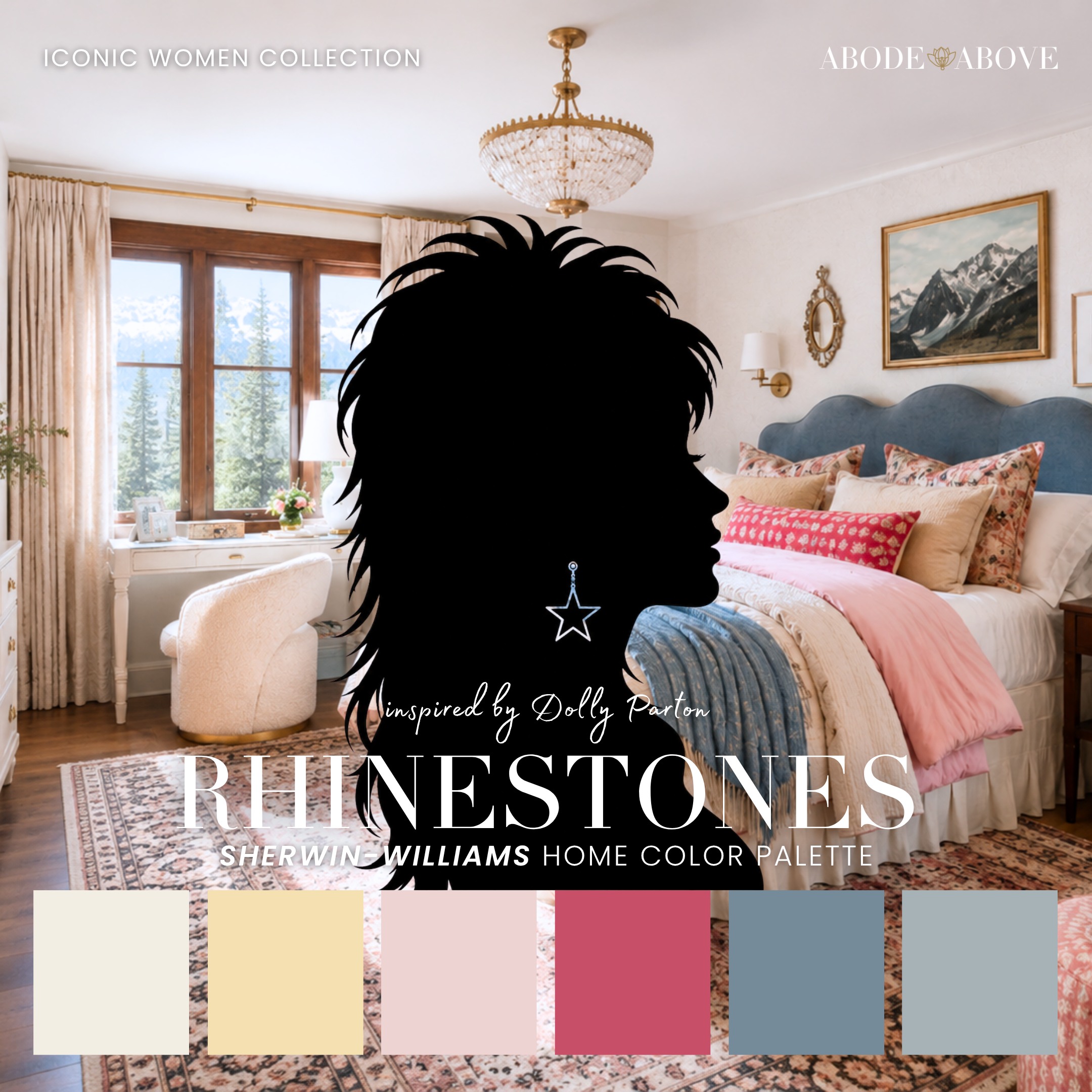
The Woman Behind the Palette
Rhinestones is inspired by Dolly Parton, and I could not be more delighted about it.
She wrote some of the greatest songs in American music, built a genuine business empire, and funds childhood literacy at a staggering scale, all while wearing more rhinestones than anyone alive. People have underestimated her sweetness for sixty years, and she has let them, right up until the moment they realize she owns the whole operation. That is the magic of Dolly: pure warmth on the surface, pure steel underneath. Big hair, big heart, and a spine of iron.
That is precisely the balance I wanted in this palette. It would have been easy to make something simply pretty and pink, but Dolly is so much more than that, and so is this scheme. Rhinestones pairs its sweet blondes and bold pinks with faded workwear denim and a deep, honest brown, giving you a palette that is joyful and feminine but also grounded and strong. Sweetness with substance, exactly like her.
The Palette at a Glance
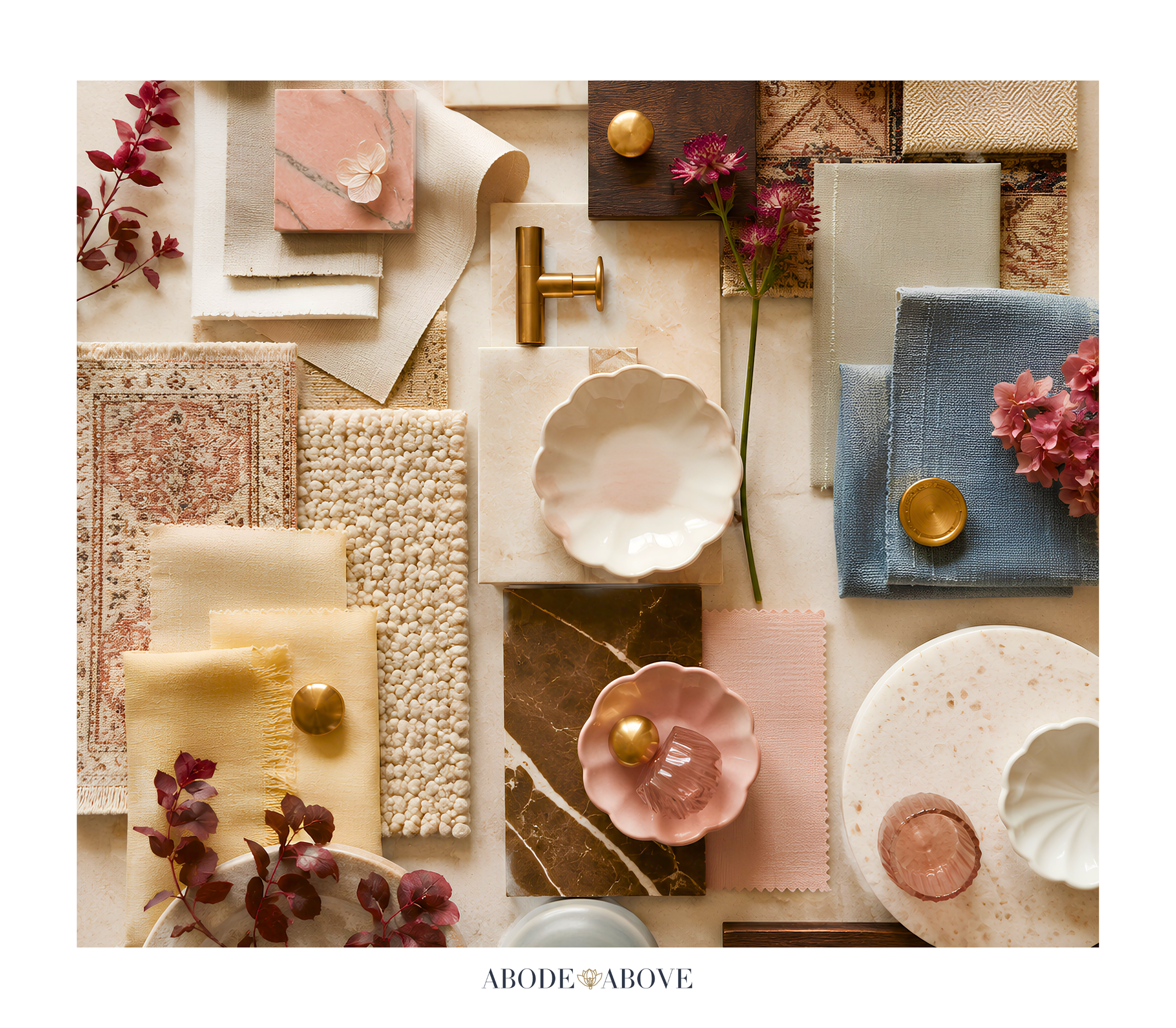
This palette uses my usual architecture, tuned for warmth and sparkle: two soft, welcoming whites for a porch-friendly foundation, then a run of joyful and grounded color. A butter-blonde yellow brings the sunshine. A sweet soft pink and a bold hot pink give you the full range of Dolly's femininity, from dreamy to showstopping. A faded workwear denim adds that nine-to-five backbone, a hazy blue-gray captures the Smoky Mountains themselves, and a deep coffee brown grounds it all.
The secret here is the denim and brown. They are what keep the pinks and blonde from ever feeling saccharine. That grounding is the steel under the sweetness, and it is what makes this palette feel like a real, livable home rather than a costume.
How to Use Rhinestones in Your Home
A palette with this much personality needs the 60-30-10 ratio to stay balanced: about 60 percent of a room in a calm main color, 30 percent in a secondary, and only the last 10 percent in the boldest pops. That structure lets you enjoy the sparkle without the room becoming too much.
The Living Room
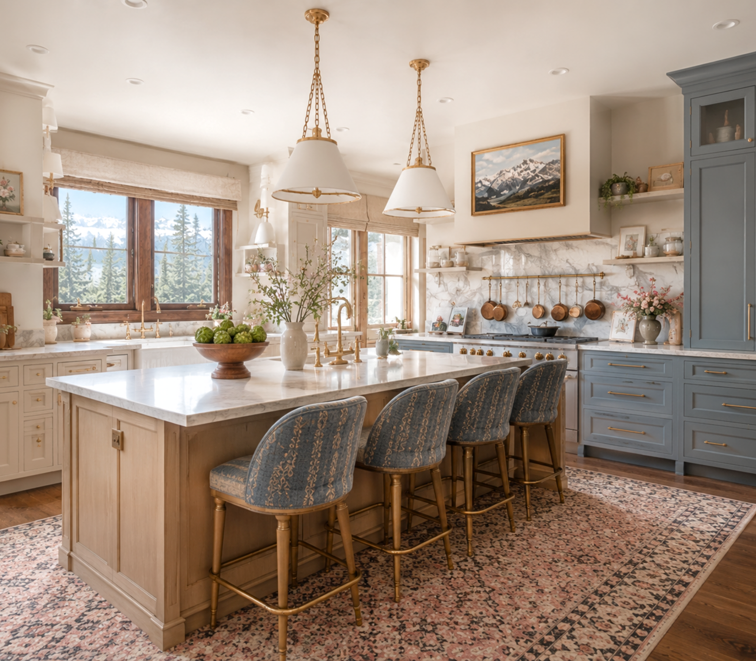
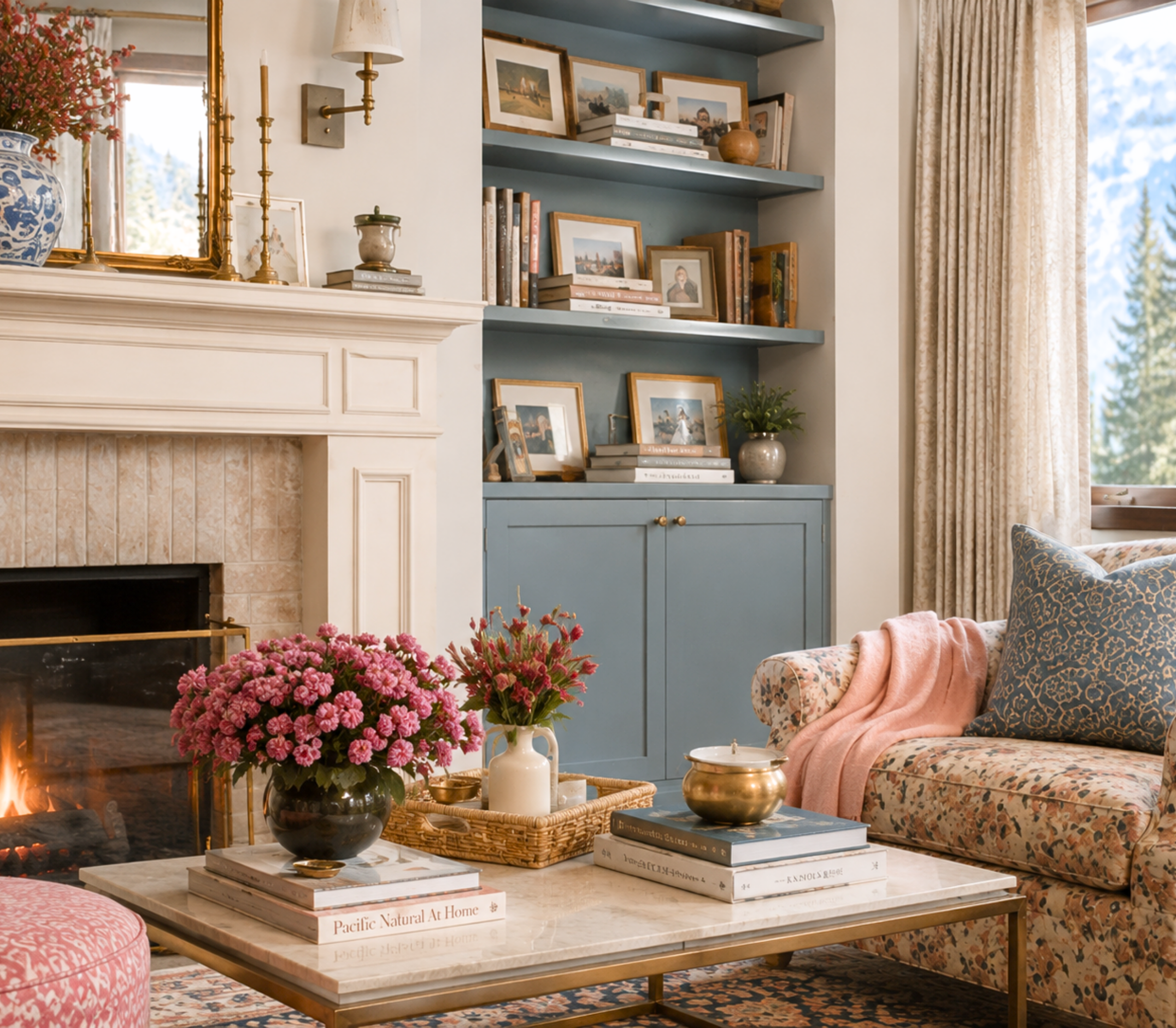
Start with a soft warm white or the golden buff on your main walls for a cozy, welcoming base. Bring in the faded denim as a secondary through upholstery, a rug, or drapery, which grounds the room and cools the sweetness. Then let the pinks come out to play in your ten percent, a sweet-pink pillow here, a hot-pink lamp or piece of art there, with the coffee brown showing up in the wood tones and leather. The result is a living room that feels warm, joyful, and a little glamorous, but still like a place you can put your feet up.
The Bedroom
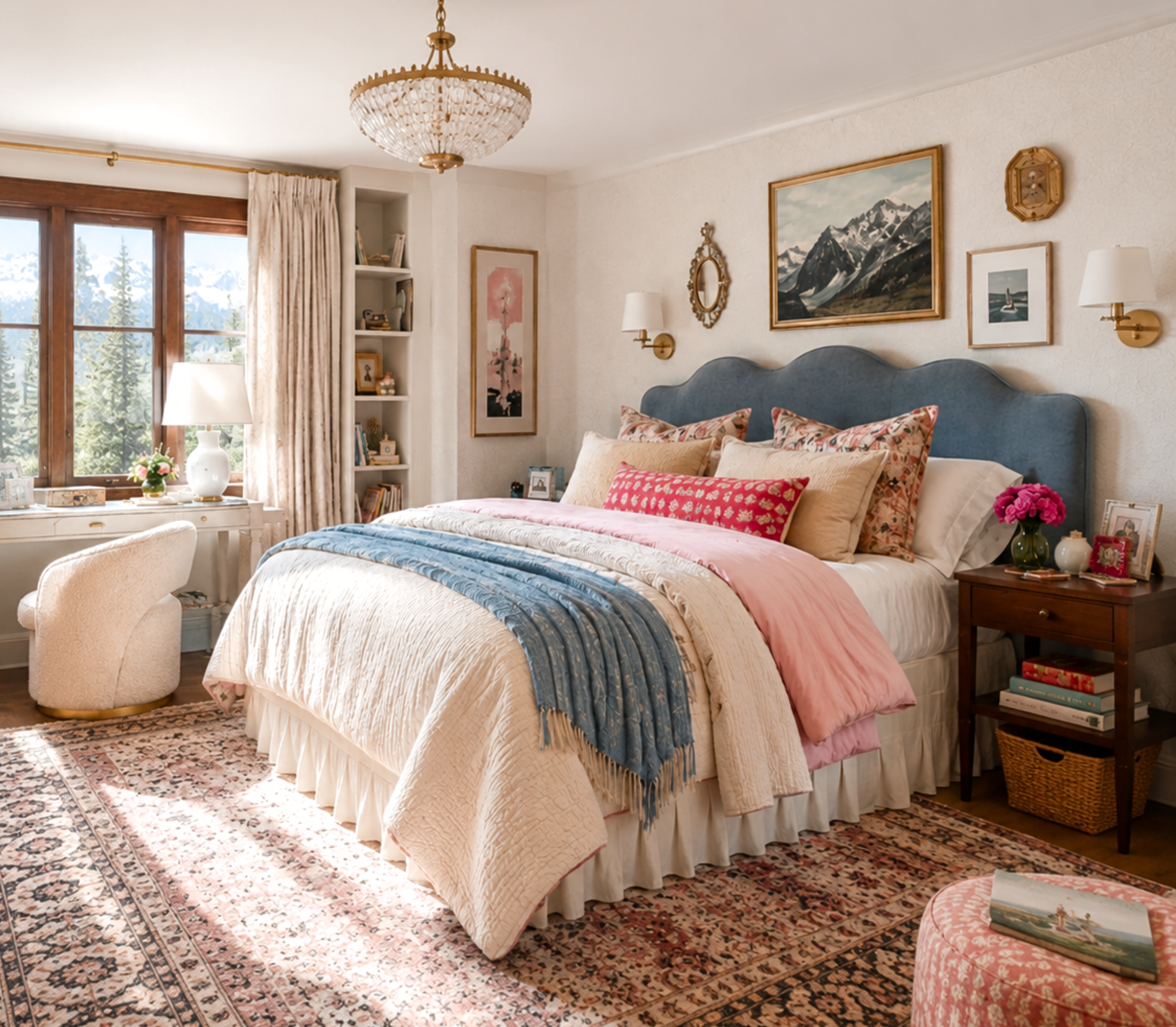
Bedrooms are the perfect place for the sweet soft pink to shine as a main color. It reads romantic and dreamy without being juvenile, especially paired with the soft whites and butter-blonde accents in the bedding. Keep the hot pink for one small, joyful moment, and let the hazy mountain blue appear in a bench or drapery for calm. It is a bedroom that feels tender and happy, with just enough backbone to feel grown-up.
The Powder Room
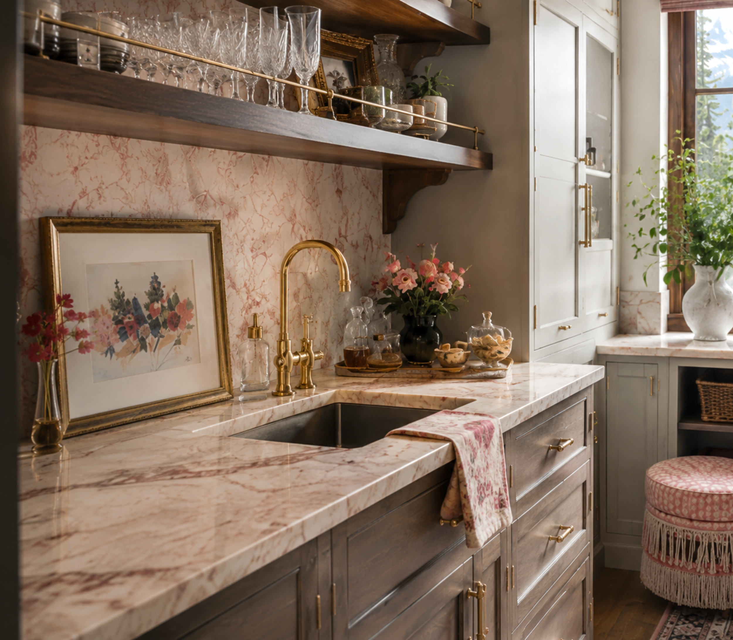
Small rooms are where you should let the rhinestones fly. A powder room in the bold hot pink is pure Dolly, unforgettable, joyful, and completely confident. Pair it with the coffee brown or a bit of brass on the fixtures to ground it, and you have a jewel box that makes every guest smile. This is the lowest-risk, highest-delight way to use the boldest color in the palette.
The Laundry or Mudroom
These hardworking rooms are a wonderful place for the faded denim and mountain blue. Take the workwear denim onto the walls or cabinetry for a space that feels cheerful and capable, with the soft whites keeping it bright and the coffee brown grounding the floors and counters. It turns a utilitarian room into one with real charm, which is exactly the kind of unpretentious warmth this palette is about.
Making It Work in Your Light
A practical word before you commit. Pinks and warm yellows are especially prone to shifting in different light, and a sweet pink can turn surprisingly loud, or a blonde surprisingly gold, on a big sunlit wall. This is not a reason to hold back, just a reason to test. Order samples, put them on more than one wall, and watch them morning, noon, and night. With the bolder colors in this palette especially, sampling is how you make sure the sweetness stays charming and lands exactly where you want it.
Bring an Icon Home
Rhinestones is for the home that wants to feel sweet, joyful, and feminine, with a grounded strength underneath the sparkle. If that sounds like you, this palette is ready in my Etsy shop, Abode Above Colors. Every download includes all nine exact paint colors and codes, the role each color plays, room-by-room placement guidance, and ready-to-use combinations so you know exactly how much of each shade to use and where.
And if you love this warm, spirited approach, Rhinestones belongs to a whole collection of palettes, each inspired by a woman whose style works like a signature. There is a joyful, colorful scheme rooted in warmth, a fresh farmhouse palette, a warm glamorous gold, and a bright, family-friendly one for the little ones. Come find the one that feels most like you, create something that makes you happy, and then send me a photo. I would truly love to see it.
You can shop the full Iconic Women Collection at Abode Above Colors on Etsy, and if you are local to the Delaware Valley and want the full-service version of this kind of color confidence, you know where to find me.
Images in this post are AI-generated for illustrative purposes only.