Favorite Things: A Warm, Abundant Palette in Sage, Terracotta, and Gold
Some homes wrap their arms around you. Favorite Things is the palette that does exactly that: a nine-color Sherwin-Williams scheme of champagne creams, garden sage, brick terracotta, and a luminous harvest gold, deepened by wine-brown and smoky green. It is abundance rendered in earth and gold, warm and gracious and made for gathering. If you want a home that feels generous and grounded, this palette was made for you.
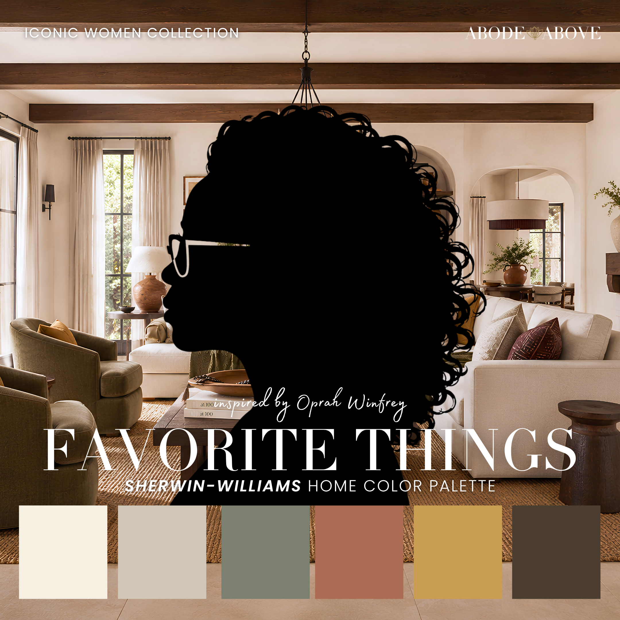
The Woman Behind the Palette
Favorite Things is inspired by Oprah, a woman whose very name has become synonymous with generosity, warmth, and abundance.
For decades she has built a career on connection, on making people feel seen, valued, and welcome. Her sense of home reflects that same spirit: gracious, layered, rooted in nature and comfort, the kind of space made for hosting the people you love and feeding them well. There is nothing cold or minimal about her warmth. It is generous and enveloping, the feeling of being genuinely cared for.
That is exactly the feeling I built into this palette. Favorite Things is not about restraint, it is about richness and generosity. It layers warm creams with garden sage and brick terracotta, then adds a luminous gold that reads like prosperity itself. This is a palette that hosts beautifully, that makes a home feel established and abundant, the kind of place where people gather and never quite want to leave.
The Palette at a Glance
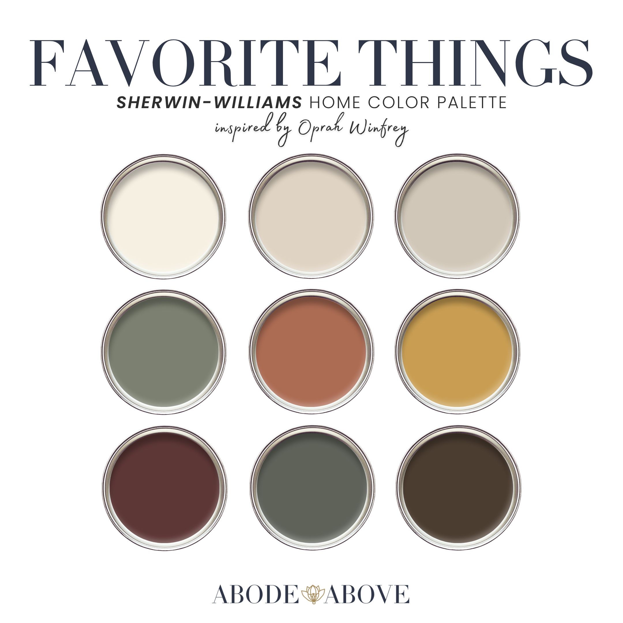
This palette follows my usual architecture, tuned for warmth: two champagne creams for a gracious foundation, a band of earthy neutrals, deep grounding shades, and a luminous statement. The whites here are warm and welcoming. An approachable greige carries the mids alongside the garden sage, which brings the palette down to earth. A brick terracotta adds rooted warmth. Then the star: a luminous harvest gold that glows like abundance. A deep wine-brown and a smoky green provide soulful depth, grounded by a rich brown.
The generosity of this palette is in its layering. The creams and greige keep it welcoming, the sage and terracotta bring it to earth, and the harvest gold lifts the whole thing into something rich and gracious. It is a scheme built for warmth and gathering.
How to Use Favorite Things in Your Home
A rich, layered palette relies on the 60-30-10 ratio to stay gracious rather than heavy: about 60 percent of a room in your main color, 30 percent in a secondary, and the last 10 percent in accents. With Favorite Things, that structure lets the warmth build into abundance without overwhelming.
The Living Room
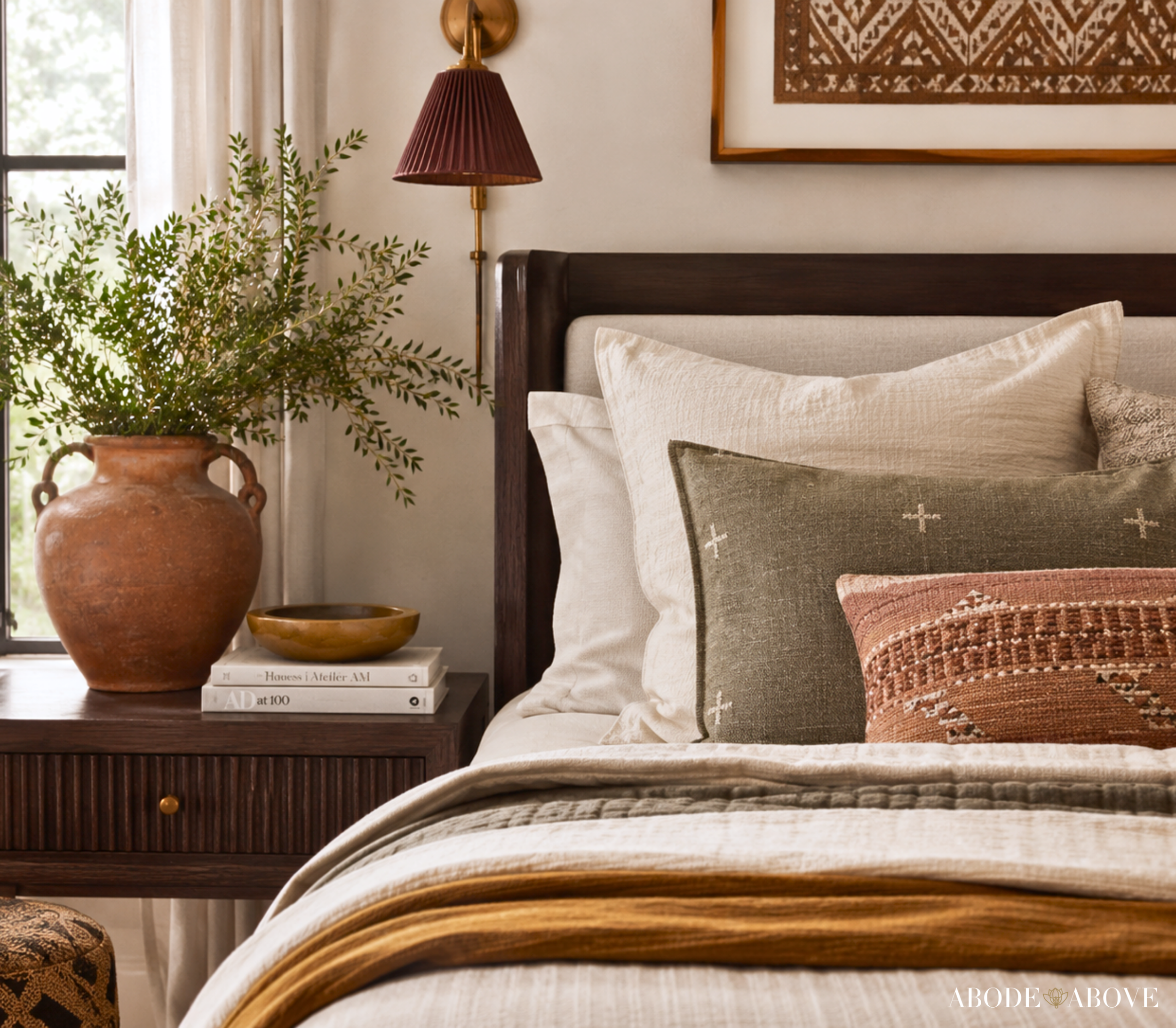
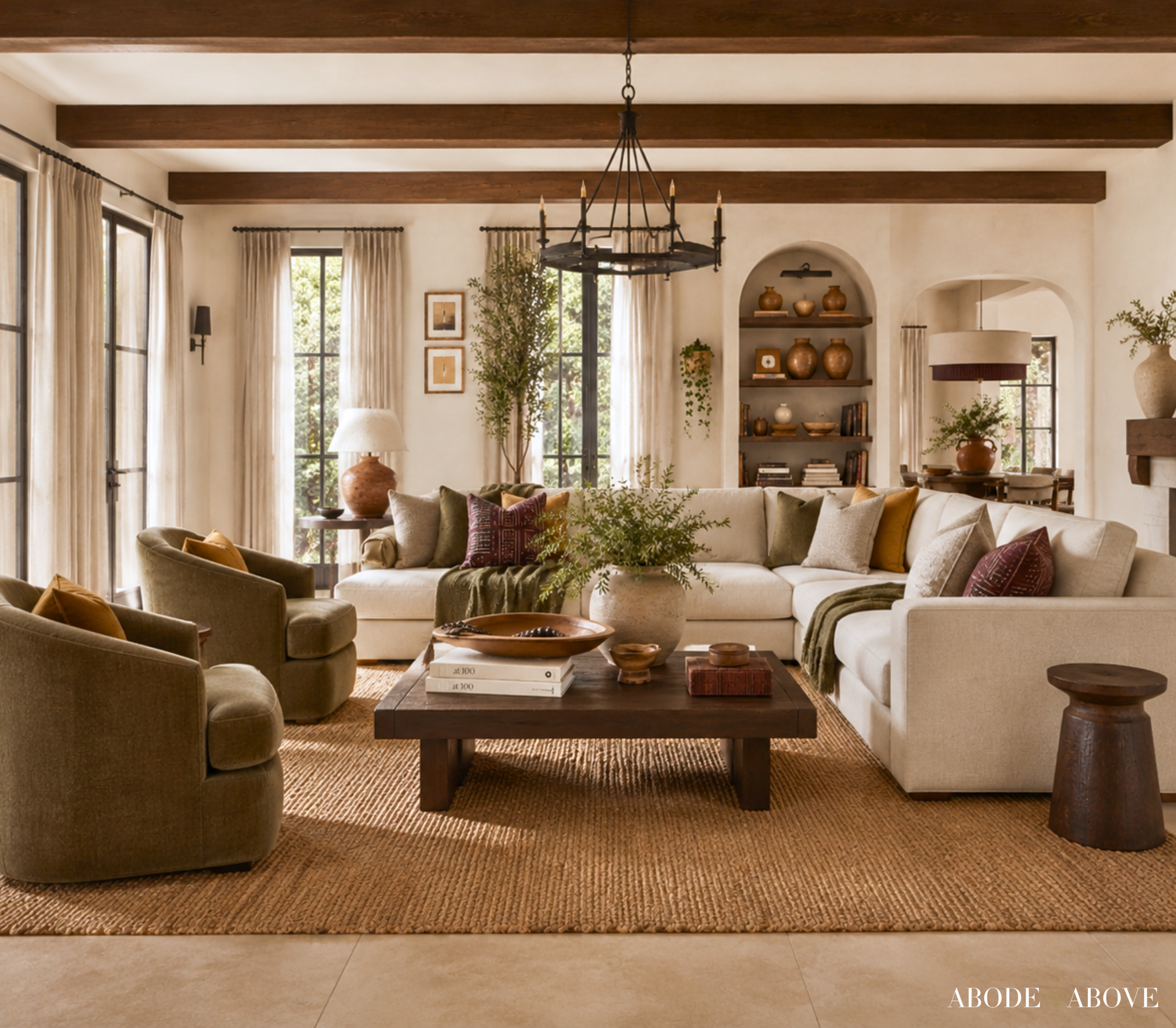
Anchor the room with one of the champagne creams or the approachable greige on your main walls for a warm, gracious foundation. Bring in the garden sage or a soft terracotta as a secondary through upholstery, a rug, or drapery, which grounds the room in earthy warmth. Then let the harvest gold appear in your accents, the lighting, frames, a few gilded touches, with the wine-brown and smoky green in pillows and art. Natural textures and plants complete the look. The result is a living room that feels abundant and welcoming, the kind of space made for long evenings with the people you love.
The Kitchen
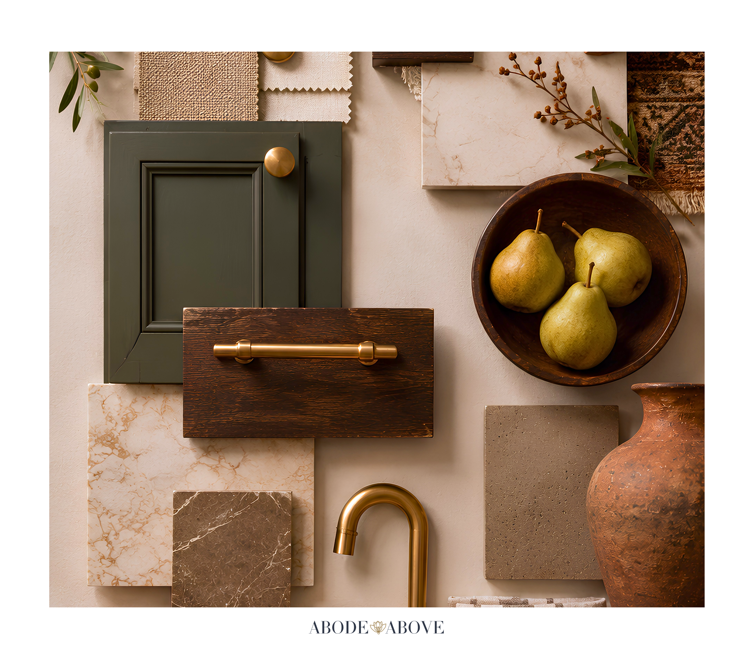
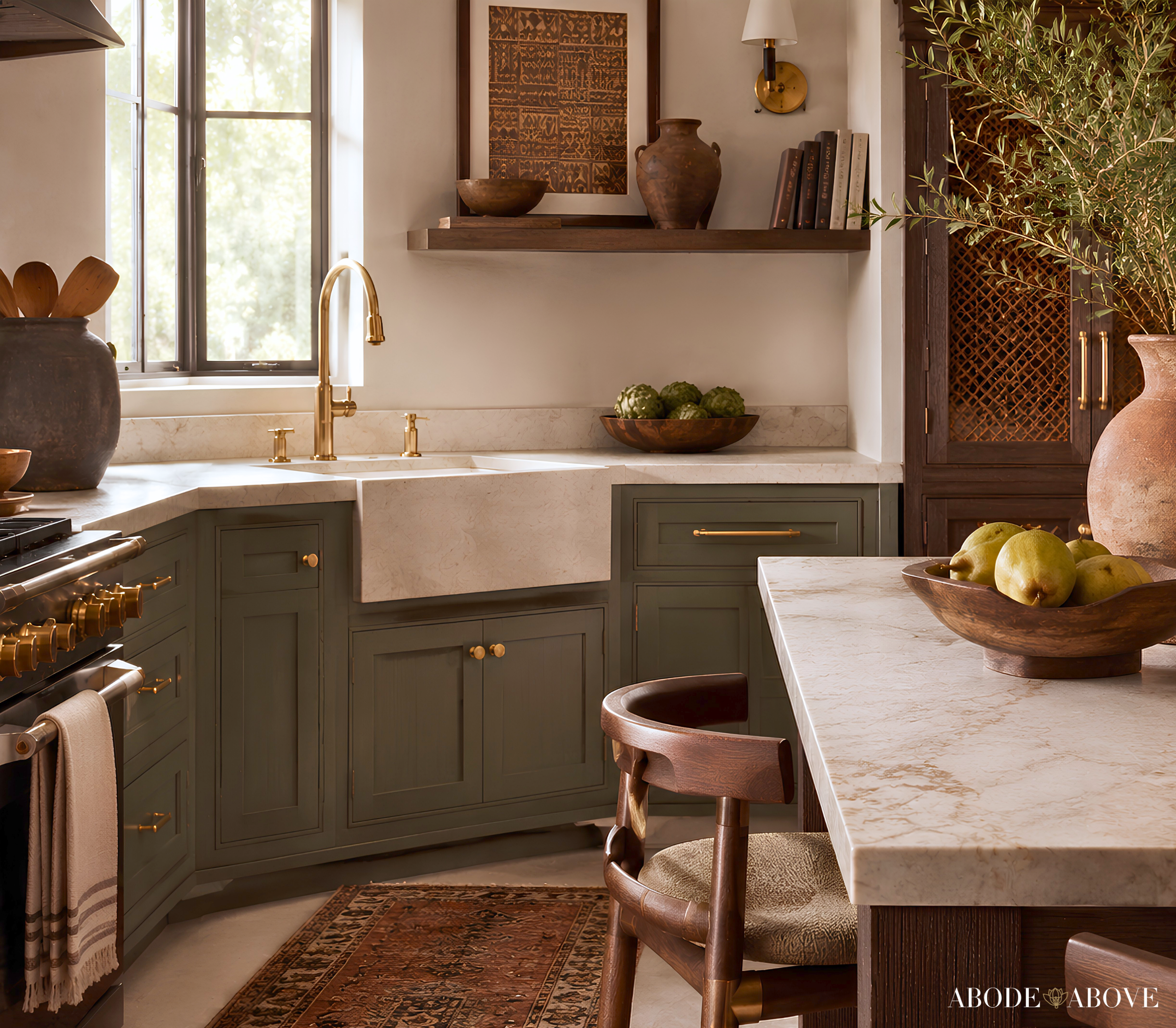
Kitchens are the heart of a gathering home, and this palette loves them. Use a champagne cream on the main walls, bring in the garden sage on cabinetry or an island for a fresh, grounded feeling, and let the terracotta and harvest gold appear in the tile, the hardware, and the accents. Paired with warm wood and brass, it feels like a kitchen made for cooking together and feeding a crowd, generous and inviting.
The Dining Room
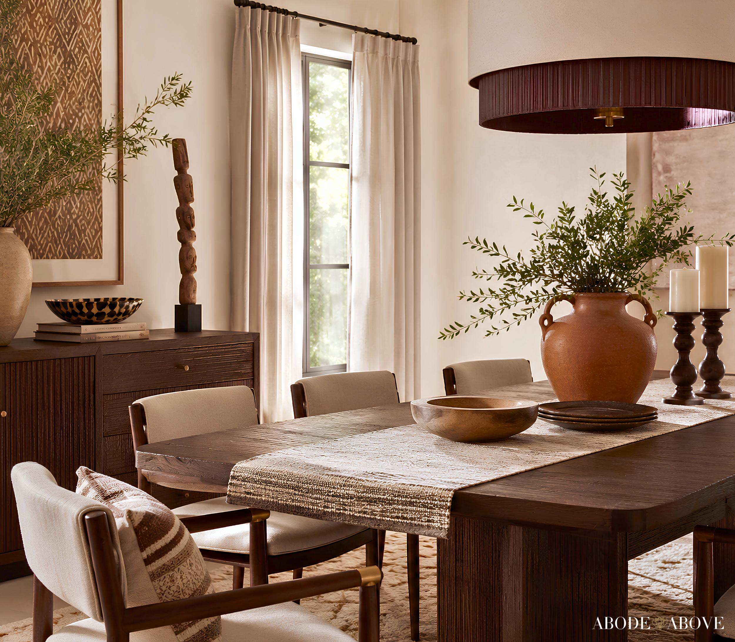
A dining room is the perfect place for the wine-brown or a rich terracotta to create a warm, gracious mood for gathering. Consider one of them on the walls, balanced by a cream on the trim, with the harvest gold glowing in the lighting and a few sage accents in the seating. Against a well-set table, these warm tones make dinner feel like an occasion, exactly the abundant, welcoming feeling this palette is about.
The Sunroom or Reading Nook
For the garden sage and harvest gold to truly shine, give them a light-filled, restful spot. A sunroom or reading nook in sage, with gold and terracotta accents and plenty of plants, feels like a warm garden retreat. It is a space that invites you to linger, which is the whole spirit of this palette.
Making It Work in Your Light
A practical word about a palette this layered. Sage greens shift between fresh and gray depending on the light, and warm tones like terracotta and gold can intensify in strong sun. Because this palette spans such a warm, earthy range, sampling is essential. Order samples, put them on more than one wall, and study them morning, noon, and night before you buy your gallons. It is the surest way to capture the gracious, abundant feeling this palette is designed for.
Bring an Icon Home
Favorite Things is for the home that wants to feel warm, generous, and abundant, gracious and grounded and made for gathering. If that sounds like you, this palette is ready in my Etsy shop, Abode Above Colors. Every download includes all nine exact paint colors and codes, the role each color plays, room-by-room placement guidance, and ready-to-use combinations so you know exactly how much of each shade to use and where.
And if you love this warm, abundant approach, Favorite Things belongs to a whole collection of palettes, each inspired by a woman whose style works like a signature. There is a joyful colorful scheme rooted in warmth, an elevated sage-and-plum palette, a warm earthy one full of California cool, and a soulful scheme layered with amber and plum. Come find the one that feels most like you, create something generous and beautiful, and then send me a photo. I would love to see it.
You can shop the full Iconic Women Collection at Abode Above Colors on Etsy, and if you are local to the Delaware Valley and want the full-service version of this kind of color confidence, you know where to find me.

Images in this post are AI-generated for illustrative purposes only.