Madam: A Classic Navy and Slate Power Palette for a Commanding Home
Some rooms are built to make decisions in. Madam is the palette for them: a nine-color Sherwin-Williams scheme of stately navy and slate-blue heritage tones, a dignified deep red, and one confident gold, kept sharp with crisp whites and grounded in black. It is a true power palette, polished and authoritative, and if you want a home that feels serious, composed, and quietly commanding, this is the one I made for you.
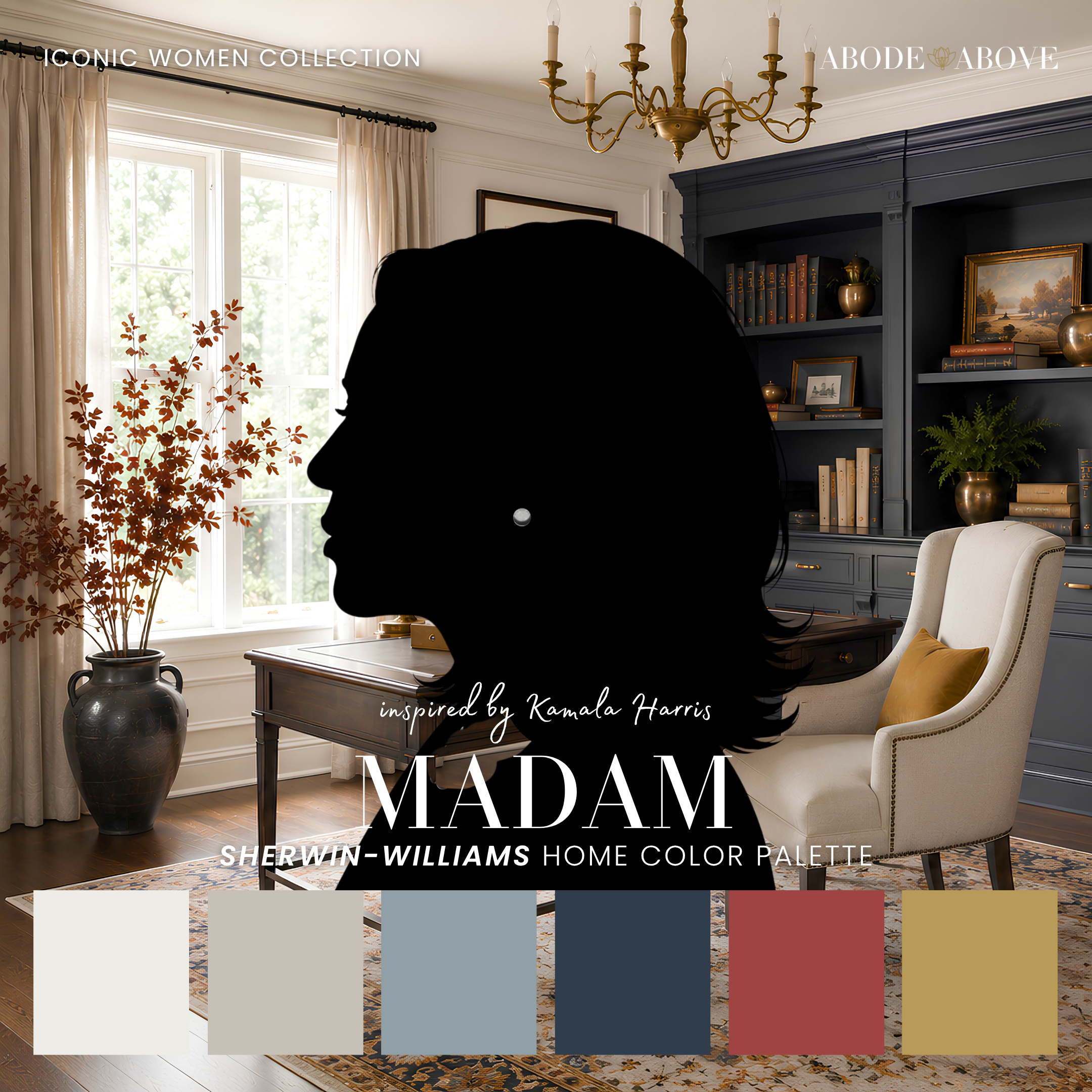
The Woman Behind the Palette
Madam is inspired by Kamala Harris, a history-making leader whose style is polished, precise, and unmistakably authoritative.
She has spent her career in rooms where composure is everything, and her personal presentation reflects it: sharp tailoring, deliberate color, nothing out of place. There is a gravity to how she presents herself that commands attention without ever needing to raise its voice. The deep red in this palette is a quiet nod to her Howard University roots, a detail that speaks to where she comes from and what she carries with her. The navy and gold echo the dignified authority she brings to any room.
That composed, commanding quality is exactly what this palette is built to give a home. Not every room needs to be soft or casual. Some spaces, a study, a home office, a formal dining room, benefit from feeling serious and considered, from carrying a sense of authority. Madam gives you that gravitas in color, a scheme as polished and self-assured as the woman who inspired it.
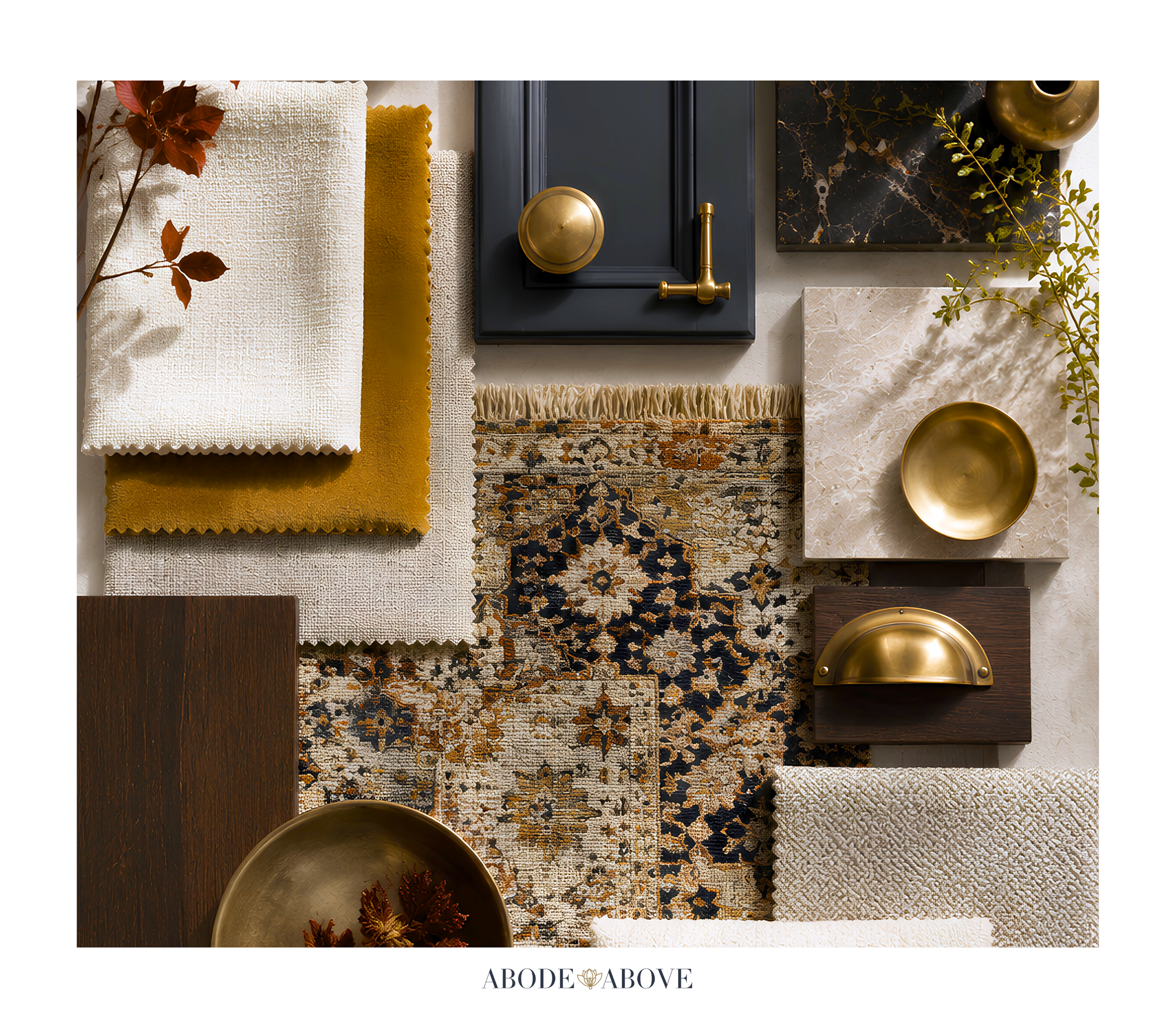
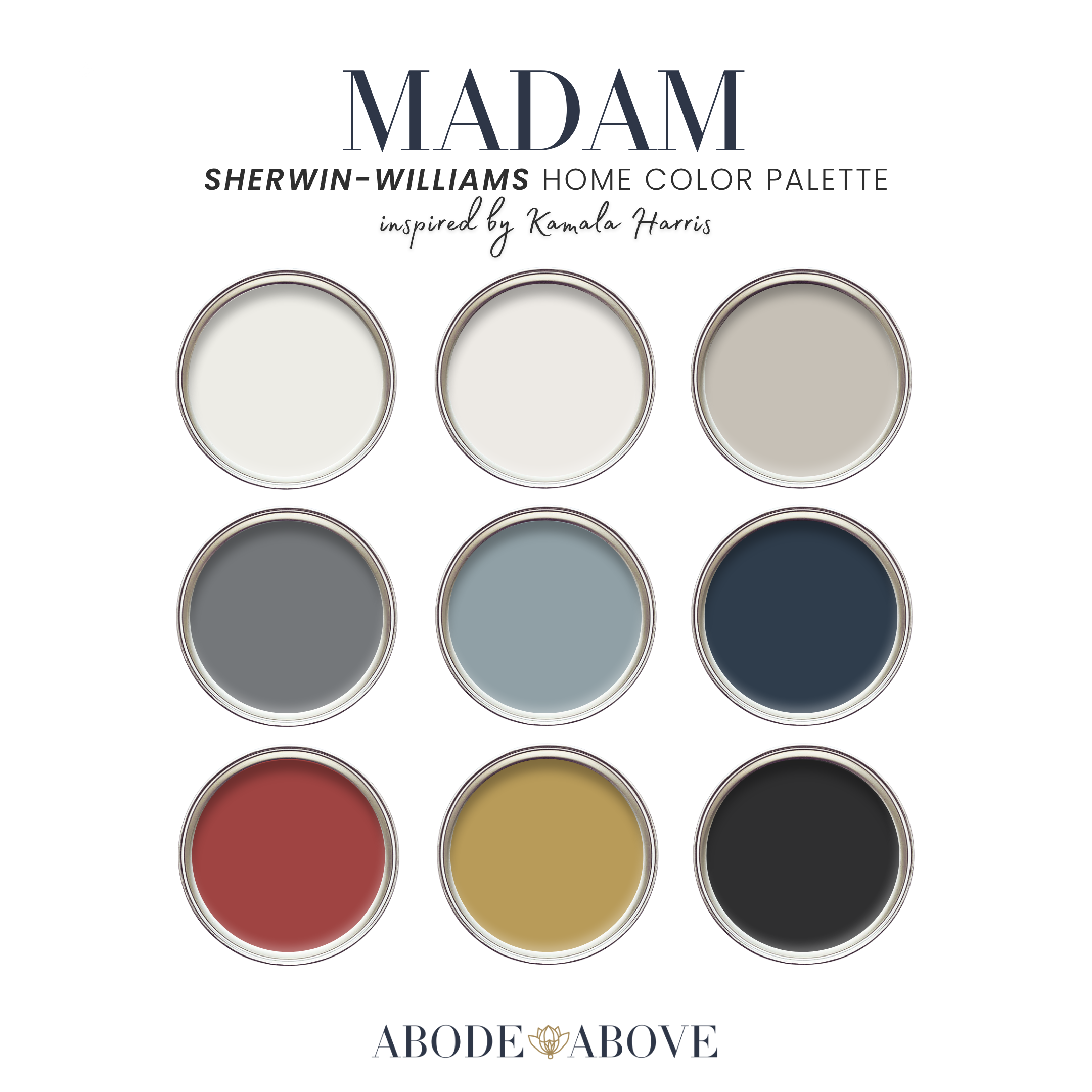
The Palette at a Glance
This palette follows my usual architecture: two crisp whites, a band of structured neutrals, deep grounding shades, and dignified accents. The whites here are clean and true, giving sharp clarity to trim and moldings. A structured warm greige and a dusty heritage blue carry the mids, composed and architectural. A deep slate blue-gray adds moody depth. Then the anchors: a stately navy that turns any room formal, a dignified deep red, and one confident muted gold for authority, all grounded by a true black.
The power of this palette comes from its discipline. The navy and slate are serious and composed, the crisp whites keep everything sharp, and the red and gold provide just enough warmth and richness to feel dignified rather than cold. It is a scheme that means business, in the best way.
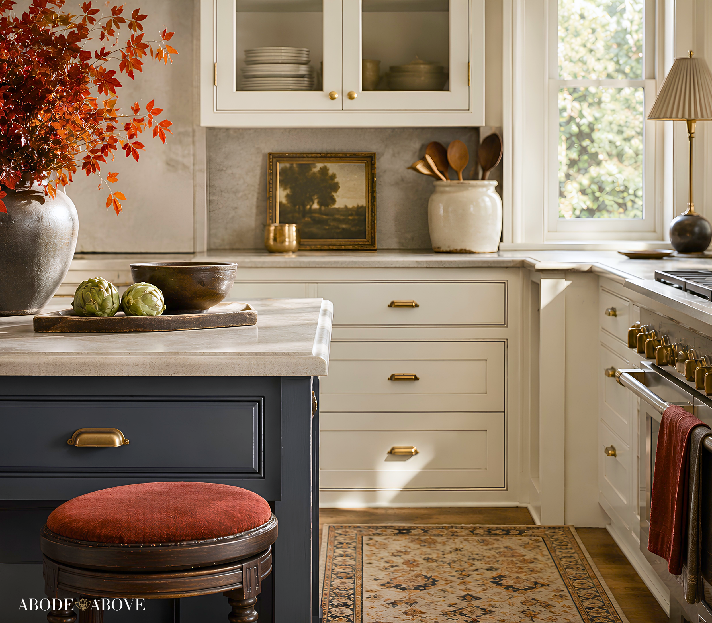
How to Use Madam in Your Home
A power palette still relies on the 60-30-10 ratio to stay balanced: about 60 percent of a room in your main color, 30 percent in a secondary, and the last 10 percent in accents. With Madam, restraint on the deep red and gold is what keeps the whole scheme feeling authoritative rather than heavy.
The Home Office or Study
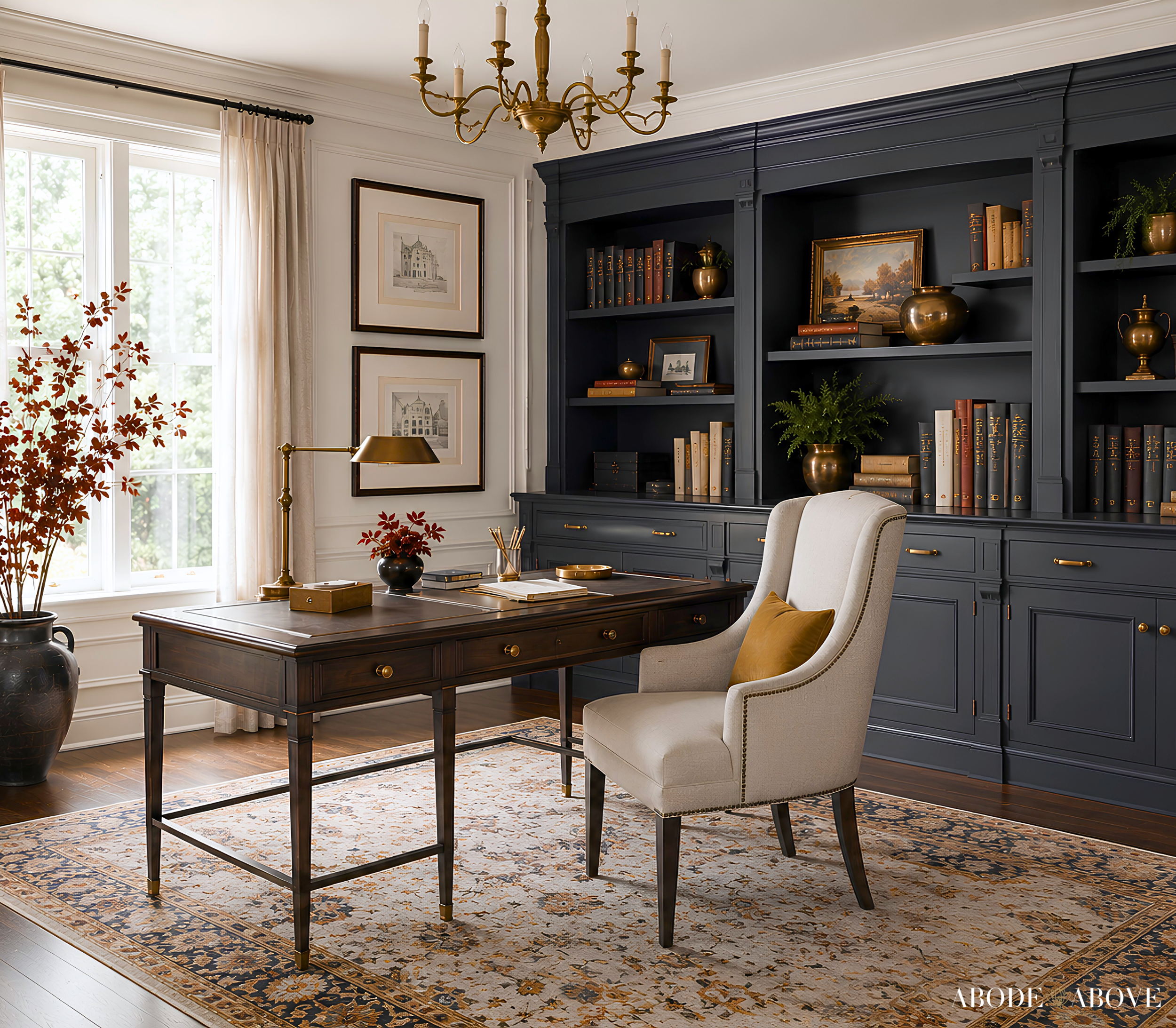
This is the palette's natural home. Take the stately navy or the deep slate onto the walls of a study for a room that feels focused, serious, and commanding. The crisp white on the trim keeps it sharp, the structured greige balances it, and the confident gold appears in the lighting, the hardware, or a single frame. A study in these tones feels like a room where important work happens, composed and quietly powerful.
The Dining Room
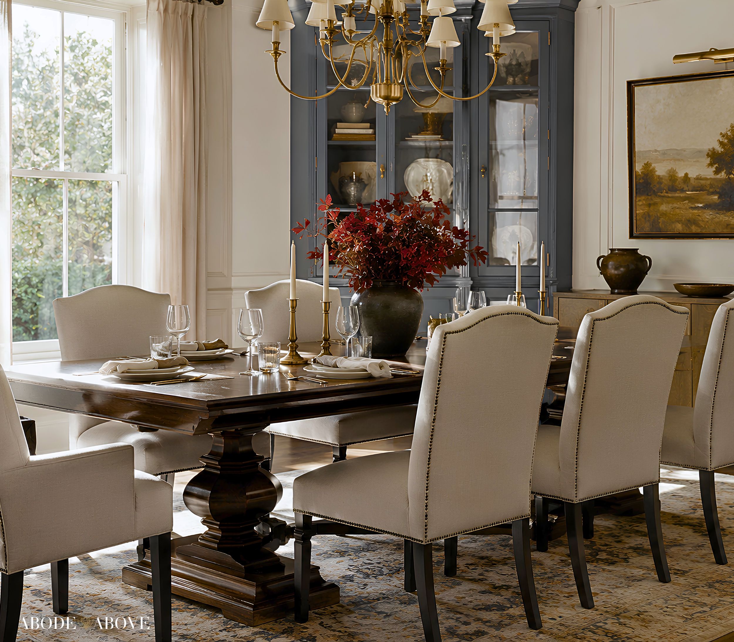
A formal dining room is the perfect stage for the navy to command the space. Consider it on the walls, balanced by a crisp white on the trim and ceiling, with the dignified red appearing in the seating or a single piece of art and the gold glinting in the lighting. Against warm wood and a well-set table, navy feels classic and authoritative, exactly the note you want for a room made for serious gathering and conversation.
The Living Room
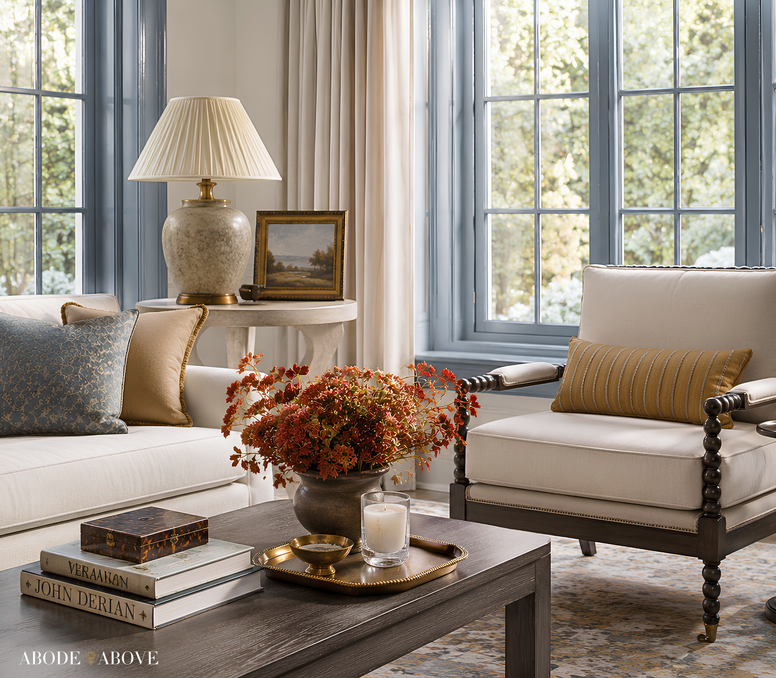
For a composed, dignified living room, anchor the space with the structured greige on your main walls, then bring in the heritage blue as a secondary through upholstery and drapery. Let the navy appear in a pair of chairs or an accent, with the deep red and gold in the accents, on pillows, frames, and lighting. The black grounds the hardware. The result is a living room that feels established and serious, welcoming but never casual.
The Powder Room or Entryway
For a small, high-impact space, wrap a powder room or entryway in the navy or deep slate for an instant sense of gravity. The crisp white trim keeps it sharp, and a touch of gold on the fixtures adds dignity. It sets a composed, authoritative tone the moment someone enters, and it makes the warmer rooms beyond feel like a considered progression.
Making It Work in Your Light
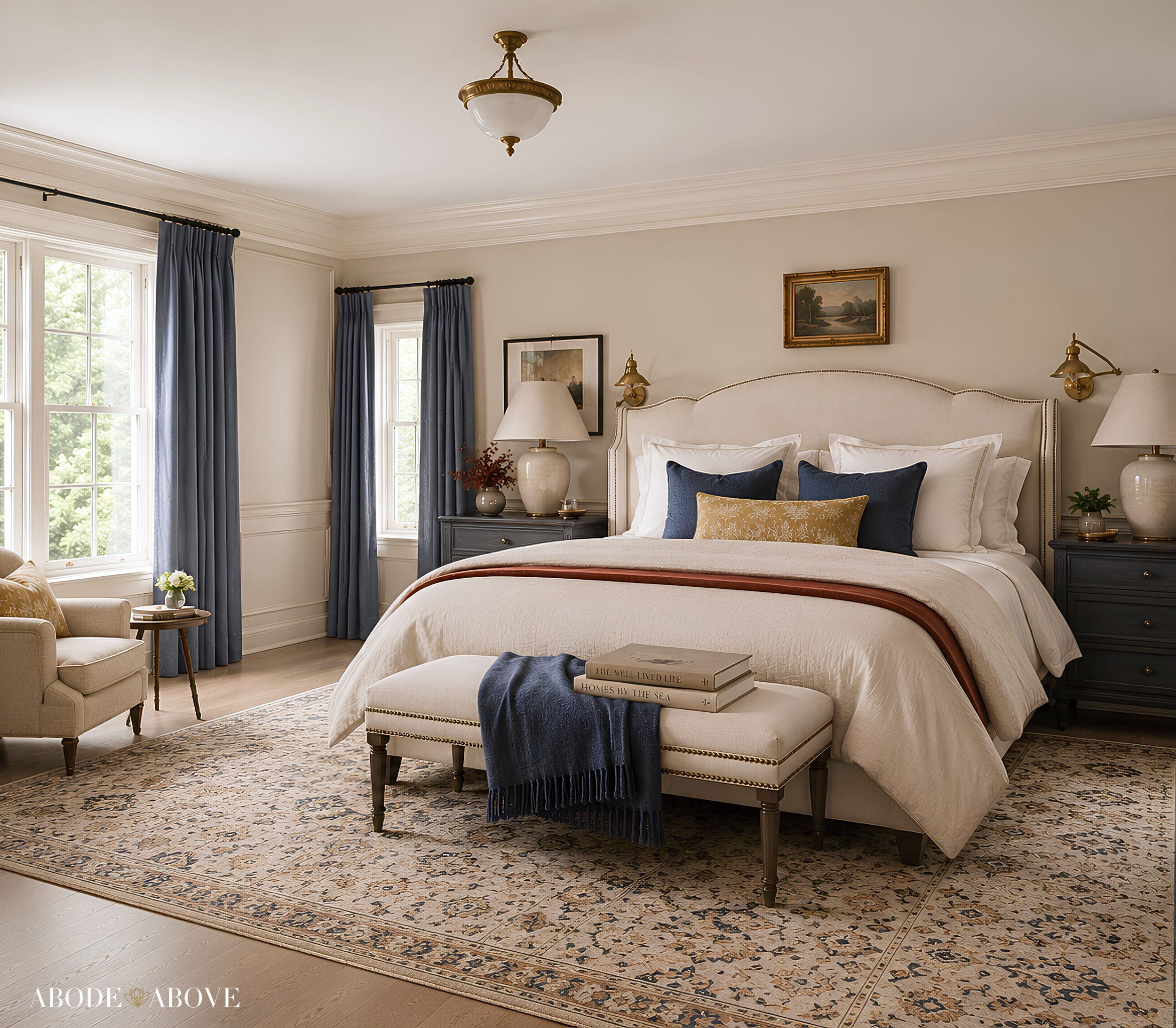
An honest word about deep, serious colors. Navy and slate blues are quite light-sensitive, reading rich and composed in a well-lit room and much darker in a dim one, and the heritage blue can shift between blue and gray. Because this palette depends on that dignified, composed feeling, sampling is essential. Order samples, live with them on more than one wall, and study them morning, noon, and night before committing. It is the surest way to get the commanding, polished mood this palette is built for.
Bring an Icon Home
Madam is for the home that wants to feel serious, composed, and quietly commanding, polished and dignified in every detail. If that sounds like you, this palette is ready in my Etsy shop, Abode Above Colors. Every download includes all nine exact paint colors and codes, the role each color plays, room-by-room placement guidance, and ready-to-use combinations so you know exactly how much of each shade to use and where.
And if you love this composed, authoritative approach, Madam belongs to a whole collection of palettes, each inspired by a woman whose style works like a signature. There is a tailored menswear-inspired neutral, a sophisticated blue scheme, a timeless ivory-and-chocolate palette, and an elevated sage-and-plum one. Come find the one that feels most like you, create something composed and beautiful, and then send me a photo. I would love to see it.
You can shop the full Iconic Women Collection at Abode Above Colors on Etsy, and if you are local to the Delaware Valley and want the full-service version of this kind of color confidence, you know where to find me.

Images in this post are AI-generated for illustrative purposes only.