Princess Diary: A Timeless Palette in Ivory, Chocolate, and Red
There is a particular magic to a look that feels both classic and completely current. Princess Diary captures it: a nine-color Sherwin-Williams palette of refined ivory and icy blue, the chocolate-brown moment everyone is having, and one perfect red for the third-act reveal. It is polished, timeless, and quietly luxurious, and if you love spaces that will look elegant for decades, this is the palette I made for you.
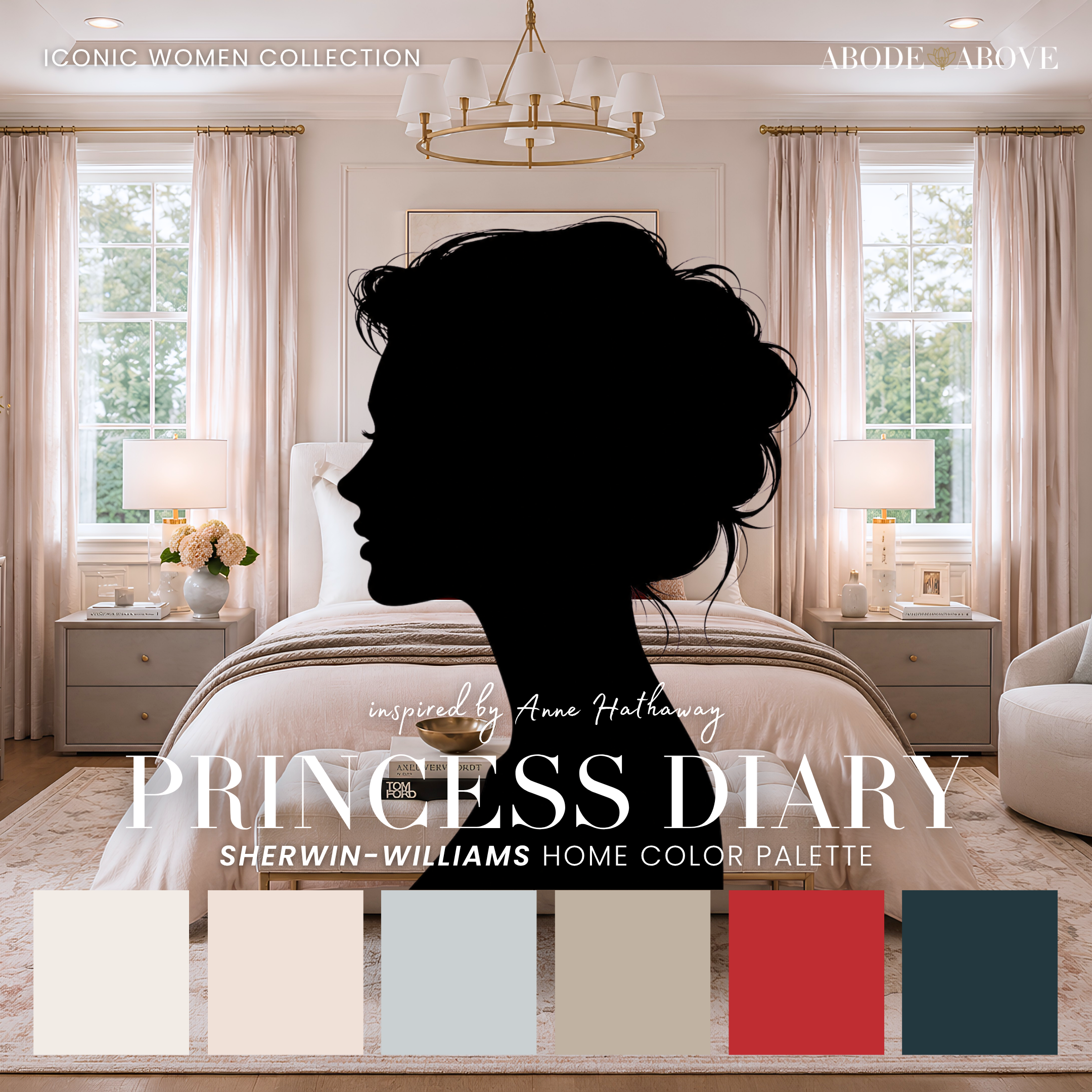
The Woman Behind the Palette
Princess Diary is inspired by Anne Hathaway, who has lived the most famous makeover montage in modern film, and then done something even harder in real life.
Two decades after that iconic on-screen transformation, she pulled off the rarest move in fashion: a genuine second act. Her recent style era, all polished tailoring, rich chocolate browns, and impeccable classics with one red-lip exclamation point, has been a quiet masterclass in timelessness that still feels fresh. She proved that elegance is not about chasing what is new, it is about knowing exactly who you are and refining it over time.
That is precisely the feeling this palette is built to give a home. Trends come and go, but a well-chosen classic scheme, warmed up with the browns that feel so current right now and punctuated by one perfect red, will look intentional and beautiful for years. Princess Diary is for the person who wants a home that feels like a timeless wardrobe: polished, considered, and never out of style.
The Palette at a Glance
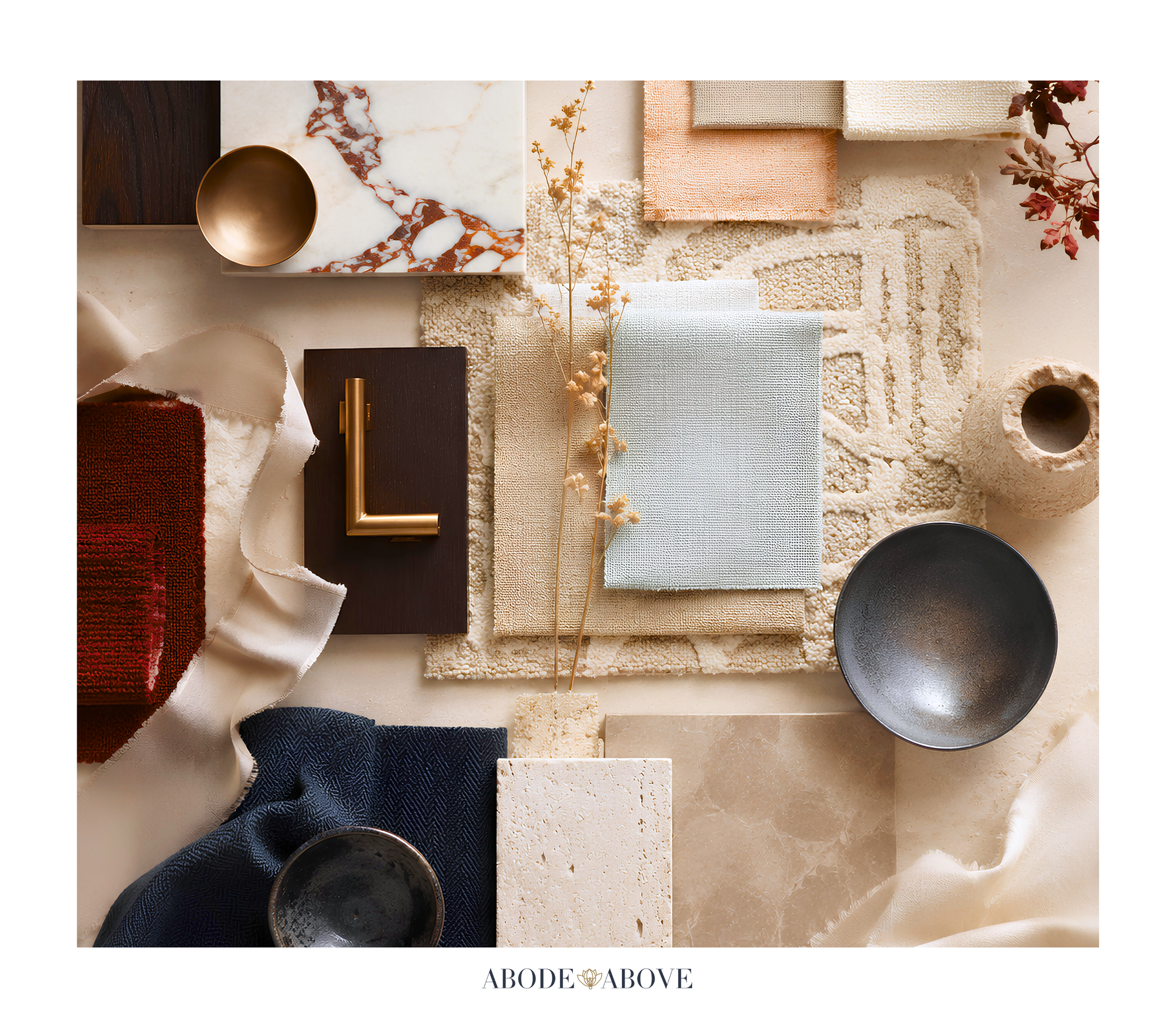
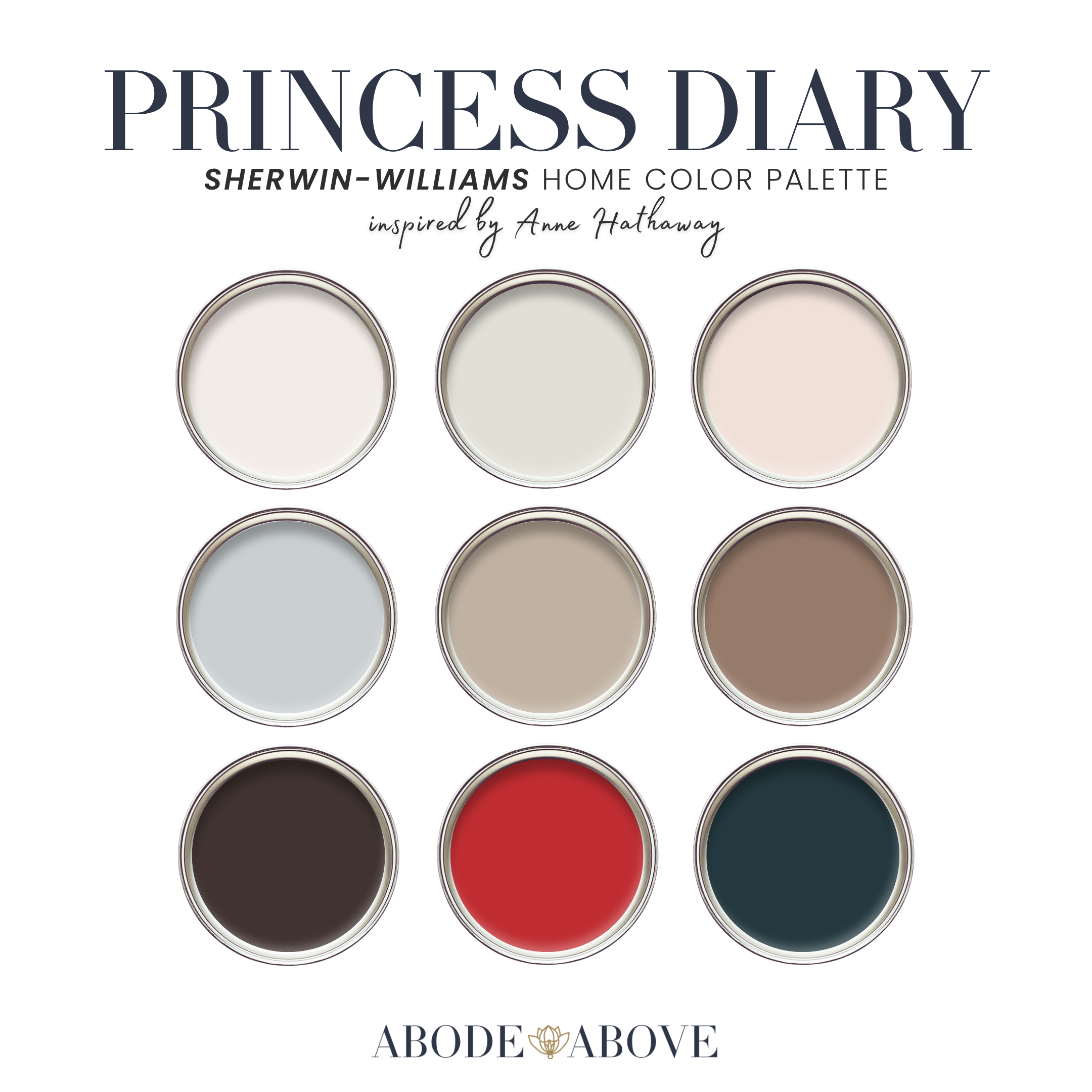
This palette follows my usual architecture: two refined whites, a set of livable mid-tones, deep grounding shades, and one perfect accent. The whites here are polished and warm-neutral, the first frame of the after photo. A barely-there blush adds romance, an icy pale blue brings crisp poise, and a trench-coat beige anchors the neutrals. Then the depth: a milk-chocolate brown, the fashion moment of the year rendered livable, and a deep espresso brown-black. The statement, held for one perfect moment, is a classic true red, grounded by an inky blue-black for evening drama.
The chocolate browns are what make this palette feel current, and the single red is what makes it feel alive. Together with the crisp whites and icy blue, they create a scheme that is timeless without being staid, exactly the balance Anne strikes.
How to Use Princess Diary in Your Home
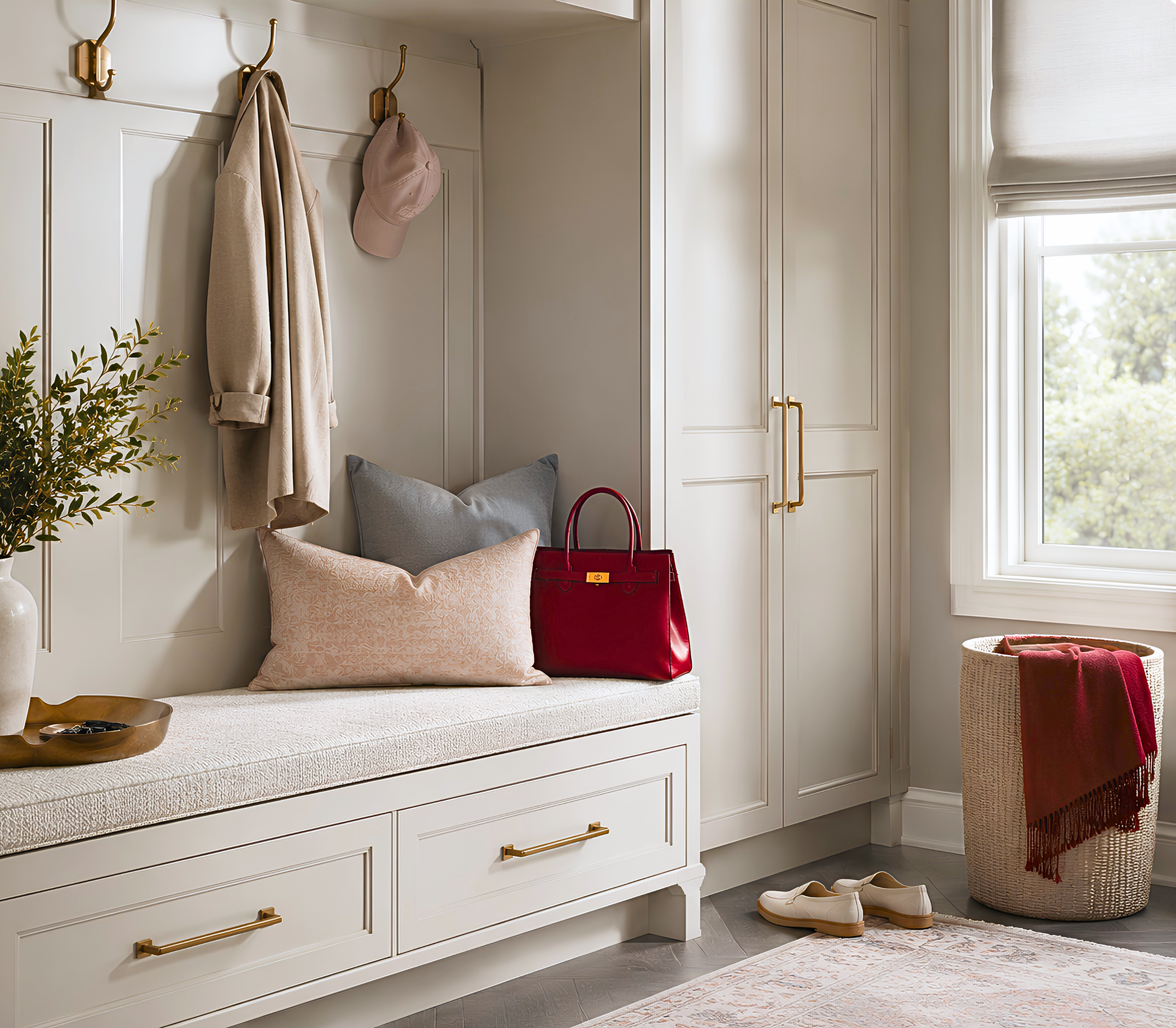
A classic palette still relies on the 60-30-10 ratio: about 60 percent of a room in your main color, 30 percent in a secondary, and the last 10 percent in accents. With this palette, the discipline is what keeps it feeling polished and intentional.
The Living Room
Anchor the room with one of the refined whites or the trench-coat beige on your main walls for a polished, timeless foundation. Bring in the milk-chocolate brown as a rich secondary through upholstery, a leather chair, or drapery, which instantly makes the room feel current and luxurious. Then reserve the classic red for one small, deliberate moment, a single lacquered piece or a bold pillow, and let the espresso brown-black handle the deepest accents. The result is a living room that feels elegant and warm, timeless with just a spark of confidence.
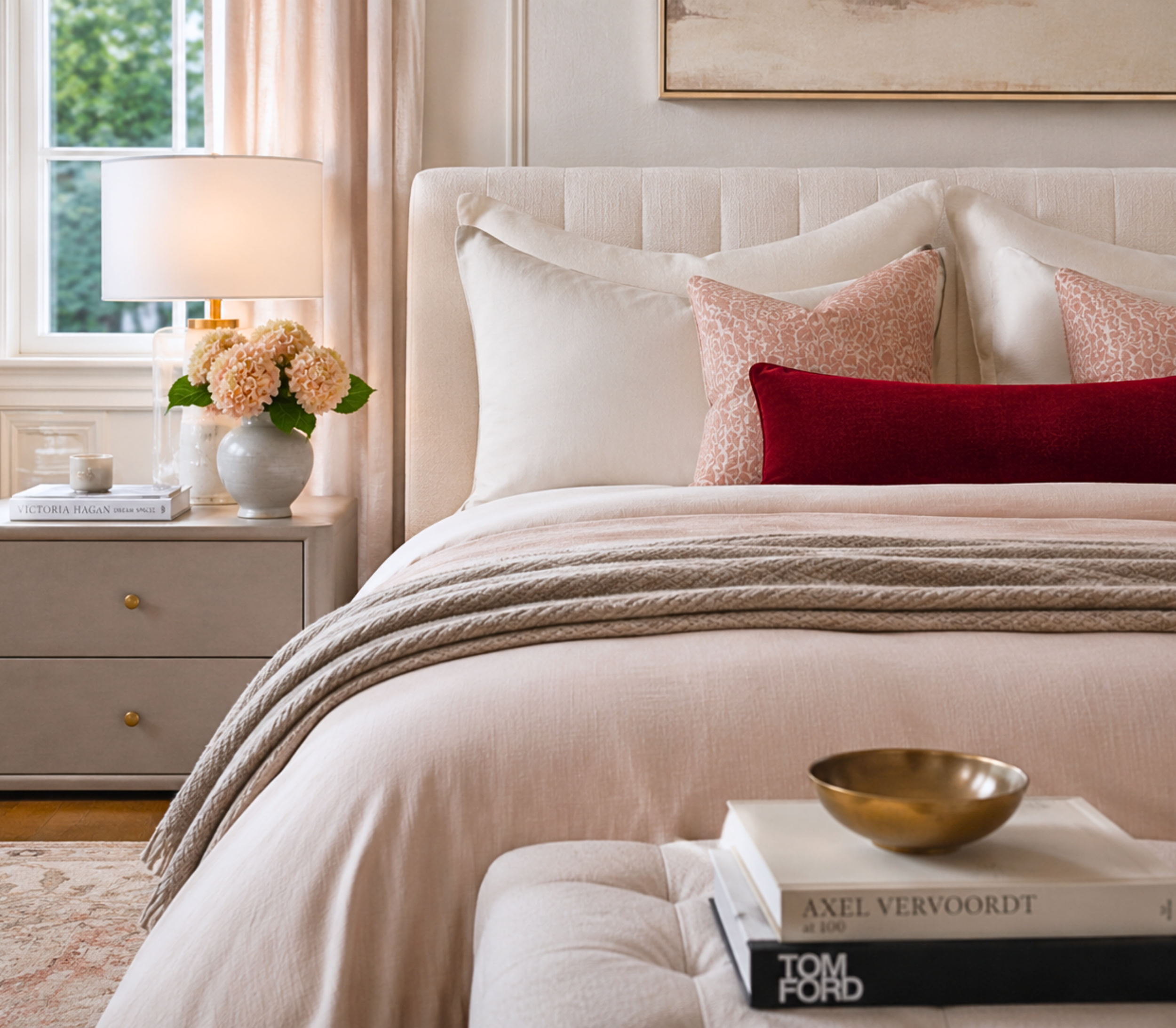
The Bedroom
Bring the icy pale blue and barely-there blush forward here for a serene, refined bedroom. Use the pale blue as a crisp, calming main color, layered with the whites and blush in the bedding for a space that feels like a luxury hotel suite. Keep the chocolate brown for grounding accents, a bench, a headboard, and let the red sit out, or appear in a single object if you want one spark. It is a bedroom that feels polished and restful at once.
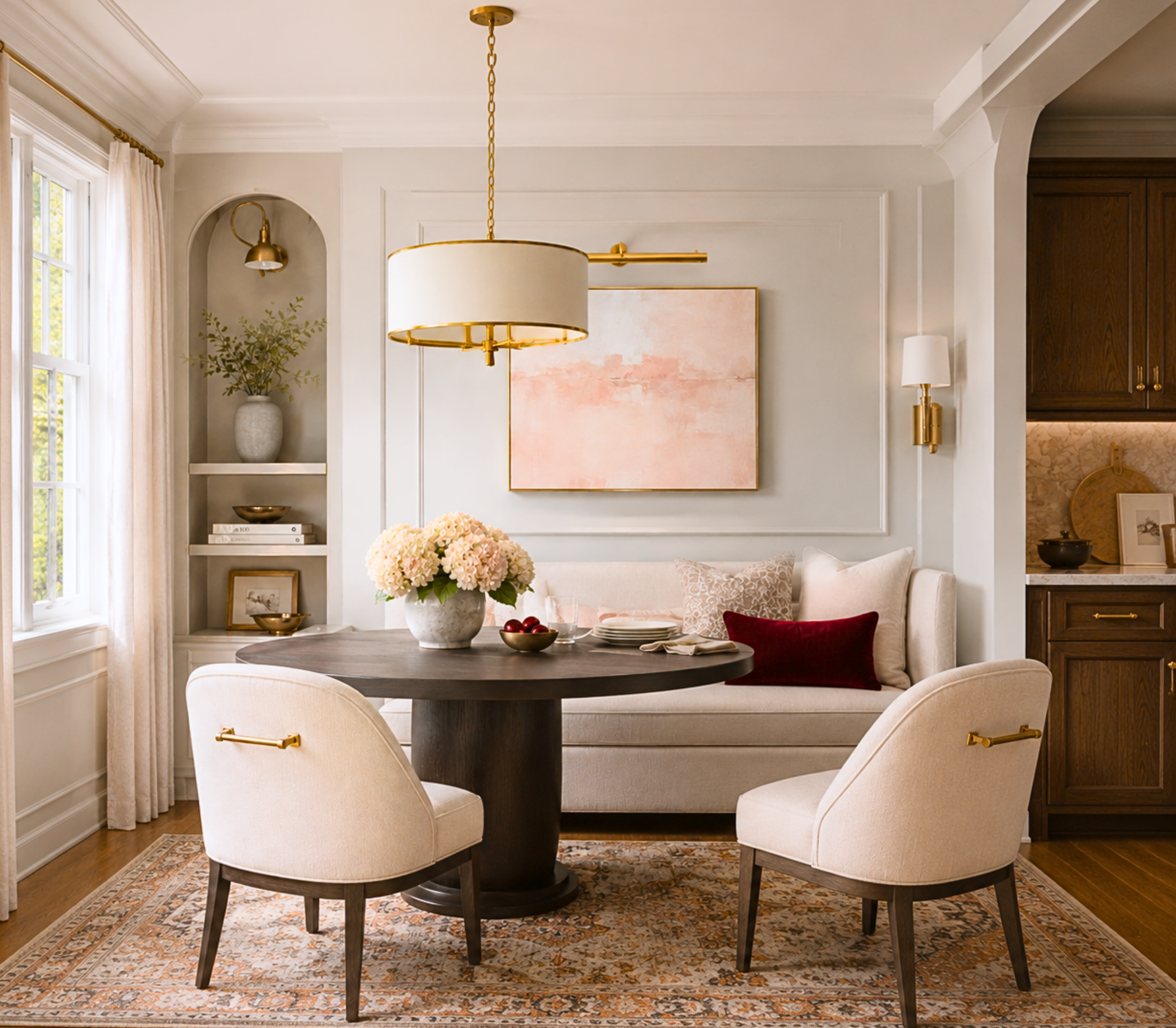
The Dining Room
A dining room is the perfect place for the rich chocolate brown or the inky blue-black to create a sophisticated, evening mood. Consider one of them on the walls, balanced by a refined white on the trim, with the classic red appearing in a single bold accent and warm brass in the lighting. Against a well-set table, these deep tones feel gracious and current, the kind of room that makes dinner feel like an occasion.
The Front Door or Powder Room
For a small, high-impact statement, the classic red on a front door is the ultimate polished exclamation point, timeless and confident. Or a powder room in the espresso brown-black with brass fixtures becomes a jewel box that feels rich and current. These are the spots where the boldest notes of the palette shine without overwhelming your main living spaces.
Making It Work in Your Light
A practical word before you commit. The chocolate browns and the icy blue both shift with light in ways worth watching. A rich brown can read warmer or cooler depending on the room, and a pale blue can turn crisp and bright or soft and gray. Because this palette balances warm and cool so deliberately, sampling is essential. Order samples, put them on more than one wall, and study them morning, noon, and night. It is the surest way to capture the polished, timeless feeling this palette is designed for.
Bring an Icon Home
Princess Diary is for the home that wants to feel timeless and polished, warm and current, with one perfect red for confidence. If that sounds like you, this palette is ready in my Etsy shop, Abode Above Colors. Every download includes all nine exact paint colors and codes, the role each color plays, room-by-room placement guidance, and ready-to-use combinations so you know exactly how much of each shade to use and where.
And if you love this timeless, polished approach, Princess Diary belongs to a whole collection of palettes, each inspired by a woman whose style works like a signature. There is a tailored menswear-inspired neutral, a warm glamorous gold, a soft quiet-luxury scheme, and a sophisticated blue palette. Come find the one that feels most like you, create something elegant, and then send me a photo. I would love to see it.
You can shop the full Iconic Women Collection at Abode Above Colors on Etsy, and if you are local to the Delaware Valley and want the full-service version of this kind of color confidence, you know where to find me.

Images in this post are AI-generated for illustrative purposes only.